Here’s a point I need to make, but one which should not be accompanied by surprise: I am not an architect.
I am also not an engineer, a city planner, or a Toronto condominium developer.
But I am, however, a real estate broker with experience buying and selling condominiums, so I think that qualifies me to opine on the ridiculous condominium floor plans that are being submitted with development applications these days.
We’ve done blogs on this topic before.
November 17th, 2021: “1-Bedroom Condo Floor Plans: Pass Or Fail?”
In this blog, the discussion was more about micro-condos and how an exceptionally small space is often unliveable.
Case in point:
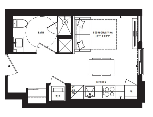
In the 2021 blog post, I gave this a “fail” because of the wasted space in the foyer, which is significant, given this is 310 square feet in total and that foyer is probably 70-80 square feet.
I also did a feature on 3-bedroom condo floor plans with the same theme.
November 15th, 2021: “3-Bedroom Condo Floor Plans: Pass Or Fail?”
In this blog, we talked about the size of new 3-bedroom units, and how tough it is to cram 3-beds and 2-baths into 700 square feet, but also about the layouts.
Case in point:
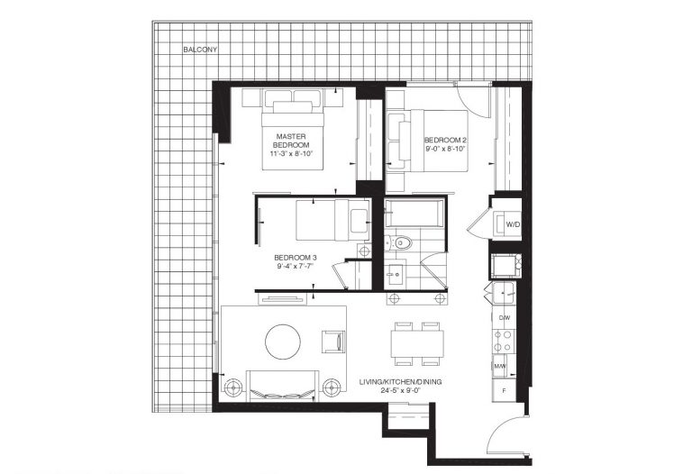
I gave this one a “fail” because the person going into the Master Bedroom essentially has to walk through Bedroom 3.
Today, I’m not looking to talk about size or even layout.
I want to talk about shape.
This sounds like semantics, but I assure you it’s not.
Layout does have to do with shape, but in the example above, the shape is a rectangle. In a perfect world, all condos would be rectangles or squares, since those provide the opportunity to avoid wasted space, but they also avoid awkward angles and “jogs” in the walls that mess up living or dining spaces and make furniture placement impossible.
A condo that is rectangular in shape might have a terrible layout.
But a condo that is a terrible shape will, with 100% certaintly, have a terrible layout.
I’m not big into Twitter but a client turned me onto “Urban Cayman,” whose handle is @ProjectEND. I think credit is due for the following floor plates.
When developers apply to the municipality, they submit a mound of documentation, all of which is made public.
Here’s a link to “Development Applications” in the City of Toronto.
From there, you can zoom in on a location or search by address. Once you’ve selected an address, you can click on “Supporting Documentation” and see every single document they have filed with the city.
Geotechnical studies, official plan amendments, heritage impact statements, pedestrian level wind study, noise impact study, sun/shadow study, and about 30-40 other documents.
You can also download their “Architectural Plans.”
I just did that for a condo proposed at 335 Yonge Street, as I’m writing this. I’d provide a link but the City of Toronto website doesn’t allow it. So just follow the steps outlined above, and you can download the “floor plate” for every condo proposed.
So having said that, let me go back to some of the floor plates that I found on Twitter last week and we can have some fun tearing these apart.
First and foremost, check this one out:
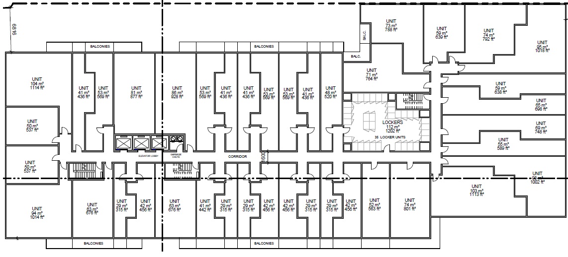
This is brutal.
And these floor plans suck.
When I said at the onset, “In a perfect world, all condos would be rectangles or squares,” you’re going to see why shortly.
Take that corner unit, for example:
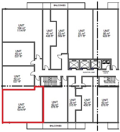
That’s a great shape to work with.
You can get a great condo layout in that shape, so long as you don’t screw it up. You have 1,014 square feet of space, presumably two walls of windows, and a rectangle. Who knows what the unit’s layout is going to look like, but the point is: success is possible.
Where is success not possible?
With this insanity:
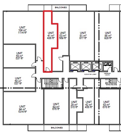
That is a ridiculous floor plan, and we don’t even know where the rooms are yet.
The shape of the condo is silly.
It’s a 436 square foot condo so it’s already tough to make that space work efficiently, but with that shape? No chance.
Then again, it’s sister is perhaps worse:
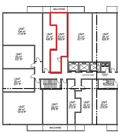
Sure, it’s larger at 569 square feet, so there’s more room to work with. But can you imagine how much wasted space there’s going to be?
Then there’s the one at the bottom:
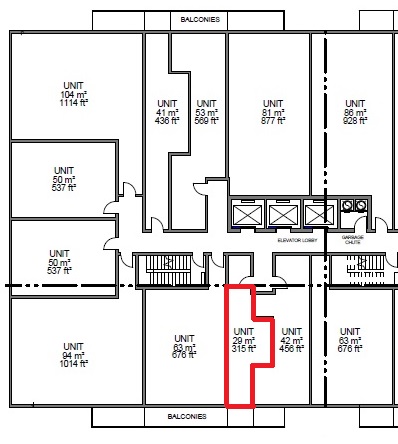
That’s 315 square feet, so already a micro-condo.
In my blog from November of 2021, I showed multiple examples of a “fail” for condos this size that were rectangular.
So how difficult would it be to make that a workable floor plan, based on the shape?
“Do I know what rhetorical means?”
On the other side of the building, things get even weirder:
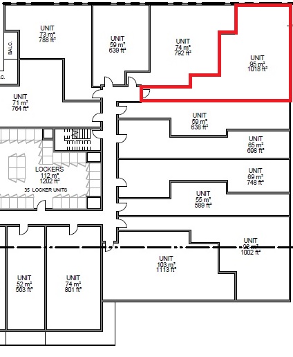
Sure, you’d love to live in a 1,018 square foot corner unit, if you happen to be reading this right now from your mother’s basement. But what the hell is this supposed to be?
Worse, is in the southern peninsula:
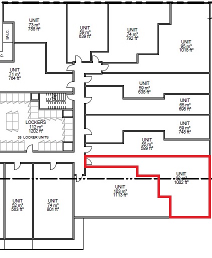
Honestly, we could do this all day.
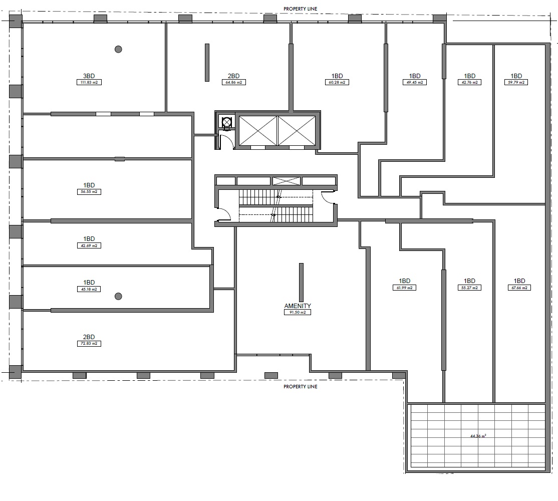
But let’s move on to this floor plate:
Are you familiar with nesting tables?
These:
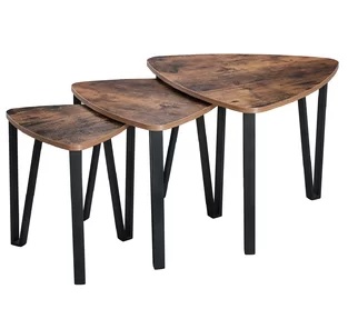
Honestly, that’s what I think of when I see those three stupid units in the top-right corner:
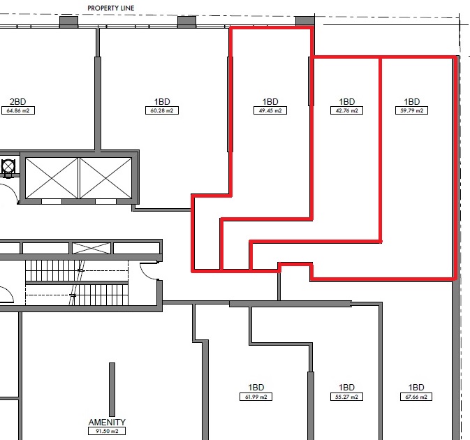
But the next one takes the cake, folks!
And I don’t mean one of those standard vanilla-icing cakes from Loblaws that is the only cake in the city of Toronto that my daughter will eat (like mother, like daughter….), I mean like one of those massive wedding cakes that are expensive and yet probably don’t taste as good, but I digress…
Here are three absolutely abysmal condo “shapes,” all nesting together like there’s nothing wrong:
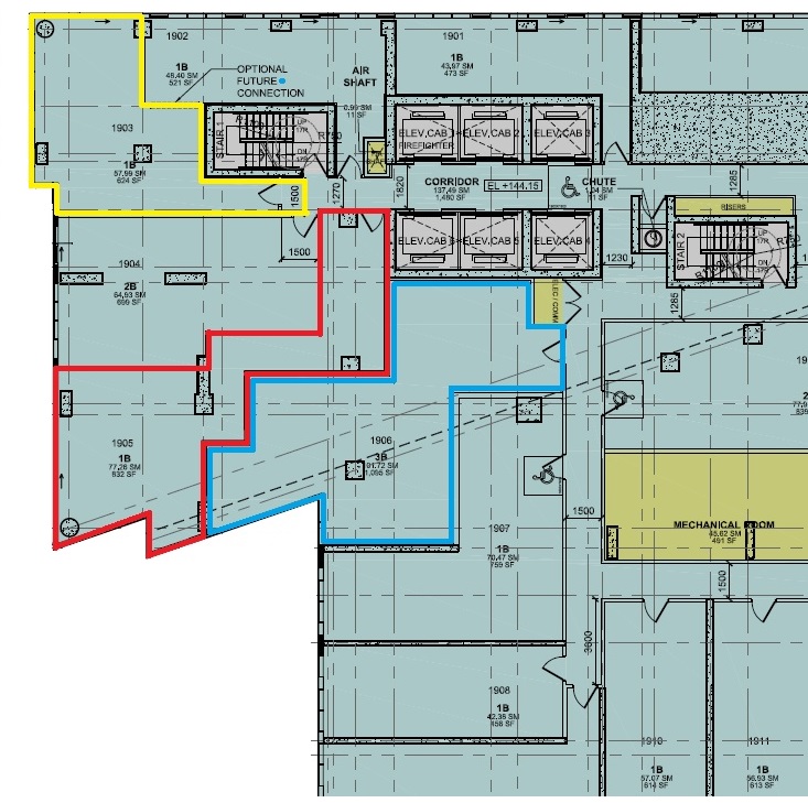
Show me a worse “shape” than that red one, and I’ll buy you coffee for a month. Seriously, I challenge you.
It zigs, zags, then zogs, and I don’t even know what a “zog” is, nor do you. But if any condo zogs, it’s this one!
That condo is 832 square feet and I wonder how much of it is wasted. Probably 30-40%? And yet, it’ll sell to some overseas investor who simply puts down a deposit and waits five years, but that’s a topic for another day.
I’ve been in this business for almost two decades, and I don’t believe I have ever seen such awful floor plans as I’ve noted thus far in 2022.
Is this by design? It’s too abundant to be a coincidence.
There simply must be some sort of cost benefit to the developers to create such nasty shapes for condo floor plans.
And if recent history is any indication, this is merely the start of a trend; one that seems to have momentum…












JF007
at 7:29 am
“It zigs, zags, then zogs, and I don’t even know what a “zog” is, nor do you. But if any condo zogs, it’s this one”
I am on Go right now laughing my head off and getting strange stares from a packed train ????????????????
Libertarian
at 9:26 am
Build baby, build!
S
at 9:33 am
It is possible to link to a development application, though not individual documents. Scroll all the way down to the bottom, then expand the “application detail URL” section. Here’s the URL for 335 Yonge: http://app.toronto.ca/AIC/index.do?folderRsn=DDto%2B2GiIua%2FeIqYQIxzGQ%3D%3D
Izzy Bedibida
at 9:51 am
This looks something my gr10’s would inadvertently do when trying to optimize their architectural designs, or trying to make them look unique.
As for “professional” engineers/architects etc., this is optimization run amok, and developers hoping that end users can not read/visualize floor plans.
I get a kick telling the story of how I got “kicked out” of sales offices when I showed up with a tape measure, and rough furniture dimensions.
Marty
at 10:07 am
“Zog” is right.
Well done today.
hoob
at 11:16 am
“unique”, “edgy”, “distinct”, “one of a kind”, “modern”, “breaks the mold”..
Any other verbiage we can anticipate will euphemistically pollute future MLS listings for these Island of Misfit Condos?
Condodweller
at 1:21 pm
I think this comes down to price vs value. Due to the high prices unit sizes have been shrinking and as they shrink it becomes increasingly more difficult to subdivide the unit into functional spaces without having weird “jogs” and “wasted” hallways. If we add in corner units that are more difficult to access from a single hallway we end up with those “nesting” designs.
Looking at it from a functional space standpoint, while ignoring prices, I’d argue that those “weird” shaped units can be good. The problem is when you shrink them down in size they become unusable. Yet they are forced to shrink them down to keep them somewhat affordable.
I used to have a unit with a zig-zag entryway which was very functional as an entrance “mudroom” with a closet and laundry closet nearby. There was also a bathroom right there which meant it was far away from earshot as David often complains about. It also served as a great sound buffer for both not letting outside noises in, or keeping my “noises” in.
David when you mentioned non-rectangle spaces I thought you might use circular designs as examples. Those are really good examples of how a larger space might work really well vs the same shape shrunk down. One of my favourite layouts is a condo I saw in the movie Romeo Must Die. The Kitchen/living/dining room was half an ellipse with the living area wrapped in glass. The kitchen was against the flat part and the bedrooms were behind it presumable. When the Met was built at Yonge and Carlton I was looking forward to seeing the round designs but man those are great examples of how a small size version doesn’t work.
Those units outlined in blue and red let you spy on your own family through the windows. Weird!
Condodweller
at 1:24 pm
Ok after having reread my comment it sounds bad regarding the noises. Those wre two separate thoughts. Keeping noises in/out I meant in reference to other units. Party/music/movie etc. vs ….well…you know.
JL
at 4:35 pm
It’s almost as if the designers start with “how many doors can we fit in the hallway” and then draw the lines dividing the space afterwards. Sadly, where I imagine “unit layout” was a consideration at some point in the past, now the equation appears to be all about maximizing unit count regardless of what’s behind the door.
A lot of these could actually be fixed by simply making the exterior hallway extend longer within the building (removing or simplifying the long internal entry corridors for the crammed corner units), but then of course developers would be selling less square footage so they opt for layout tetris instead.
Shana
at 2:43 pm
Yep, when units are selling at $/sq ft, they’d rather have stupid sq ft in the unit than un-sellable space in the passageway. They’re just moving the passage into the unit so they can get paid for it too.
Steve
at 9:24 am
In that first diagram from the previous blog surely that is a 1 BR + Den, not a 1 BR! After all look at that nook by the entry way against the closet jutting out. Ready to go WFH space!
Steve
at 4:53 pm
I was considering downsizing from my semi in Little Portugal into a new condo …. went looking here and there …. and well, small rooms and poor layouts abound. And prices were sky-high, or in older buildings fees were through the roof!
Empress Zod
at 8:30 pm
For the love of Emperor Zod please look up Zog in the Urban Dictionary and update this article without the accidental slur.
Daphne D
at 9:29 pm
These floor plans remind me of Jefferson Airplane and White Rabbit (I use this reference because I know how David likes to refer to an era when music was truly good!)…”one that makes you larger and one that makes you small”
StevenCS
at 9:28 am
The problem of modern lousy floorplans also exists in Vancouver, which, IMHO, stems from the need to have more sellable units because the developer has paid millions for the land, more millions to the city for amenities, more millions to financiers awaiting various city & inspection approvals. Time for some serious changes.
Jon Thompson
at 12:37 pm
“There is an old story about the market craze in sardine trading when the sardines disappeared from their traditional waters in Monterey, California. The commodity traders bid them up and the price of a can of sardines soared. One day a buyer decided to treat himself to an expensive meal and actually opened a can and started eating. He immediately became ill and told the seller the sardines were no good. The seller said, “You don’t understand. These are not eating sardines, they are trading sardines.”
Same thing with these condos, why build them to suit the preference of someone who’s actually going to live there when you have people lining up to buy them purely for speculation?