It’s often fun to look at artist’s renderings of new condominiums, isn’t it?
And I’m not just referring to the renderings of the buildings themselves, but rather the amenities too.
Just consider the liberties that an artist could take while drawing a lifestyle!
Whether it’s the renderings in print, like a glossy advertising booklet, or the renderings online via the developer’s website, I always love perusing these gross exaggerations!
For example, what would you expect to find in the “shared kitchen” of a new downtown Toronto condo – one that’s primarily sold to pre-construction investors, who then rent out the micro-condos to tenants?
Probably not this:

I know I’m a cynic, but I’m also a realist.
In the photo above, I see six white people, all in their 20’s, getting along in harmony as two of them tend to an herb-garden outside while others share communal appliances in an unrealistically clean kitchen.
I shudder to think how disgusting those shared appliances would be after a week, let alone one year. That is, if nobody walks away with them.
How about this zen garden on the building’s rooftop?

Six more of Toronto’s finest, all dolled up for a night on the….
…terrace?
Who wears an evening gown or a suit to a rooftop terrace at a downtown condo?
Unless this is a five-star restaurant or hotel, I find the idea of this representing any of today’s pre-construction condo projects to be downright hysterical.
In any event, I love looking at artists’ renderings when buildings are first launched and then keeping the pictures to do a “before and after” years later.
Many, many moons ago, I saw an artist’s rendering for a building called “Theatre Park” on King Street West.
It looked like this:
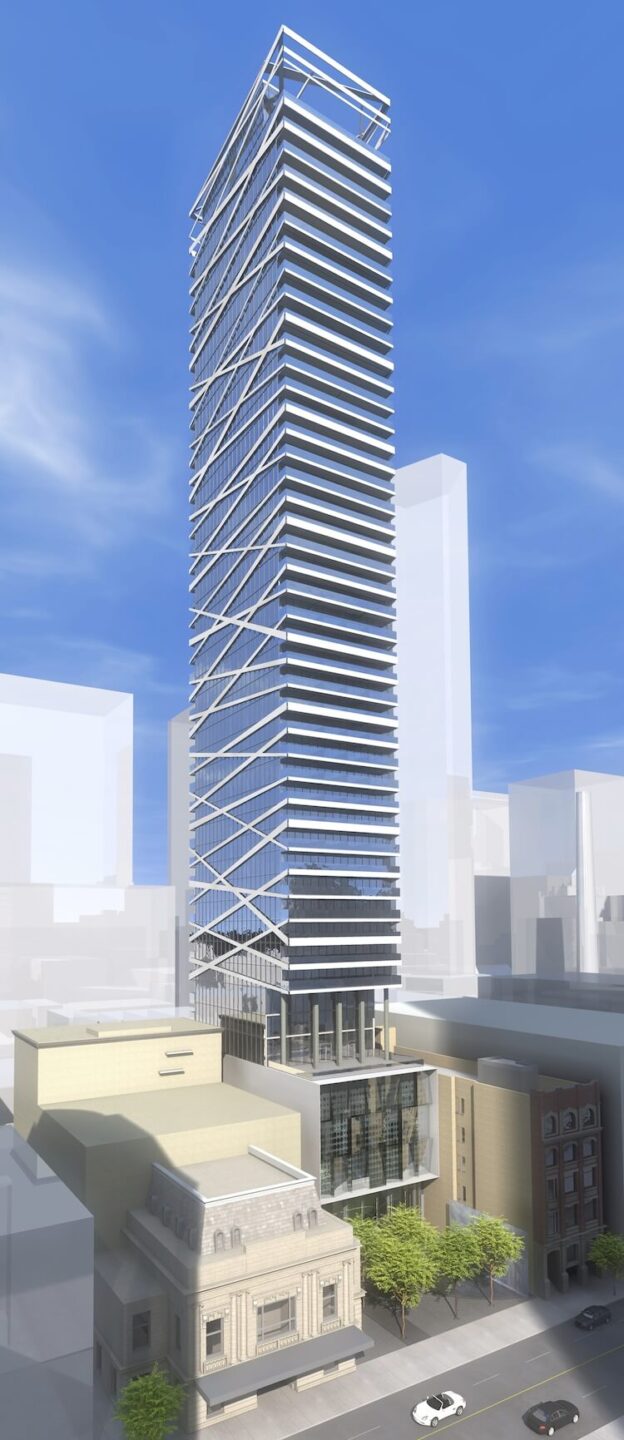
Now, do you see those white lines on the west (or left) side of the building?
Those criss-crossing, diagonal white bands?
When I first saw this artist’s rendering, I thought, “There’s no way the developer is actually going to put those lines on the side of the building.”
After all, it might look cool, but functionally, this is awful.
And we’re in the business of building functional living spaces, right? It’s not all about how it looks?
Uh-oh. I think I was way too far ahead on that one.
After all, this was well before “plating” became an adjective, and the presentation of food, as an example, trumped the importance of taste and satisfaction.
I mean, what the hell is this…

I’m clearly not the spitting image of class and sophistication, but I don’t need my food to look like a piece of art.
Five-star cuisine?
Meh.
Give me a shawarma, dripping garlic sauce, and tzatziki, any day of the week over this fancy piece of art.
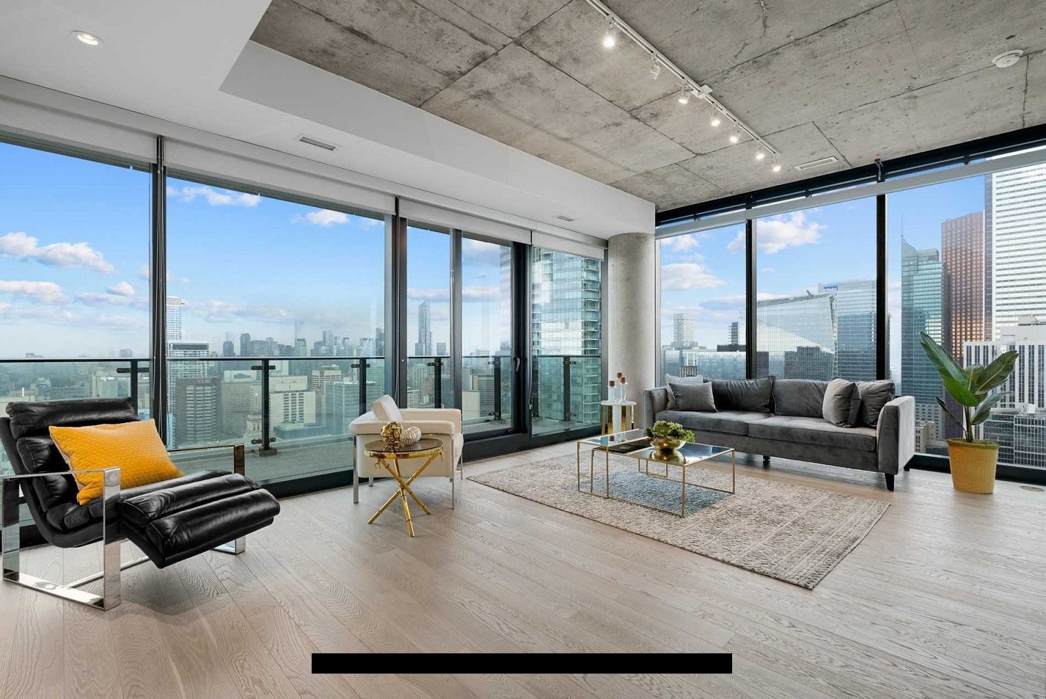
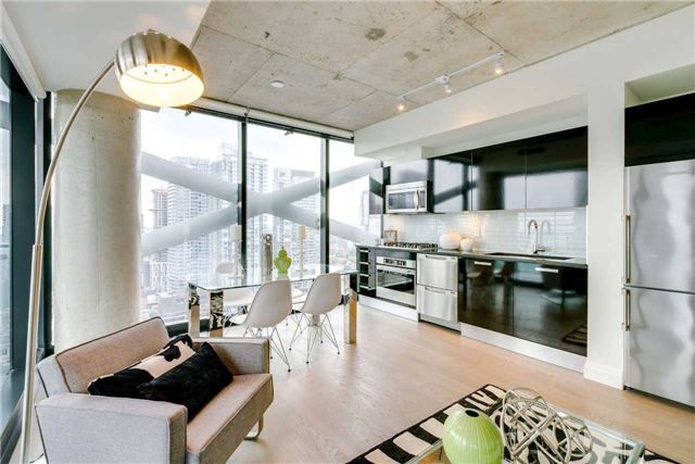
Unfortunately, for the buyers of pre-construction condos at Theatre Park, the developer did go with “looks” over “functionality.”
While some lucky unit owners walked into views like this:
Others have their views obstructed by giant white X’s like this:
Or this:
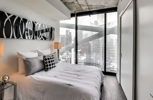
So it begs the question: why do developers put design ahead of functionality?
I was recently perusing the floor plans for a building on The Esplanade, and I noticed that most of them are terrible.
But is the design of the building from the outside really that aesthetically superior to something simpler?
Is this brilliant architecture?
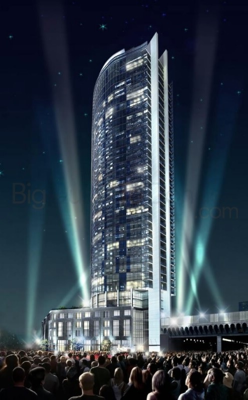
Again, you have to love the rendering with all those people lined up outside to gaze upon the building, during the aurora borealis, with no other buildings in the skyline.
But is it a thing of beauty?
You tell me.
Nevertheless, it got me thinking about what floor plans would look like in the building, and my-oh-my, are there some bizarre ones.
Before we get to that, I want to show you the floor plan for my first condo:
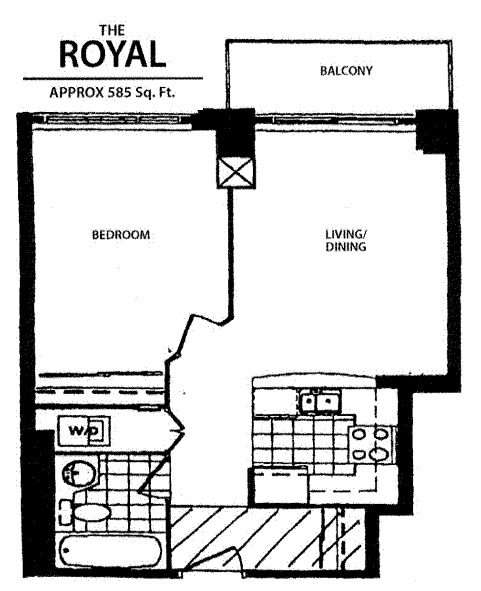
Or at least, I think that’s the floor plan. It’s pretty close. The image itself tells you just how long ago this building was constructed and how hard it is to find floor plans online…
In any event, I call this a “square plan” as the unit is (duh!) essentially a square or a rectangle, and there is no wasted space.
There are no awkward design lines, no odd angles, no long hallways, no rounded or triangular walls, and nothing that would cause you to say, “Huh, this doesn’t really work…”
Throughout my years in the industry, I have always advised buyers – especially first-time buyers on a budget, to consider a square plan above all else. When you pay by the square foot, a long, useless hallway might “cost” you $75,000, and a triangular living room might provide you with wasted space that you’ll never use.
Call me boring, unoriginal, or simply not fun, but we’re not “plating” food here. We’re trying to find a comfortable, convenient, functional place to live.
Let’s have a look at some of the floor plans in the building and you tell me if I’m wrong.
Floor Plan #1:

Sorry, not sorry, but this is absolutely brutal.
Look at the master bedroom! Why would anybody want that shape? What is somebody supposed to do with that triangular space across from the bed?
And that den? It’s laughable. I’m dizzy just looking at it.
I can’t imagine trying to furnish that living/dining room, given the odd angles, and don’t forget that the circle represents a pillar, so good luck coming up with a layout to “maximize” the space.
–
Floor Plan #2:
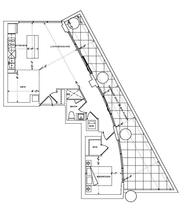
Do I even need to comment? Or should we simply move on?
This is one of the most ridiculous floor plans I have ever seen, and it’s clearly the result of the building’s “design” taking priority over the functionality of the unit itself.
Most of this unit is hallway.
I hate this.
–
Floor Plan #3:
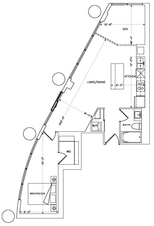
Same, same, but different?
This unit is larger than the last one, but it’s really just the same layout with longer dimensions.
Are you starting to get the gist of it?
This building is like dividing a watermelon into quarters and then being amazed that the pieces fit back together again.
–
Floor Plan #4:
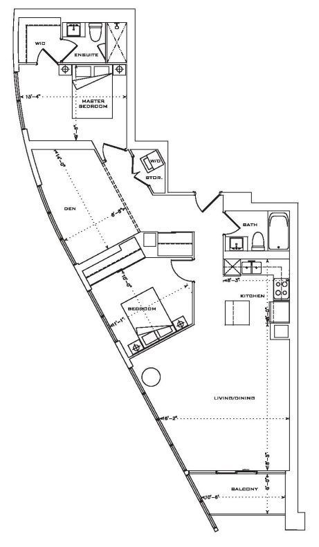
Once again, this is a larger version of the previous iterations, and maybe it offers a little more functionality, but I still don’t understand why this is appealing.
Look at the second bedroom!
I’ve never been on a cruise ship before, but I would imagine this is what it feels like; being sandwiched into a very small, awkward “room” that feels like it was never intended for living, and being told that this is a comfortable, personal quarter.
That pillar in the corner is just killing my buzz.
–
Floor Plan #5
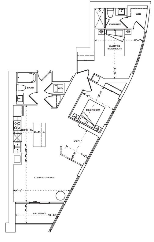
Seen one, seen them all?
It certainly feels like it!
But here’s my point: if we cut up the watermelon and then put it back together, it might look something like this:
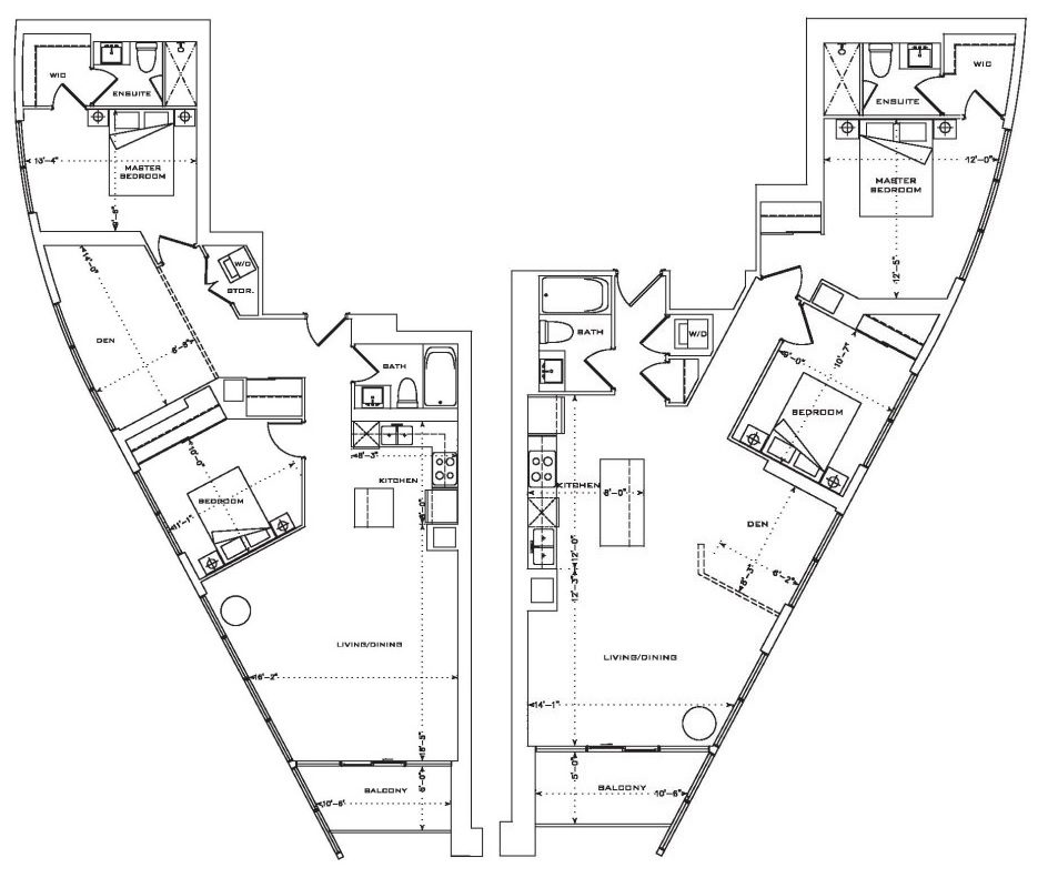
Looks like a spaceship, right? Like something out of Star Wars?
I just asked Lindsay what it looked like. You don’t want to hear her answer…
Just consider another parallel to this example, if you will. Consider designing a car from the outside, then moving inside to work on the design afterward.
Wait….I’ve got the perfect analogy: a human.
On the outside, this man has perfect hair, a chiseled jawline, rugged good looks, a high-school quarterback’s body, and the smoothest skin you’ve ever seen.
On the inside, he has a rotten heart – metaphorically and literally, a bad kidney, a small brain, a rare blood disorder, and several ingrown hairs.
Do you see where this analogy is going?
I understand that beautiful architecture is respected, appreciated, and in many causes, lauded and awarded.
But this isn’t the Coliseum, and it’s never going to be.
Designing condominiums that look good from the outside but offer miserable, misguided floor plans on the inside is tantamount to “plating” food in a way that allows you to post a stellar picture on Instagram for your friends to like, but which doesn’t satisfy your hunger – because that’s the entire point of eating in the first place…














London Agent
at 10:04 am
C’mon David, haven’t you heard the saying “you eat with your eyes first”?
Functionally, these aren’t the worst plans of all time but when cost/sqft is the biggest consideration, a buyer can obviously do better.
I always want to share a thought regarding modern architecture and what is considered “good”. Personally, I don’t believe that any of these buildings are groundbreaking or significant in a pool of glass towers that are all just different versions of each other. They aren’t pushing the boundaries or creating anything new in terms of sustainability (which is a big deal in architecture nowadays because we can build literally anything) nor do they represent great feats of engineering or rely on revolutionary building materials or systems that further architecture as a whole. It’s all the same shit. They are also so far removed from classical architecture that was actually based on human scale, proportion and what was pleasing to the human eye and experience. It is so easy to create something sculptural that “looks cool” that there is almost no point. Anyone could do it, hand it to an engineer and say build it, then voila, here you go, something fancy to sell (or not).
So for a buyer to spend more money than they need to on a bad floor plan, for a cool design that is actually garbage and insignificant, they can definitely do better.
Izzy Bedibida
at 11:26 am
Developers also want to sell from renderings etc. They don’t want people who can read and interpret floorplans-especially when these “cool designs” are being offered.
I remember being “escorted” out of many sales offices when I showed up with a tape measure, notes on furniture sizes and stared asking pointed questions about the floorplans and vague/missing dimensions.
Francesca
at 11:40 am
I remember when back in 2004-2005 my husband and I were visiting his parents in Vancouver and marvelling at how cool and modern these all glass towers were that were starting to pop up everywhere in Vancouver. Eventually Toronto caught up and started building all glass towers too like the infamous City Place condos. Now it seems that there is no originality left with 80 percent of condos all looking the same so I guess developers try to do something different with these weird exterior aesthetic designs and impractical interior layouts. Someone must be buying them though if they are receiving financing to be built right!? My first one bedroom condo was also a perfect square like David’s and I bought it because there was no wasted space and could actually accommodate regular furniture. I can’t imagine how you would configure furniture placement in these new irregular layouts.
Seth
at 11:58 am
It’s almost as if the top two photos were inspired by a North Korean mural.
Derek
at 12:24 pm
What’s the word on the street for sales action through the first 3 weeks?