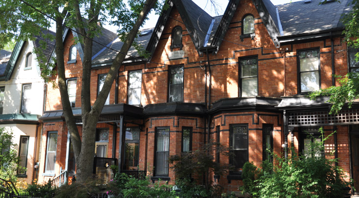
We talk a lot about “curb appeal” for houses, namely how they look from the outside, hence “if you were standing on the curb.”
A client of mine recently told me, “I couldn’t care less what my house looks like on the outside, so long as it’s everything I want on the inside.”
Last week, a different client told me she wouldn’t be offering on a house because, “I just can’t get over the lack of curb appeal.”
To each, their own. But what about when it comes to condos? Do you care what the actual building looks like?
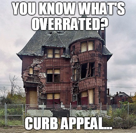
Ask ten buyers how they feel about curb appeal, and I think you’ll get ten different answers.
If I had to guess, however, how many out of ten feel that it’s important, I’d say more than half.
Despite the exact opposing views of the two clients that I detailed in the intro above, I’d say that maybe 7/10 buyers would find curb appeal to be important.
I’ve seen it be the deal-breaker on many occasions, but I’ve also seen it not matter in the slightest.
I think you want to like the look of where you live, but it’s a question of how much.
I work in real estate, so it would be hard to say that I “don’t care” what my home looks like from the outside. That’s like the who works at Bay-Bloor Radio saying he doesn’t care what make and model of TV and speakers he has in his living room.
Personally, I put curb appeal really high on my list of evaluation criteria.
I love red-brick homes. I love the two white pillars out front. Add some black shutters, maybe a cedar shake roof, and I’m drawn in.
But I also like the Victorian look.
And Edwardian.
I suppose you could say I like houses that are attractive, and built in a notable style.
The client I mentioned in the intro was checking out a house a few weeks ago in Wychwood, which they ended up bidding on.
One of them asked me, “What don’t you like about this house? What are we missing here? What are we giving up?”
Basically, this house checked all their boxes, and then some. It’s rare to find a house that has everything you want, plus some improvements or features that you hadn’t considered. So when all was said and done, my client was basically saying, “This seems to good to be true. Tell me something bad about it.”
I couldn’t really think of anything, but eventually I said, “I suppose I don’t like the ugly grey brick-tiles they’ve glued to front of the house. I would imagine there was red brick under there at one point.”
My client completely brushed that comment aside and said, “Oh I don’t care about that. What else?”
Honestly, I drew a blank! And on a personal level, I didn’t think the home had as much curb appeal as it could have, but as I said – to each, their own. He said he couldn’t care less what it looked like on the outside, so long as it had everything he wanted on the inside.
I think that view might be in the minority, but let me know if you agree.
And then let’s segue into today’s topic – this idea of “curb appeal” for condominiums.
It’s a different idea altogether.
You own your home; you simply live in your condominium building.
Yes, you own your unit. But there’s no exterior; there’s no curb appeal!
Right?
A blog reader recently emailed me the artist’s rendering for a new condominium in Manhattan known as “U-Tower.” Take a look:
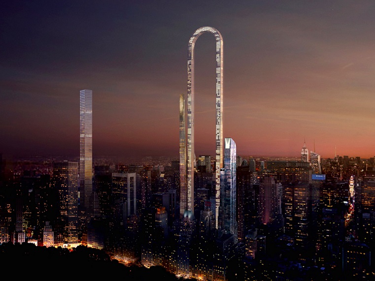
She told me, “I’d love to live there!”
I asked her, “What are the units like?” And she simply said, “I don’t care – the building looks so cool!”
This got me thinking: would you live in a building because of how the OUTSIDE looks?
I think that’s a cool looking building, for sure.
How practical is it? I don’t know.
But what are the floor plans like? What are the prices in comparison to neighbouring buildings? Aren’t these the things that matter?
Or maybe the same theory behind the “curb appeal” for houses, translates to condominiums as well.
Take 168 King Street East, for example.
In the mid-to-late 2000’s, before a slew of new condos in the St. Lawrence Market area (Vu, Post House, Berczy, The Modern, East Lofts just to name a few) were built, King George Square at 168 King Street was the “crown jewel” of the neighbourhood.
It was a red-brick building, with a black iron gate out front:
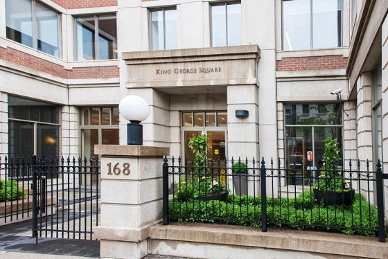
This was by far the most “charming” condo in the St. Lawrence Market area.
And for a long time, it was the most popular, most sought after, and most expensive.
The only reason it hasn’t remained tops on the list is because there are more buildings in the area, and newer buildings, which is what most condo buyers want. But in this building’s heyday, the “curb appeal” was part of what made it such a big draw.
So fast-forward a little, and tell me if, in the past few years, the “curb appeal” or the architecture of Toronto condos has made them successful.
What about L-Tower?
Remember the first time you saw this rendering:
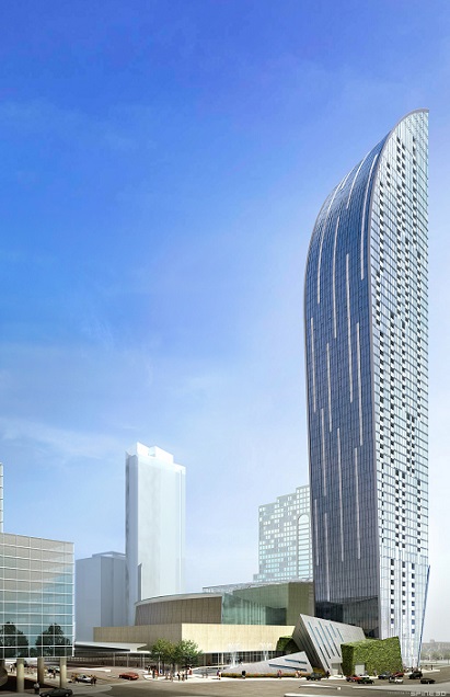
I’ll be honest – I thought it was cool.
I didn’t like the pricing, the size of the building, and thus the potential for problems, in addition to the slew of issues I have with the way pre-construction condos are sold, but that’s old news.
The project sold well, and it went forward as just about every pre-construction condo does in this market.
But what was the result?
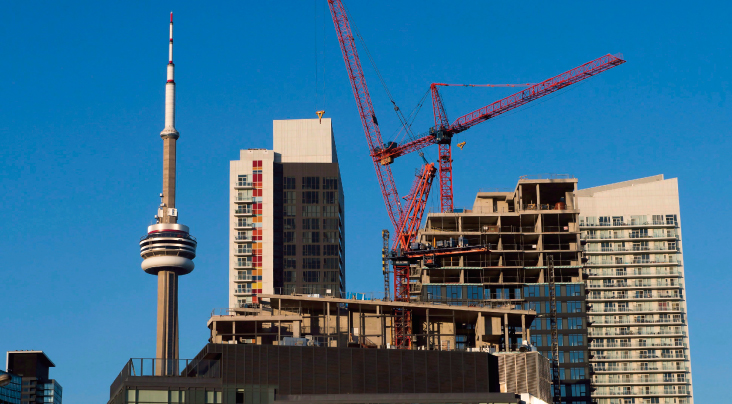
If you follow real estate gossip, you know that the crane atop the building remained there for about two years after it stopped being used. Everybody in the city wondered, “What’s wrong with this place?”
The lobby took literally years to finish.
And personally, I don’t care for the floor plans, and the micro-appliances.
I have never sold a unit in the building, and the chances that I do, are slim.
This has nothing to do with “curb appeal,” however.
I think the curb appeal helped sell the project in pre-construction, as people bought from the artist’s rendering. But in the market today isn’t great.
The National Post wrote an article about all the ongoing problems back in 2015, check it out HERE.
And just for fun, here’s how the building looked when it was almost finished, crane and all:
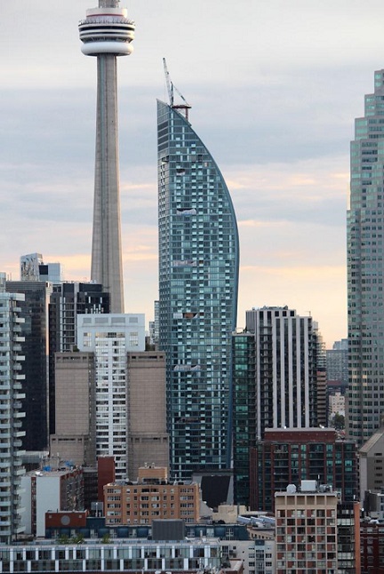
What do you think about the “Marilyn Monroe Towers” in Mississauga?
Surely you’ve seen these towers from afar, as you’re driving along the QEW, or even flying into Pearson Airport!
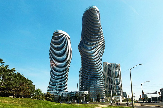
Would you buy into the building because it has curb appeal?
Do you even think it has curb appeal?
Or does it just look weird to you?
Better question – does it look like Marilyn Monroe’s curves?
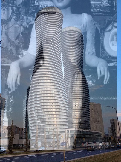
How about now?
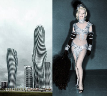
Okay, how about now:
What about Emerald City in North York?
Did this project have curb appeal when the renderings were released?
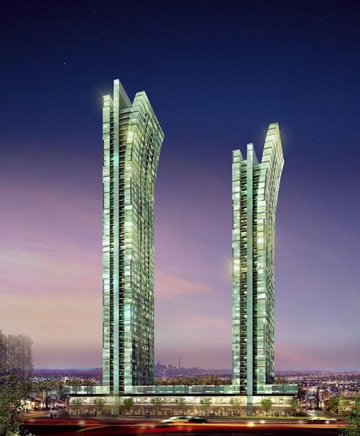
I guess every condo has curb appeal, when we see the artist’s renderings.
In the renderings, the sky is always PURPLE!
Who wouldn’t love to live in a world with a purple sky! The future is here!
The renderings also always seem to show no other buildings, or signs of life (other than trees, and people carrying coffee and walking dogs), and make the buildings look majestic.
So what do you think of the real Emerald City now:
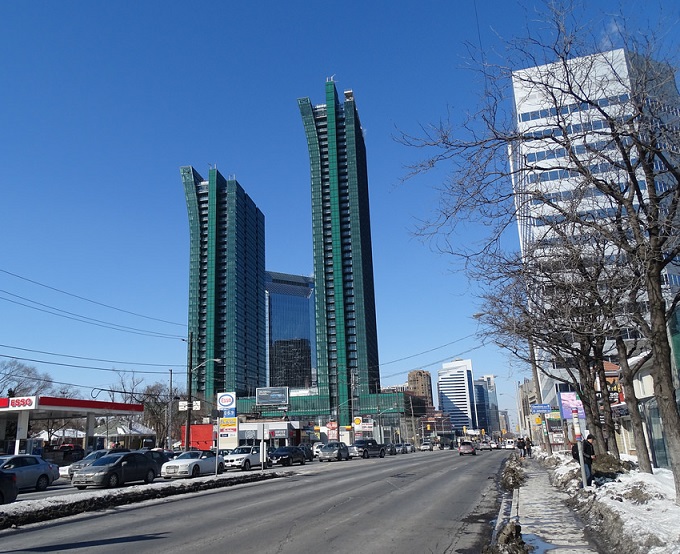
Geez, I dunno.
Just another condo, I think.
I guess what I’m trying to figure out is – how many of you out there, reading this, either in the market for a condo, or having bought, would put “curb appeal” for a condo in your Top-Five criteria?
Top-Ten?
Maybe curb appeal doesn’t matter as much, but rather the construction of the building itself does?
I’ve heard some people say they don’t want to buy in these glass-and-steel buildings, because they worry about how the glass will hold up in the long-term, and/or because of the falling glass saga that started back in 2011.
Either way, I’d like to hear your thoughts.
And along the lines of “curb appeal,” check out Business Insider’s “25 Most Beautiful Buildings According To Architects”, which is a fun read as well.




















BillyO
at 8:01 am
Good post, and you’ve touched on something that I’ve been thinking about as a condo owner and investor. That is, architecture/curb appeal means nothing, and the developer (along with other no brainier things like location, price, etc) is one of the most important factors in buying a condo, whether it is pre construction or resale. Simply put, there are builders whose buildings I would never buy in.
Interestingly the better builders often have the most drab looking buildings. I’d take the very mediocre looking Pinnacle buildings on Yonge vs slick looking L Tower anyway of the week.
Let’s start naming names!
Wouldn’t touch with a 10 foot pole:
Urbancorp – duh
Lanterra – slick marketing pre con, cheaply done when you get your keys
Citizen – after L Tower fiasco, they’re dead to me
Not so good, but would buy if the price/location was right and heavy due diligence was conducted:
Conservatory Group – at least you know what you are getting into
Cresford – good locations
Great Gulf – they’ve started to slip, sadly
Freed – style over substance
Lamb developments (similar to Freed)
Decent to good builders (no particular order):
Minto
Tridel
Daniels
Candrel (debatable?)
Pinnacle
Pemberton
KS
at 12:42 pm
Lifetime makes a nice looking building- 32 Davenport has a real beautiful exterior that is different from the rest. It is also not super tall-roughly 29 stories? Also has a gorgeous Tomas Pearce designed lobby.
Izzy Bedibida
at 10:40 am
I used the Marilyn Monroe Towers in a discussion with my high school architecture class. Students agreed that the buildings looked cool. They also suggested that the buildings would probably contain many pie-shaped units which would be difficult to properly furnish and create lots of dead space, further reducing the overall efficiency of the unit.
As for myself, unit styles/layouts, and status certificate come before curb appeal.
Condodweller
at 11:34 am
This is a good topic as I like architecture and design. Having said that I would break curb appeal into two categories: 1. design 2. appearance (for a lack of a better word i.e. it has to look decent). I like unique designs therefore I’m all over any building that breaks the brick on end mold. Would I live in one though; not necessarily. While I love the design of optical illusions like Emerald City or the L tower I may not want to live in it. For example Emerald City looks like the “the overhang” units at the top might fall off any second. I’m sure it’s built using sound engineering but psychologically I’d have a problem with it, always wondering if I am safe. It’s like the glass floor on the CN tower.
My #1 criteria in a condo is always the floor plan. If it’s a floor plan that doesn’t work for me I will not buy it regardless of how nice or well designed the building is.
I would be an agent’s nightmare client as I am both an emotional and rational decision maker at the same time if that makes any sense. I can come up with a top 5 chirtera and yet a confluence of other factors might make me like a place that is missing most of my top 5 factors.
WRT to the purple sky etc. developers and agents to a certain extent are basically con artists. They present everything in the best possible light to make a sale no matter how blatant the lie is. Ok, on second thought they are not at all like con artists as that would make con artists look bad since they goal is to pull it off without you realising it. But developers like to obviously misrepresent things. I remember when my parents came home with drawings of houses from the developer when looking at houses back in the 80s. Back then they had the floor plan folded in two with an artist’s rendering of the outside of the house on the front. It was a nice house surrounded by trees as if it was little red riding hood’s grandmother’s house in the forest. Once I saw the actual house in the subdivision nicely nestled in between two other of the same houses maybe 3 feet in between them was one of the biggest let downs for me.
I recently read through a list of proposed/under construction condo buildings in the east of Jarvis west of DVP corridor and I am pleased to see that there are many cool designs. As a side note, micro condos have been discussed here in the past and my impression of all these new buildings is that it’s the case of boiling a frog. Builders are slowly decreasing unit sizes to the point where people are unaware of just how small these units are. It’s just insane. I saw a floor plan which was basically one long corridor with the kitchen along part of one wall where the width was less than seven feet including the kitchen cabinets. The “living/dining” room was a bit wider but still less than ten feet. I know someone looking now and they think a 550 sqft 1 bedroom unit is large. wow!
Izzy Bedibida
at 12:32 pm
Excellent points. Years a go when I was looking at midtown condos, I was escorted out of several sales offices when I showed up with a tape measure and notes of furniture sizes I wanted to use, and started asking sales agents about such things as missing dimensions and how a queen size bed can possibly fit in an 8′ x 8′ bedroom based on provided rendering.
As I was being escorted out, sales agents always said that those weren’t very important and to return when I was ready to buy, along with a reminder that prices would be rising soon.
Ralph Cramdown
at 2:02 pm
For me, if there’s an opposite of curb appeal, but for floor plans, it has to be those concrete columns near the outer corners. If a condo is a loft conversion and the pillars are original, I completely understand why not keeping them would be impractical. But if it is a new build and the architect is placing one in the outside corner of the floorplate — making unusable a few thousand dollars worth of square footage for the sake of a few hundred dollars of structural steel, or to avoid a fractionally thicker concrete floorplate, it just makes me shake my head.
I also agree with Condodweller’s point about many new condo “kitchens.” When did become OK to stick all the appliances and plumbing along one wall and call it a kitchen? Anybody who ever cooks takes one look and thinks “pass.” Maybe that’s why the pics on MLS showcase takeout cartons?
AT555
at 12:09 pm
I think the ‘Marilyn Monroe’ building in Mississauga looks amazing and it got a lot of investors because of its curb appeal but they dumped a lot of inventory (sale & rentals) when the building was finished. It ended up attracting wrong kind of people which has now ruined the property value.
Obviously when you make a building mimicking Marilyn Monroe’s silhouette you’re gonna get every whore in town thinking it’s cool to live here.
Ed
at 11:08 am
Thanks for the tip.
Gotta check it out now.
downtown
at 1:45 pm
I’m really happy you provided the artists rendering of Emerald City. Every time I drive buy it, I think “This thing is such an eyesore, why would anyone have bought into it?”. The rendering is definitely prettier than the reality. Although, I’m still not sure I would have wanted to place my life savings into something that looked like de-laminated green Cheestrings.
Joel
at 3:19 pm
How much of the desire to own a loft is the curb appeal?
I find that Toronto in general has no desire to have architecturally interesting buildings. Chicago is a great comparison as buildings there vary in appearance and make the City skyline much better. I think in Toronto it just doesn’t matter for sales, so developers build boring and cheap.
Paully
at 6:35 pm
Emerald City: “The Green Zipper Buildings.”
KS
at 4:42 pm
Lifetime makes a nice looking building- 32 Davenport has a real beautiful exterior that is different from the rest. It is also not super tall-roughly 29 stories? Also has a gorgeous Tomas Pearce designed lobby.