Do y’all play fantasy football?
I do.
I have for more than half of my life…
Having downloaded songs on Napster in November of 1998, and having joined eBay in May of 1999, I like to tell stories about my early adopting of technology that make me sound a lot older than I actually am, specifically, to groups of people who don’t care.
In a related story, I played fantasy football for the first time in September of 1998.
While our trustworthy federal government has now legalized sports gambling, I know there’s a very high percentage of males aged 18-50 that play fantasy football, and some have been doing so for years.
But how about for twenty-five years, eh?
Yes, there are few things in life that I’m proud of, but the fact that I’m about to play my twenty-fifth season of fantasy football is second-to-none.
This is also the twentieth anniversary of my football pool, with the same ten guys, and who among us can claim that?
Now, you might be asking, “What the eff does this have to do with real estate?” and to that, I might reply, “Great question!”
Friday night is our fantasy football draft, and having hosted the innagural draft in 2002 and the ten-year anniversary draft in 2012, it’s now my turn once again.
Oh yeah, in case you’re wondering, I do insist that we host on rotation. It’s more fun that way.
In 2002, I was 21-years-old, about to head back for my last year of university, and we drafted from my parents’s house.
In 2012, I was 31-years-old, eight years into a real estate career, engaged to be married, and we drafted from my downtown condo.
In 2022, I’m now a middle-aged bro, approaching two decades in the real estate industry, married with two kids, and we’re drafting from my house.
How weird is that?
At no point in 2022 did I think about the 2012 draft.
At no point in 2012 did I think about the 2022 draft.
But rest assured, tomorrow night, I’ll be thinking about the 2032 draft, the 2042 draft, and scared sh!tless about the concept of the 2052 draft.
So as I prepare to take a much-needed day (and night) off, I can thank last week’s version of myself for having pre-written today’s blog for that proverbial “bloggy rainy day.”
Last week, we looked at a slew of design features and gave them a “yay” or a “nay.”
It was actually more fun than I thought it would be, and having posted two very stats-heavy blogs this week, I figure it’s time for something colourful and fun.
There are way more yays than nays this week, in my opinion. But that’s just my view. I’m interested in yours…
First up, I want to go back to this idea of paneled bedroom walls.
Personally, I think drywall is plain and boring. It’s too simple, even if you go with a feature wall.
What do you think of this one?
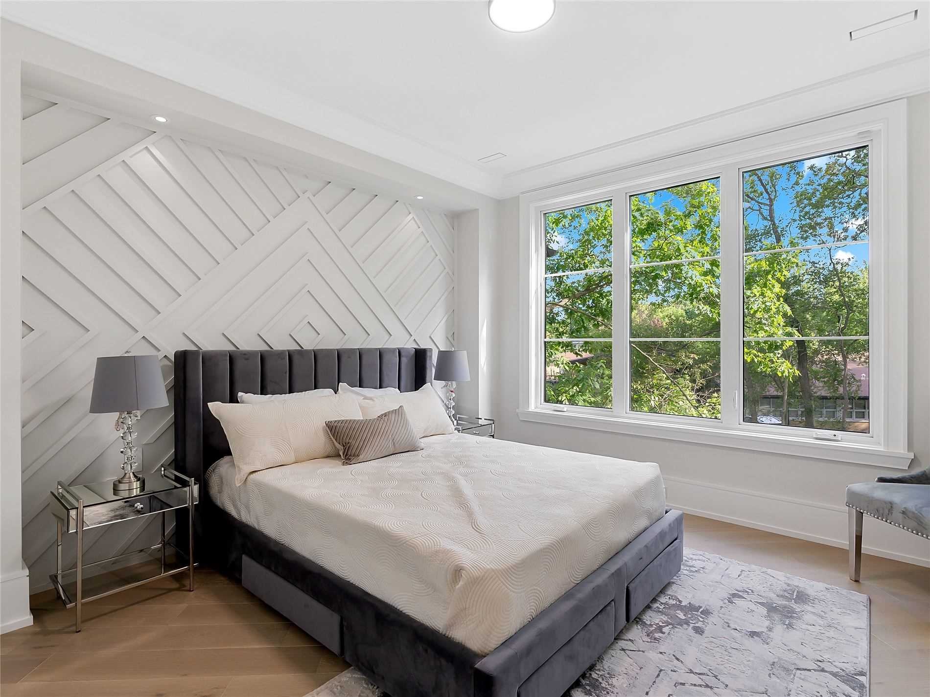
I love it!
Huge yay for me.
Here’s another room in the same house, same bed and linens so we keep it consistent, but a different panelling:

Still a yay for me, but I prefer the first one.
Now, just to cleanse the palate, let’s get a refresher of what plain drywall looks like:
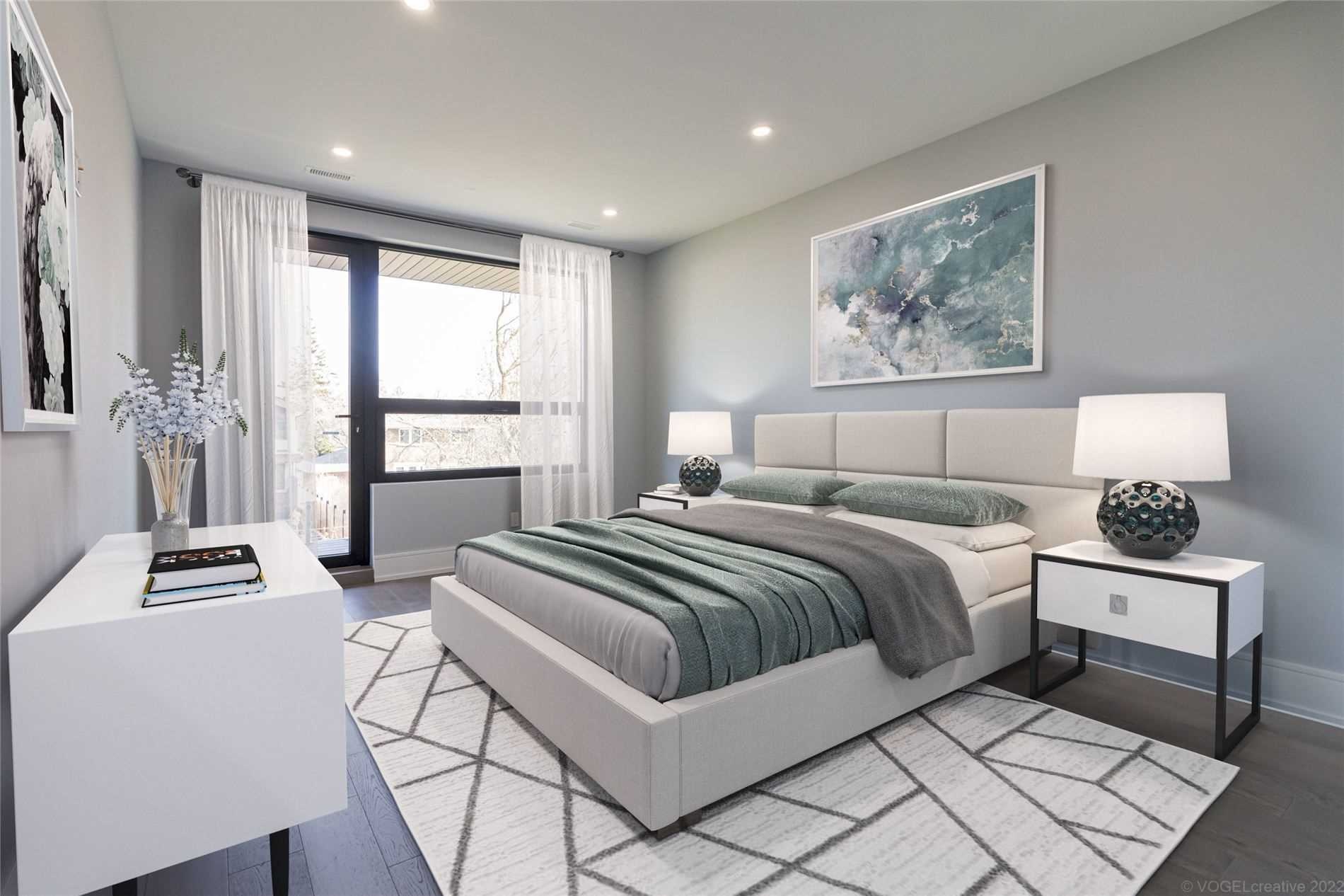
Right. Okay.
So then, what about another panelled wall, but something more funky, like this:

On its own, that might be odd.
But with the modern theme in this house (note the light fixture above the bed), and those black window frames, I vote yay.
–
We looked at a lot of kitchens last week, looking at upscale kitchens with different coloured upper and lower cabinets, or islands with a different style and colour.
What about kitchen with the same colour and style upper/lower and island, but with paneling?

It’s honestly not my style.
But strangely, I like it!
Yay to this, but only because of the light floors and white marble counter.
Also because of the different coloured cabinets in the pantry which you can see from a different angle:
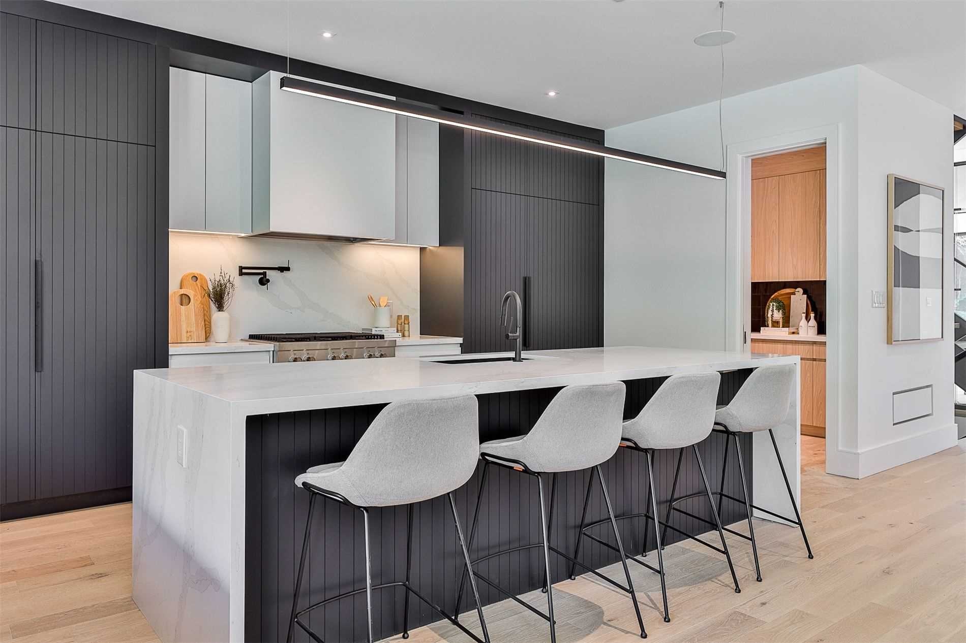
I love it even more now.
We see a lot of light uppers with dark lowers, or vice versa, and we like that.
So when we see the same colour uppers/lowers, we might think it’s a bit drab. But in this house, with that huge pantry, the light cabinetry gives the kitchen-and-pantry combo a nice contrast.
Yay for me.
–
In a larger house, you might find there’s a two-storey, floor-to-ceiling rise in the foyer where you can see the second level from the main floor.
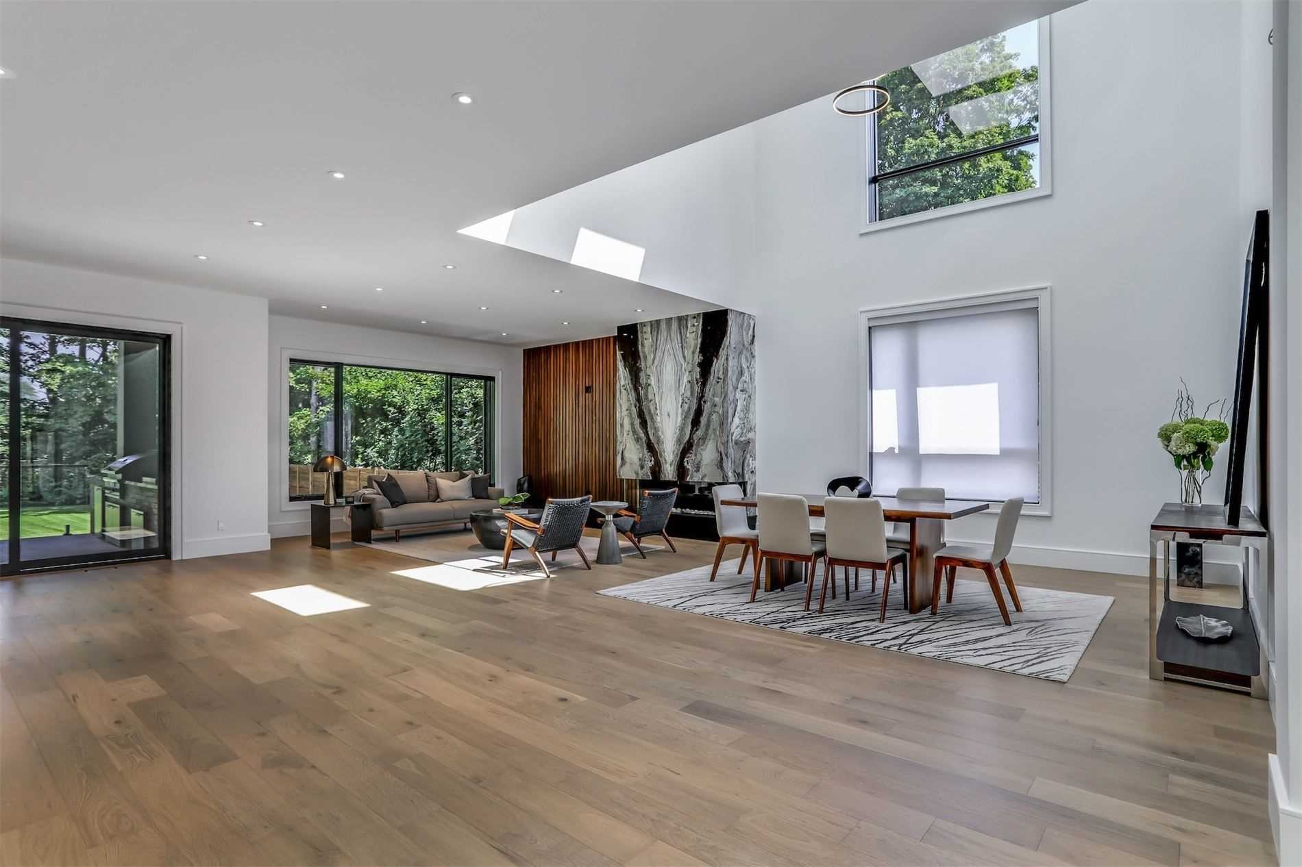
But what about a floor-to-ceiling rise in the living room, like this:
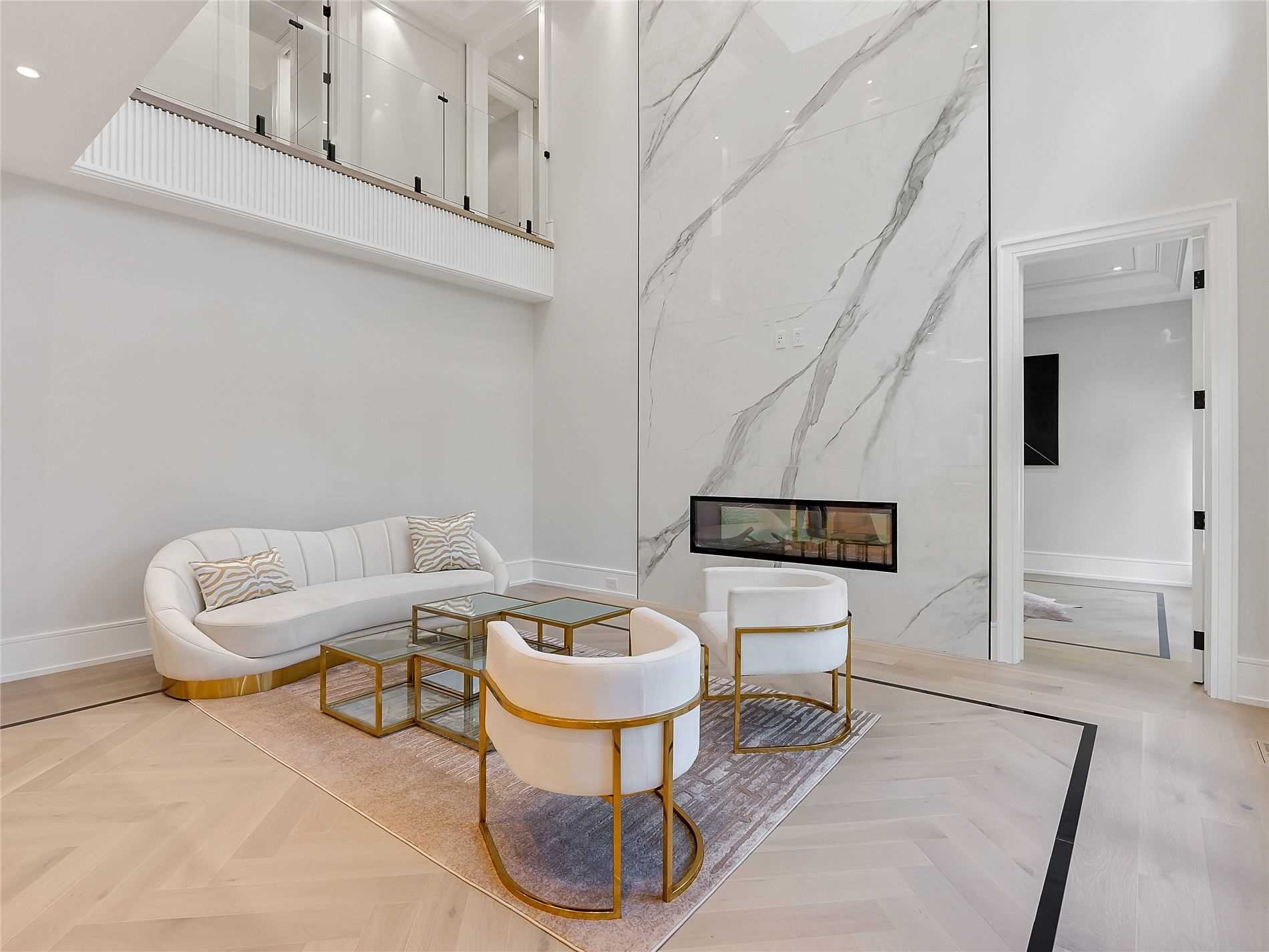
It’s a nay for me because I’d rather have that second-level square footage that’s being given up here to get a 20-foot ceiling.
But in a large enough house, I guess it doesn’t matter.
Here’s another example but in the dining room:
Again, in a large enough house, you really don’t need the space on the second level. And this is a huge house!
–
We see exposed concrete ceilings in a lot of soft loft condos.
But what about exposed concrete walls in bathrooms, like this:

Nay for me. It’s cool, but maybe I’m not…
–
Last week, we talked about floating stairs.
Most of the newer, cooler floating stairs had glass panels instead of railings.
What about a sort of funky, thinking-outside-the-box railing to go with floating stairs?
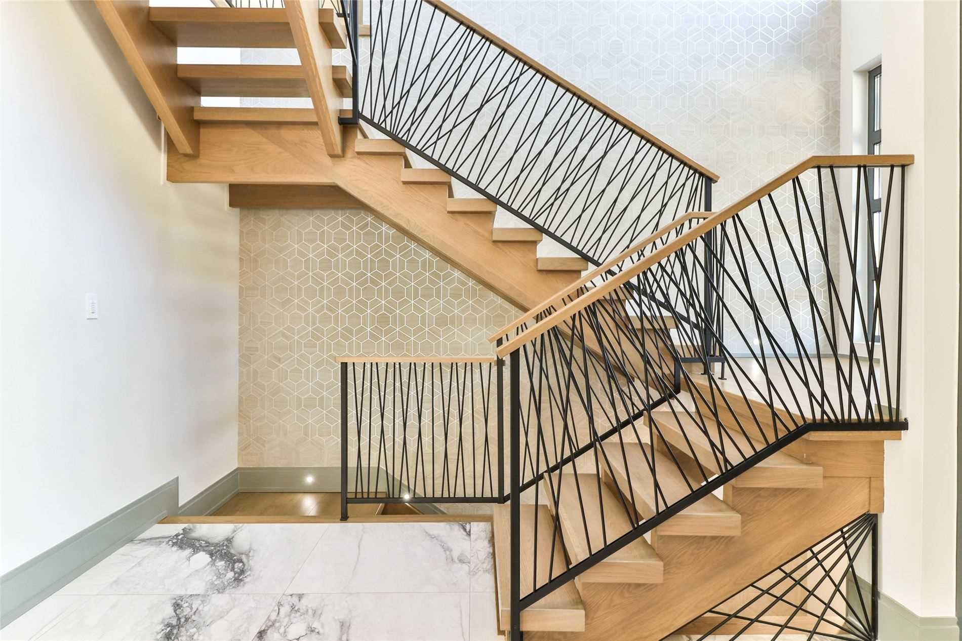
Sometimes, thinking inside the box is just fine.
This is a nay for me.
–
Speaking of thinking-outside-the-box, do you need to funk out your home movie theatre?
Can you go with a simple ceiling, or must you have a space-themed ceiling like this:
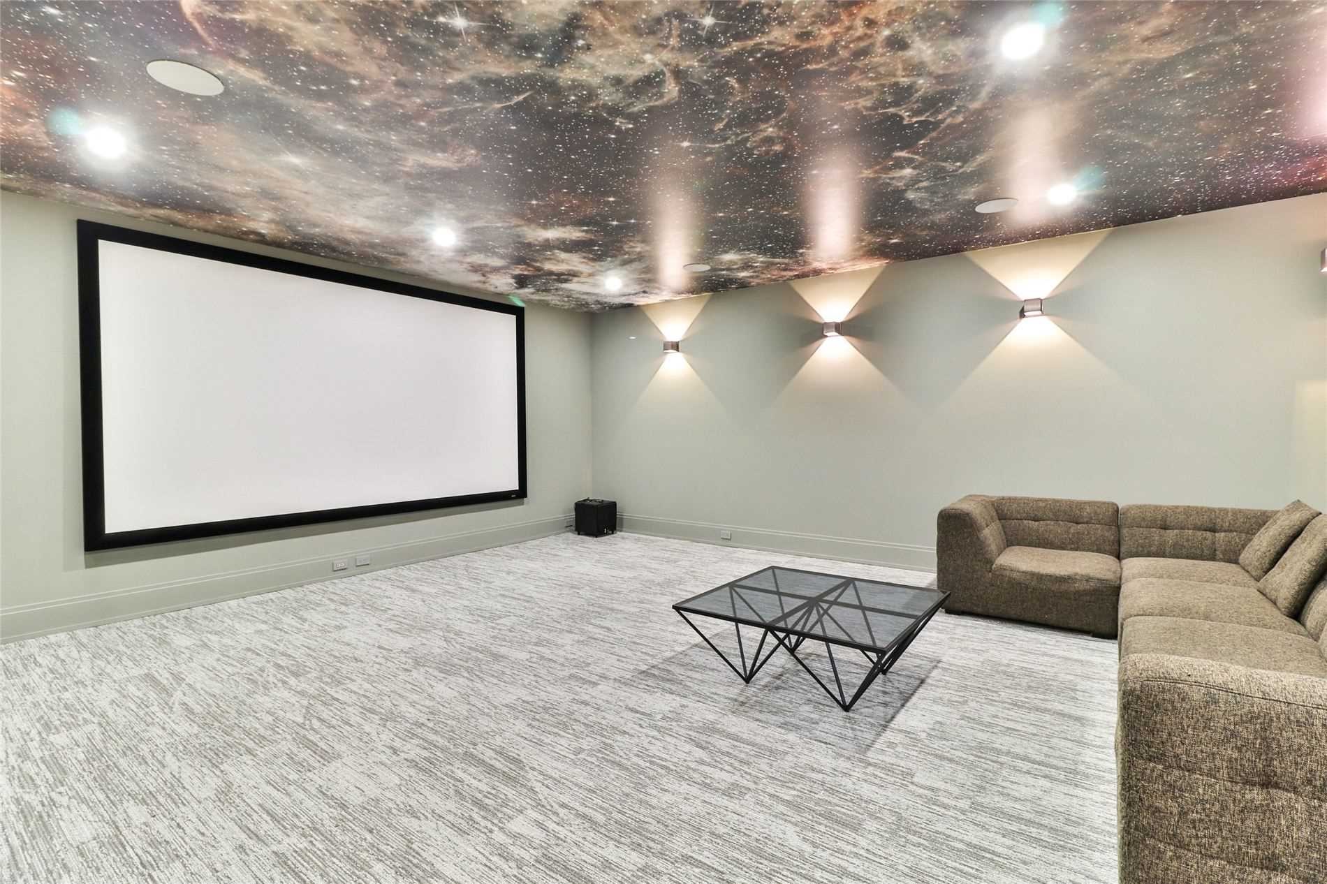
Hard pass.
Big nay for me.
Unless every single movie you watch is Star Wars…
–
What’s up with those hanging egg-shaped chairs anyways? Are these actually comfortable?
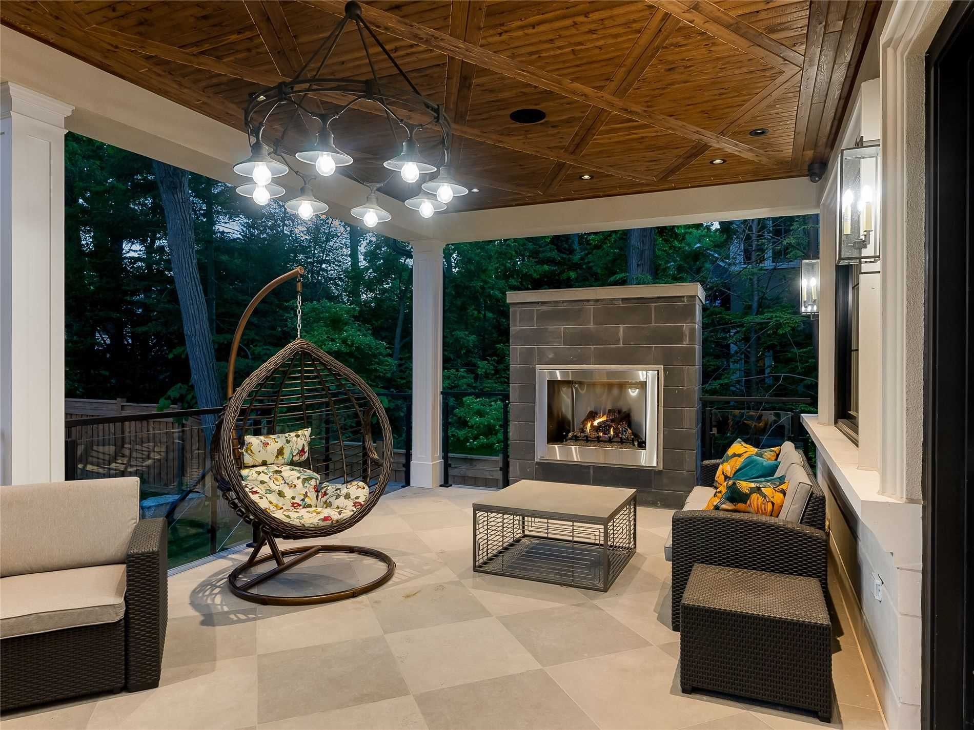
Nay for me. But only because I’m far too practical. And because I get dizzy easily…
–
Stone exteriors are great.
But what about stone interiors?

Not my jam.
Nay for me.
–
I’ve always liked hardwood flooring in the kitchen. I like consistent flooring throughout the kitchen/family/living/dining.
What do you think about tile kitchen/dining?
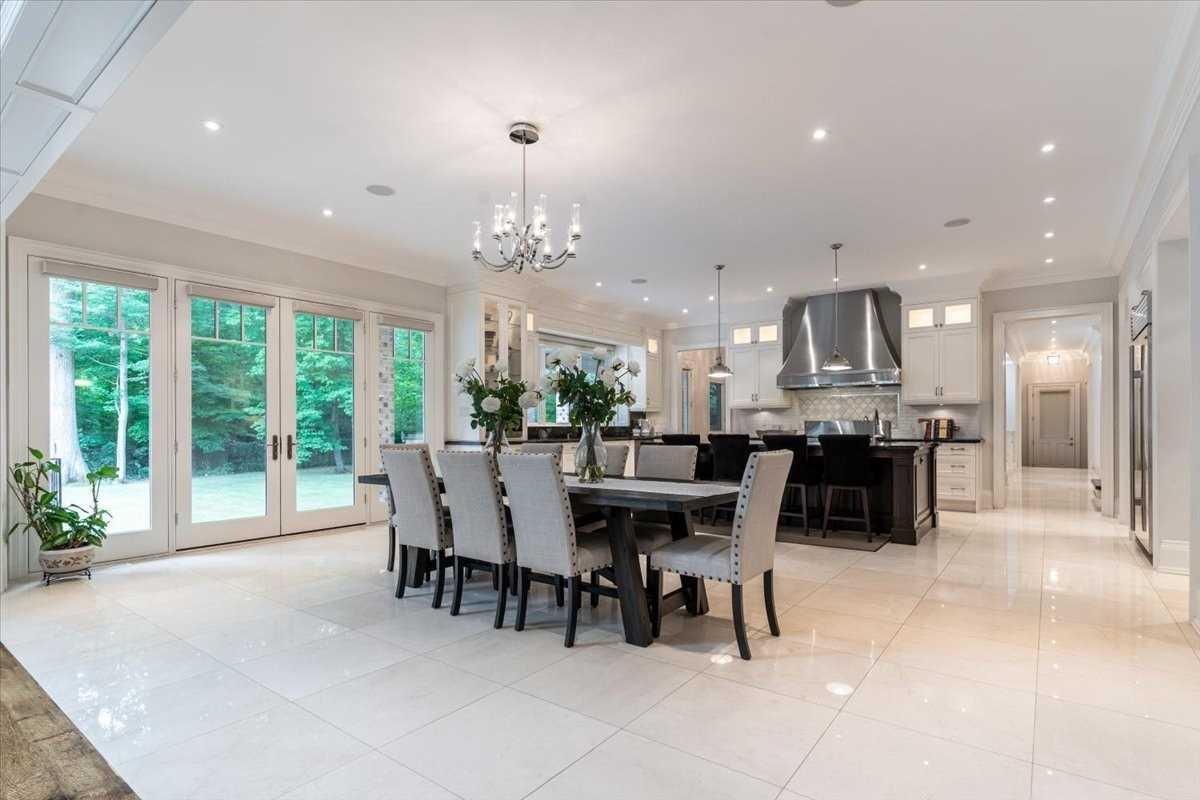
Nay for me, but this isn’t bad.
In fact, I only really included it to introduce this:
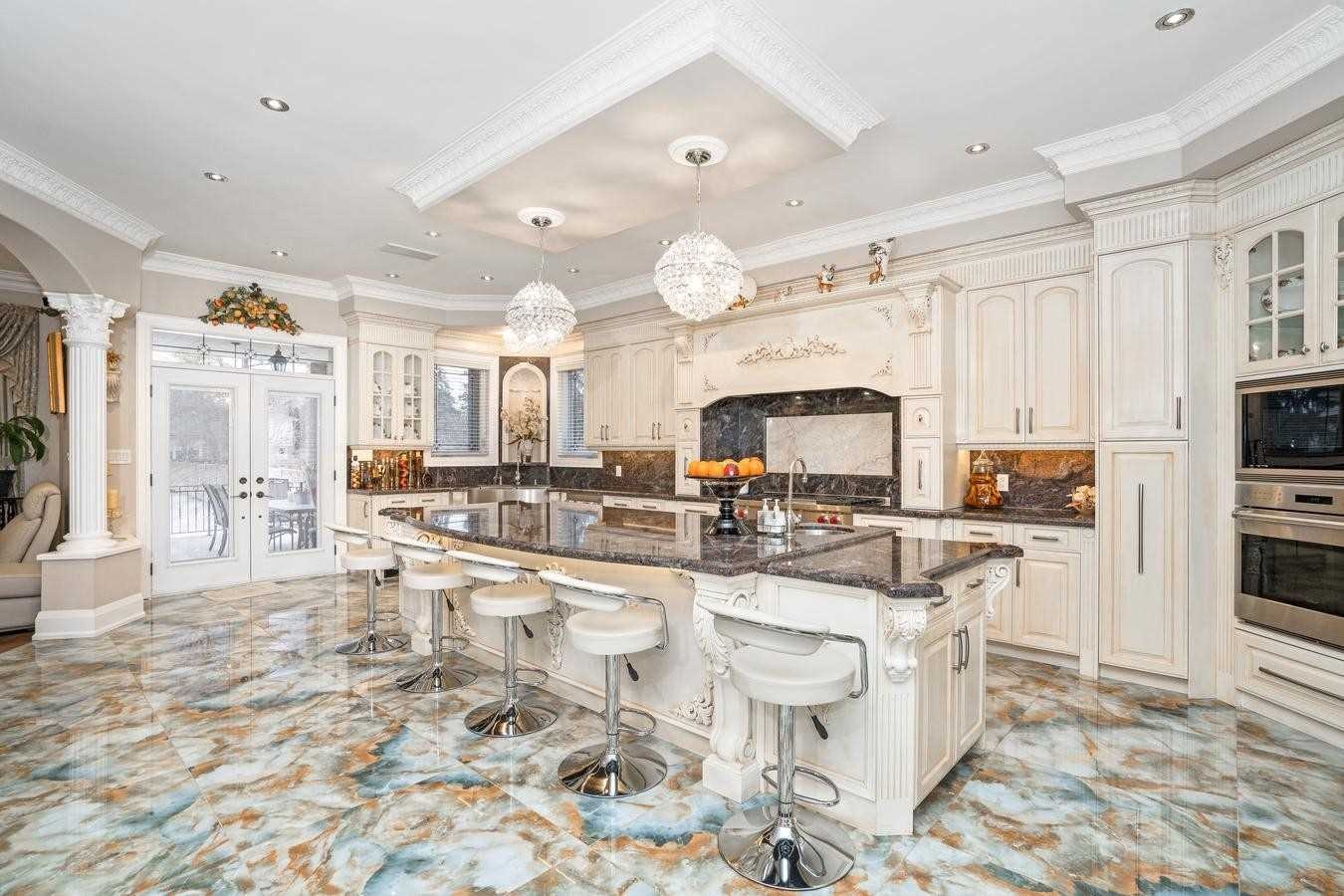
Um…. do I really need to say nay?
–
This next one has less to do with that weird peacock painting that looks like the snout of a pig, and more do with the idea of a huge second level landing area:

In larger houses, you often see a large landing where you overlook the main floor.
Sometimes, it’s nice to not have every bedroom door spaced out 4-6 feet.
But this is a huge waste of space to me, I don’t care how large the house is.
Nay for me.
–
I love modern design more than I ever thought I would.
But what about this open-concept shower?
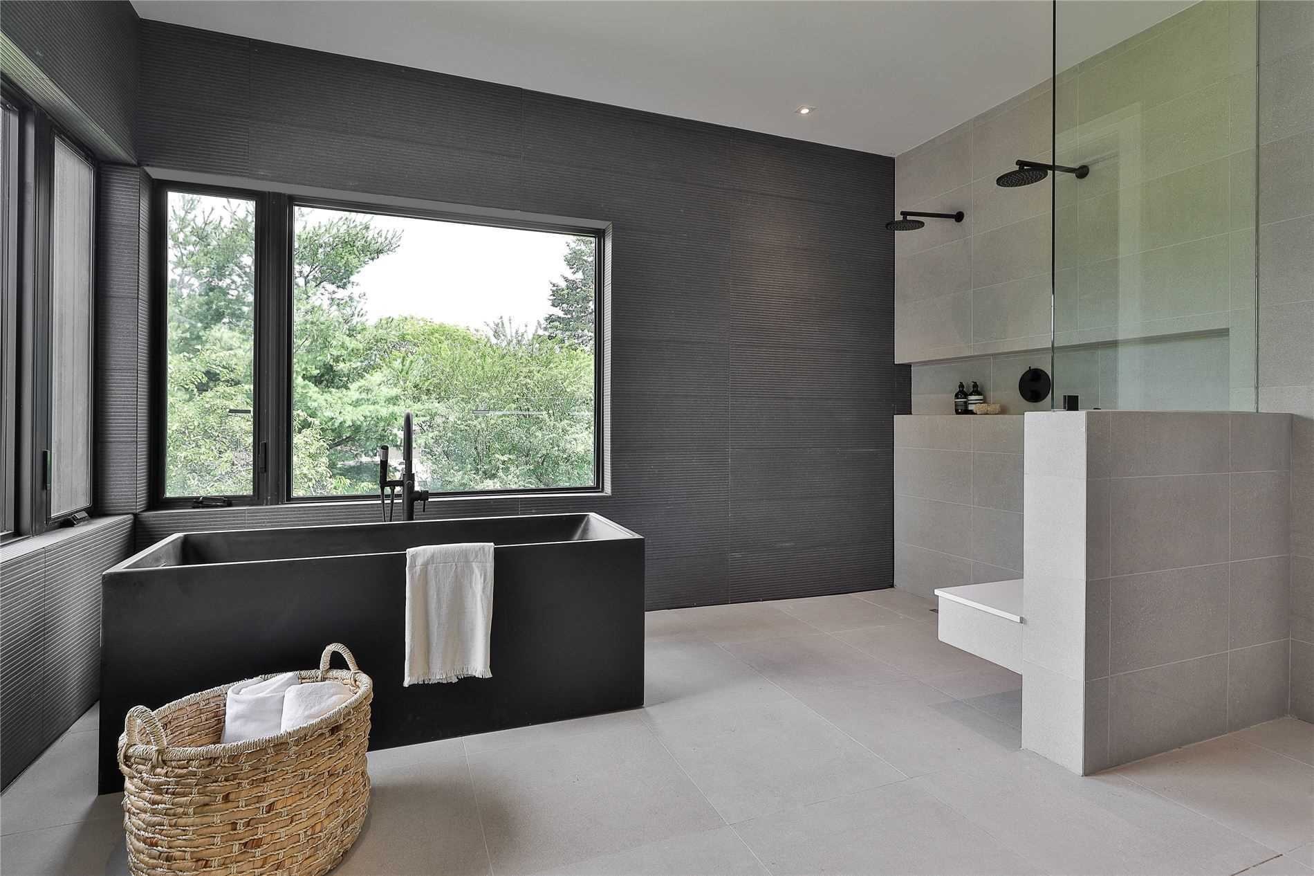
Nay for me. It would drive me nuts.
But what about this open-concept fireplace?

I don’t understand this at all.
Nay, please and thanks!
–
Let me introduce to you a very modern, simple, clean home office:
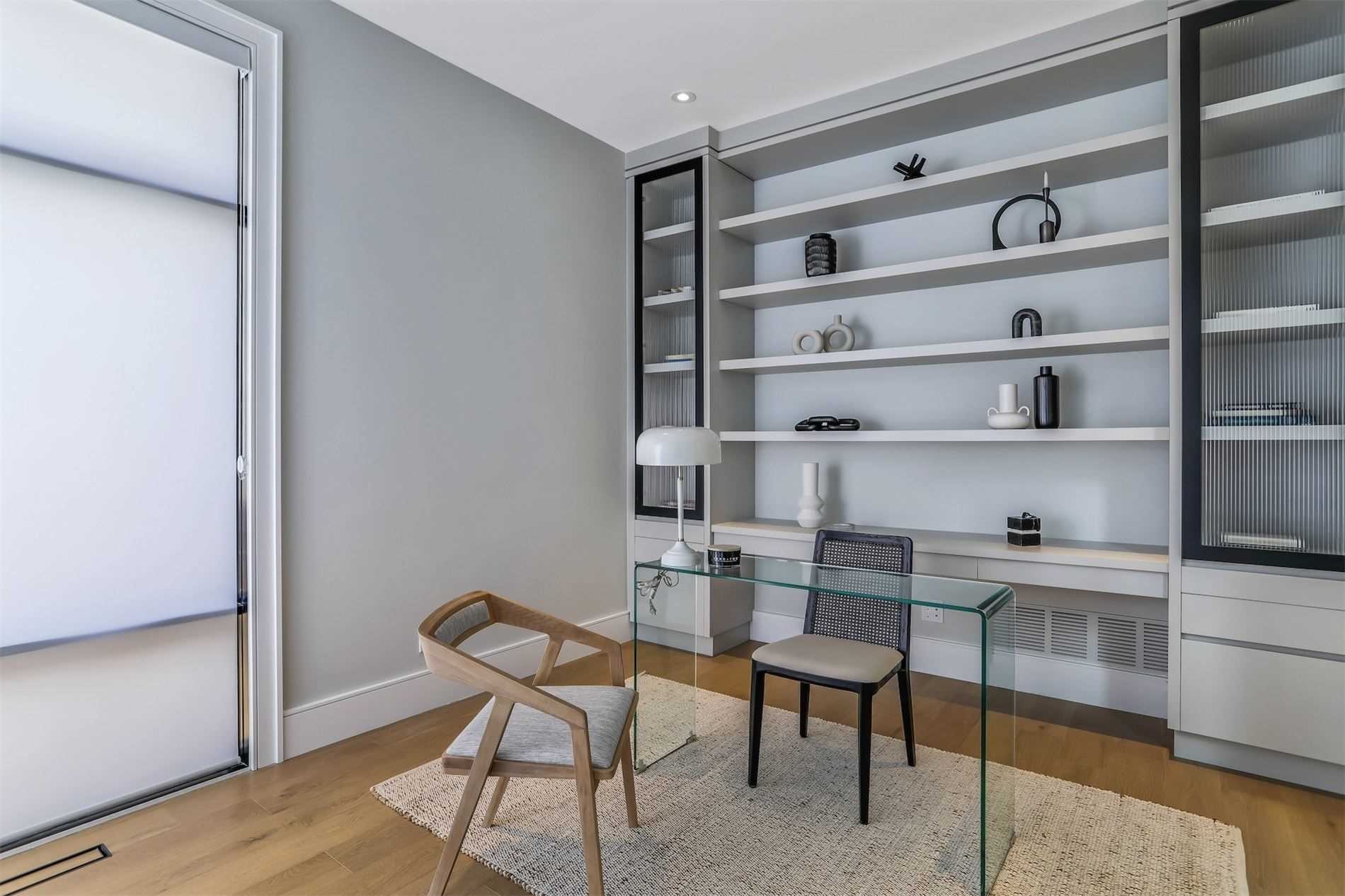
….if only to contrast with this round-in-shape home office that is possibly located in a turret at the front of the house:

Oh, I freakin’ love this!
I mean, I love that there’s a sword leaning against the wall too.
But look at the round ceiling detail! I love modern, but I love traditional too.
Yay all the way for me!
–
There’s something to be said for minimalist design.
But what about this minimalist wine cellar?
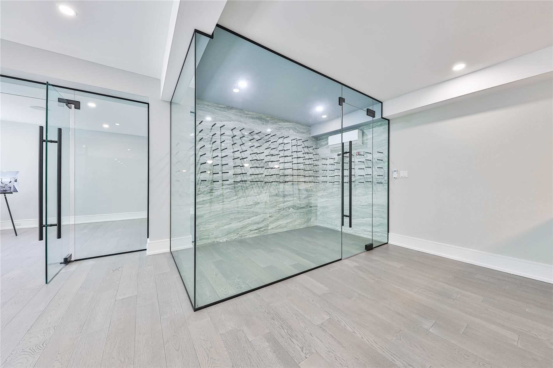
Hard pass. Way too boring.
It’s literally a glass box in the corner of the rec-room.
Nay, like a horse says, only spelled differently…
–
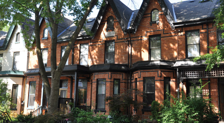
Last, but not least, what about flat roofs?

Call me old-fashioned, but I need some peaks. I need some slopes. I need some triangles!
Here’s a house from the same area, and regardless of the interior style, I just need a house to look more like this from the outside:

–
Okay folks, that’s it for me!
Here’s hoping my sub-par fantasy football keepers, Ezekiel Elliott and Deebo Samuel, can lead me to the promised land in 2022.
Wish me luck!
And have a great weekend!








Kyle
at 9:48 am
Yay, If it is a wall that’s genuinely made of stone and they’ve left it exposed, but if it is a stone veneer (especially the tacky AF kind made of little bits of scraps that they sell at Costco), then it’s a big nay.
House Keys
at 10:50 am
Flat roofs are great if you can preserve it as useable space (i.e. a rooftop terrace). Especially given the small footprint of that house in the picture.
Brendan
at 2:38 pm
It could be worse. You could be in a one-keeper league and have Mark Andrews. Yeah 2021 was a bad season.
Derek
at 3:34 pm
My league allows 2 keepers but they must have been drafted previous year (not necessarily by you) and the kept player is taken two rounds earlier than drafted last year. Not sure it that is standard for keeper leagues or not.
Ace Goodheart
at 1:19 pm
Interesting take on interior masonry walls.
In our house, one of the upstairs bedrooms had a large built in shelving unit, behind which was a noticeable water leak from the ceiling.
We had a roofer look at it, and the verdict was a new flat roof was needed, which we installed.
Then it was time to deal with the water damaged shelf and wall.
So the water damaged shelf went into a bin.
Behind that we found old plaster, similarly damaged by years of water leaking. So down that came.
Behind the plaster was a perfectly preserved 142 year old red brick wall.
As the house is a semi, meaning it is an inside wall, we vacuumed off the wall, and left it.
I can tell you, it looks amazing. Way better than drywall.
Cost of doing this? Free.
Sometimes masonry looks good inside a house.
Carrie
at 3:25 pm
David you seem to rotate between modern and minimalist design, and that of classic and traditional. Trying to figure out an appropriate style for your own home must be an occupational hazard!
Brian
at 4:42 pm
Those hanging egg swing chairs are actually really comfy! There’s like a thousand different brands and makes so if you bought one from Canadian Tire I’m sure it wouldn’t be that great. My wife got one five or six years ago from DOT Furniture and brought it home, I saw the price tag and was like, “What are you doing?” But so glad she did. It’s my go to all summer long!