Before we begin, a point of clarification is needed: is it “yay” or nay, or, “yea” or nay?
Merriam Webster’s dictionary says “yea” but Cambridge English Dictionary says “yay.”
First-world problems, and all that. But this will bother me all day…
In the spirit of sayings, idioms, and adages, how about this one:
One man’s trash is another man’s treasure.
While “trash” and “treasure” are surely hyperbolic, I think it’s reasonable to conclude that what some people like, others might not.
Well, what else is new?
When it comes to real estate, this is incredibly apparent. Whether it’s a person’s desired neighbourhood, or the housing style, or even the premium that buyer places on real estate criteria, every buyer is different.
Now and again, I’ll find a photo of a feature or design element of a property and share it with my team; whoever happens to be around, and responds to my all-encompassing, “Hey, check this out!” But I find, more often than not, most features or design elements are hit or miss. Some like them, some don’t. And if I’m saying, “Look at this awful wallpaper,” the person I’m talking to is equally as likely to say, “That is terrible,” as they are to say, “I actually kind of like that.”
I’ve been keeping a folder of design elements that I both like and don’t.
I want to share those, and get some feedback on whether these are a “yay” or whether they represent a “nay.”
Cool?
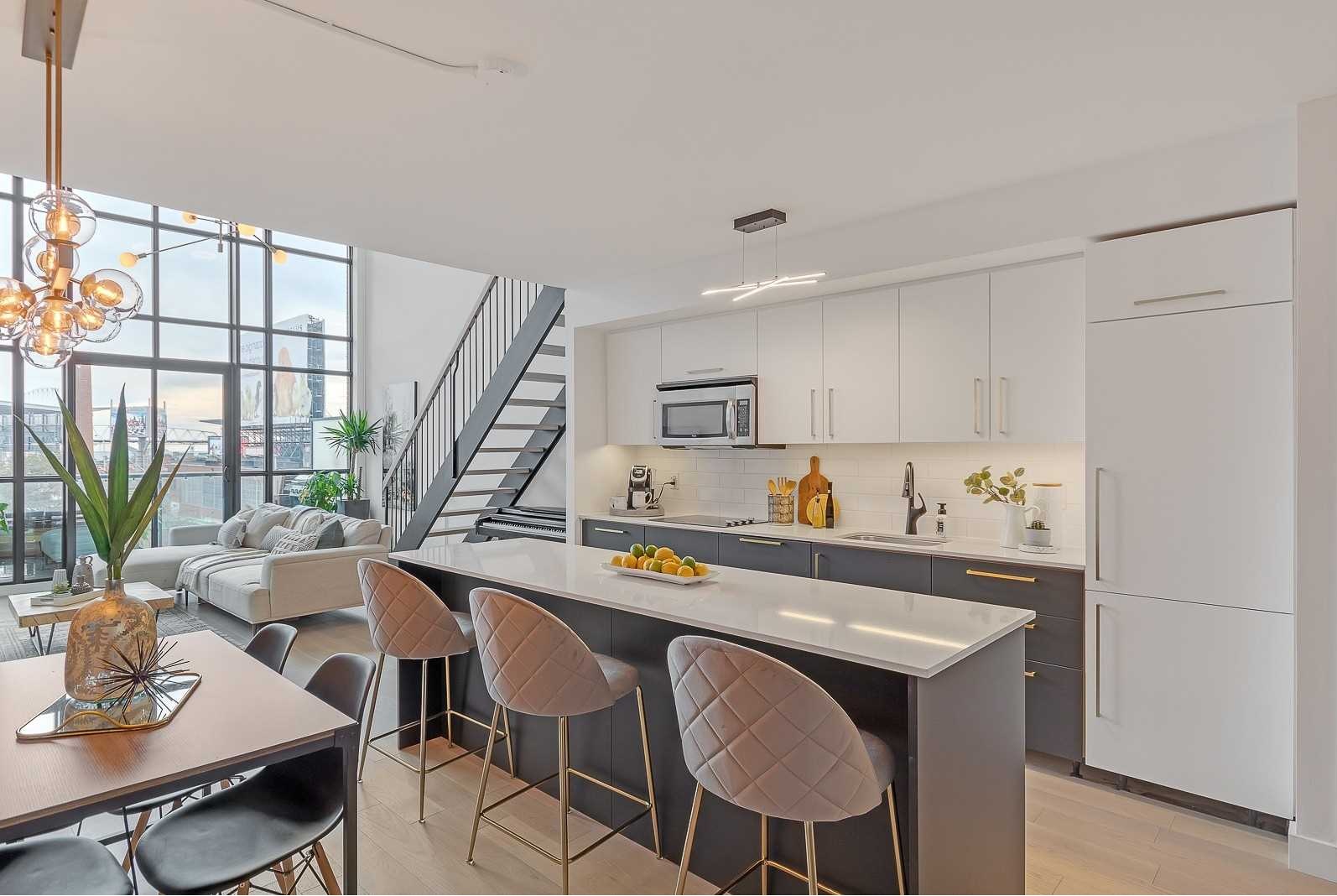
What do you think about going off the beaten path for kitchen cabinets?
Most are white or some shade of brown.
How about blue kitchen cabinets?
I actually like it!
It’s nice to look at, very cool reno, and fun.
I don’t love that herringbone floor in this condo, however. With those cabinets, you need a more modern floor.
So while I would answer “yea” to the cabinets, this overall offering is a nay because of the combined look and feel.
So while we’re on the subject of herringbone floors, how about this?
This is old herringbone floor, and while herringbone has made a comeback, you just know when the floor is old, and it’s not the same.
They tried to dress the room with modern furniture, but this is a nay for me.
How about this one:
It’s not quite herringbone, is it?
That’s actually something new and cool – much cooler than me, since I don’t know what I’d call it.
But I’m old-fashioned. This is a nay for me.
Here’s a much classier look:
Big yea for me.
I don’t know what it’s called, but I like it!
Now, back to a more traditional herringbone:
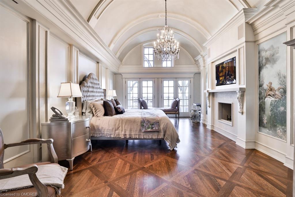
Maybe it’s because we’re in what looks to be a luxury home, but I have to say, I love that floor.
How else would you work with a round foyer?
Your typical horizontal flooring would be too plain.
This floor is perfect for the space! Bravo to whoever picked this. Huge yea for me.
How about those hardwood floors with what looks like a border?
You know the ones:
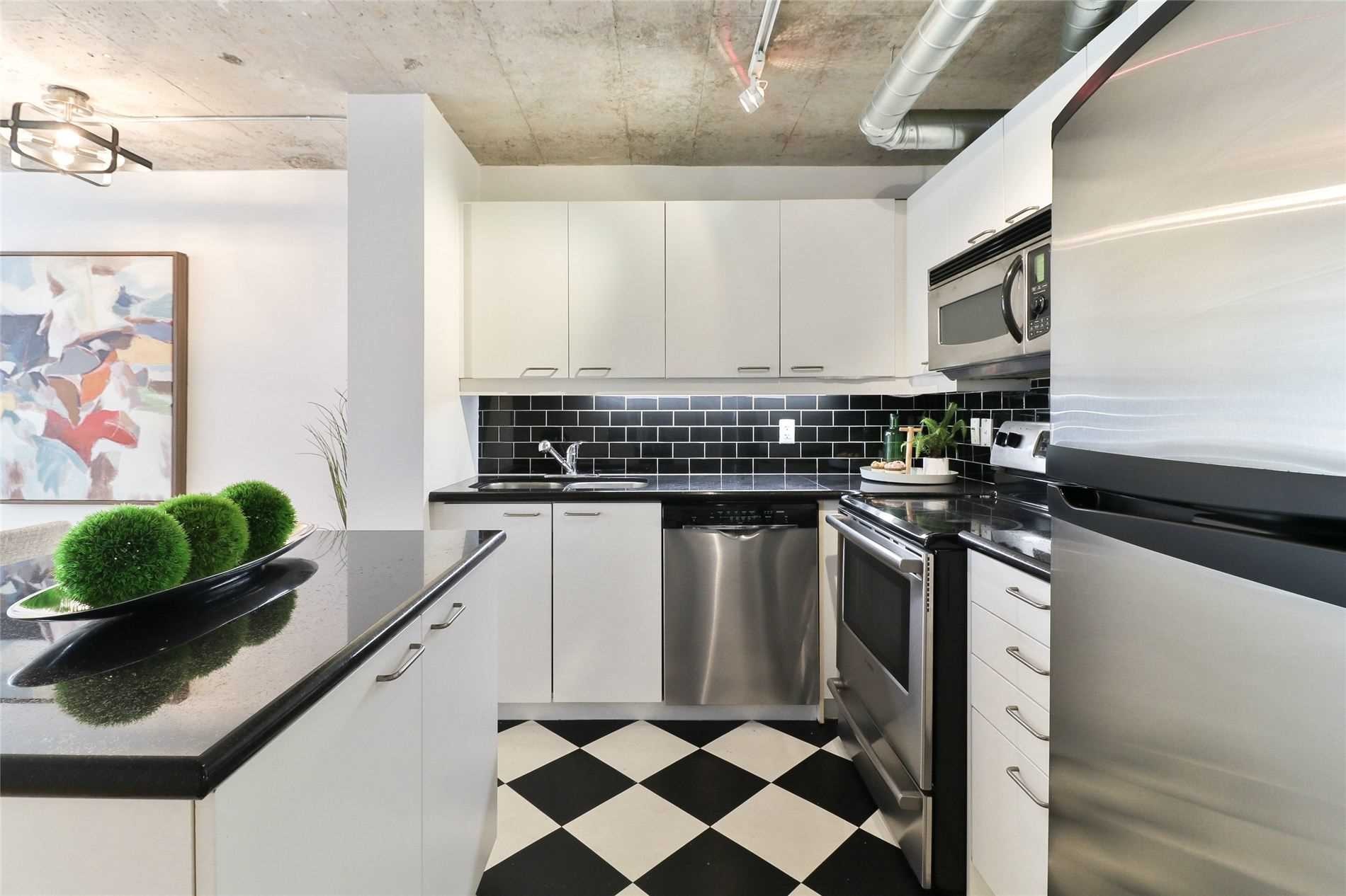
How about a checkerboard floor?
Honestly, I don’t know anywhere that this would work.
Perhaps in an impeccably-maintained Rosedale home?
Black-and-white tile flooring has been around for thousands of years. Literally. It was also apparently big in the Renaissance Era. Louis XIV’s architect used this design in the Queen’s Staircase in Versailles.
But it’s now 2021.
This is a nay for me.
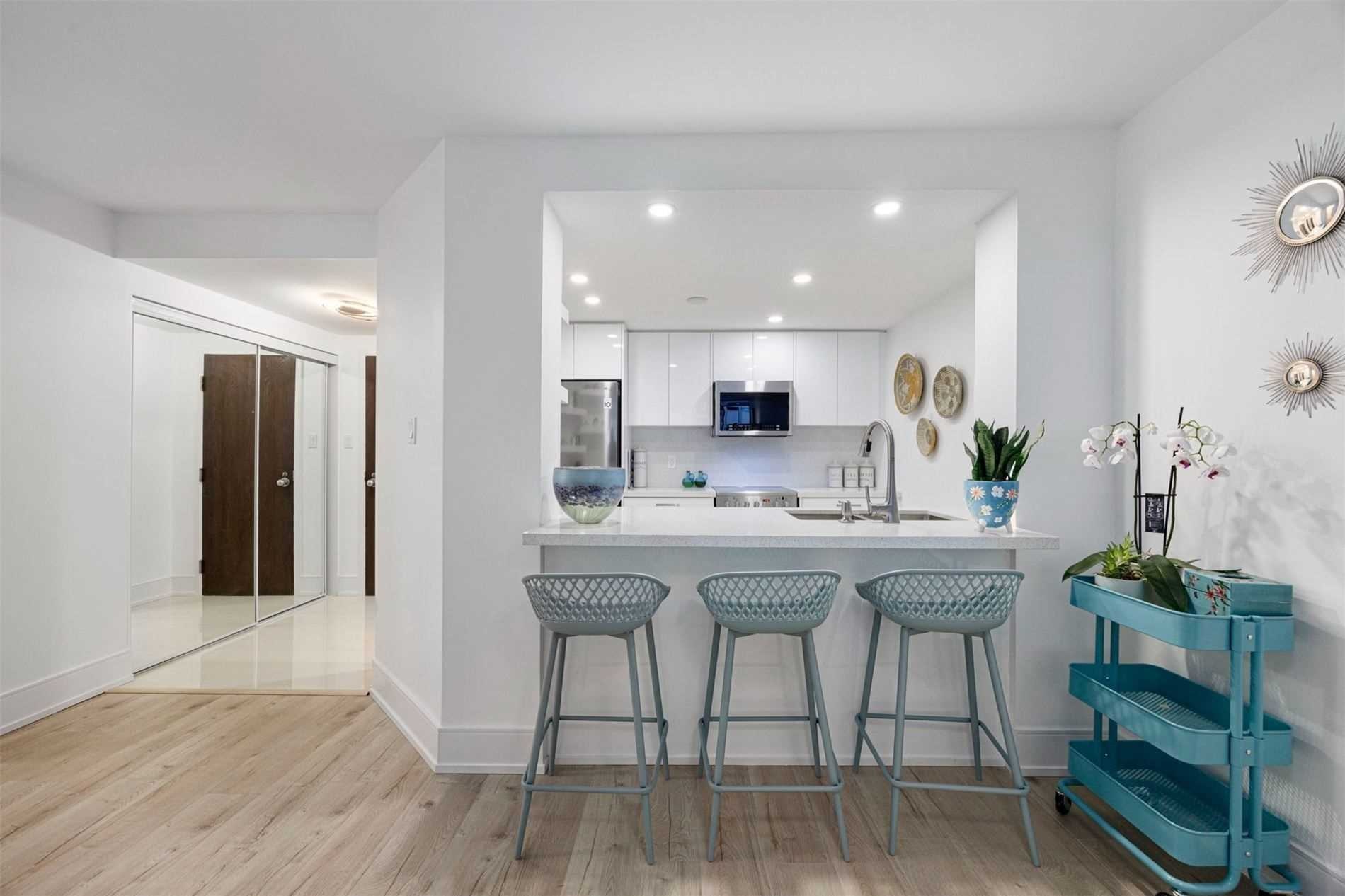
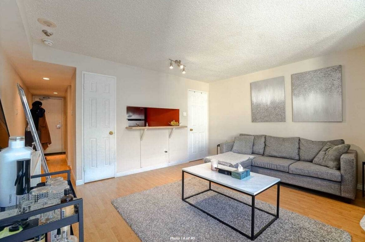
While we’re on kitchens, how about those condo kitchens with the pass-through between the kitchen and dining area, like this:
I think that’s better than just having a wall there, right?
Many younger condo buyers would like to see that wall on the left side, removed. Open-concept is king, and that wall serves no purpose.
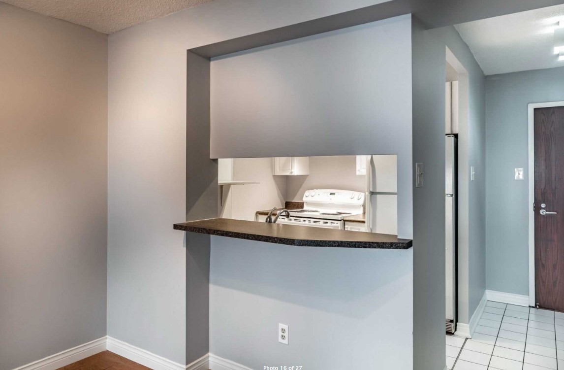
However, a lot of these condos originally featured an enclosed kitchen.
Some are open but not as open as the one above:
I’m a big nay on that, but who wouldn’t be?
That brings us to less of a “pass-through” and more of the short-order chef kitchen like this:
Huge nay.
But it can get worse.
Oh, so much worse….
That’s literally a short-order-chef window.
If I lived here, I would probably get drunk on a Saturday night and think I’m at the late-night order window at McDonald’s at Queen & Spadina. Does that still exist?
Every single iteration of this is a big nay for me.
Staying with the kitchen theme, anybody for zebra wood cabinets?
I’ve seen this work really, really well in some new houses.
But in a condo? It’s more hit than miss.
Nay for me, but that’s because I like the theme and not the implementation.
How about different coloured uppers and lowers?
Absolutely gorgeous!
Huge yea for me.
But it’s not automatic.
Here’s an example where the island is the same colour as the lowers on the left side, but the uppers are not:
That’s a nay for me.
Now, what if we combine two features?
How about zebra wood combined with different coloured uppers and lowers?
You know something, I don’t hate it.
It’s a bit too shiny though.
Speaking of which how about lacquered kitchen cabinets?
So lacquered, in fact, that there’s a shine that actually reflects like a mirror.
Here we’re combining three elements from our list above: blue cabinets (blueish/greyish), different coloured uppers/lowers, and lacquered.
Still, it’s a nay for me.
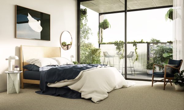
Last, but not least would you like to live in a forest?
Not an actual forest, but a bedroom like this:
As a child, nay. It would scare me.
As a man with a small child inside, yea.
Small room, no windows, surrounded by trees.
A man (with a wife and two kids…) can dream, right folks? 🙂
Have a great weekend, everybody!


















Jenn
at 9:13 am
Nay:
Blue kitchen cabinets
Herringbone floor
Checkerboard floor
Shiny cabinets
Zebra cabinets
Chef kitchen window
Sleeping in a forest
OK they’re all nay! Lol
Steve
at 10:39 am
Another preconstruction success story for you:
https://www.cbc.ca/news/canada/toronto/ontario-condo-developer-suddenly-cancels-years-long-sales-deal-unless-buyers-pay-100k-more-1.6251278
Steve
at 10:59 am
Hah, I notice now that you even got a quote in there.
R
at 2:28 pm
You should know the difference between herringbone, chevron, versailles and straight lay plank hardwood flooring if you are selling it.
Let’s talk real design crimes-
1. Giant script address over the door “123 Anyplace Street”. Bonus (negative) points if it’s on a pediment that is far too tall and too skinny for the proportion of the house.
2. Shiplap, barnboard or anything with fake old wood, unless you live in a bard.
3. Any “decor” that has inspirational quotes. Live, Laugh, Love. etc. Bonus (negative) points if it is fake handmade but really bought at Home Sense.
4. “Transitional Style”. It’s not a “style” when it’s a pastiche of other styles combined with reckless abandon.
5. Anything from Home Sense.
Moonbeam!
at 4:21 pm
I agree with #3, always irritating.
Toronto
at 6:01 pm
This was a refreshing, great blog post that got my mind going about design. My floors are 8 yrs old light laminate (lol) at the time they looked cheap. Today everyone comes in and says wow expensive white oak. Again, lol. Trends always recycle.
Appraiser
at 3:23 pm
At the current rate of 4% + inflation, lending mortgage money is a misnomer – they are paying you to borrow it!
“Online brokers in provinces such as Alberta, British Columbia and Ontario are still giving away insured variables at record-low rates as cheap as 0.87 per cent.” https://www.theglobeandmail.com/investing/personal-finance/household-finances/article-mortgage-rundown-why-variable-rates-wont-wait-for-the-bank-of-canada/?cmpid=rss&utm_source=dlvr.it&utm_medium=twitter
Alexander Pugach
at 6:40 pm
Even thou I do not like to follow trends, some of them are making sense and some are just ugly. Or they are going to be ugly in 5 to 10 years you own the condo or house. You walk in the house and see how many years ago it has been renovated. Pink toilets and neon-green paint were trendy at one age. Black window frames are now. In a few years people will look at them and say – oh, it is so outdated, it is 2021… I suggest to look at old magazines and see if design is still valid today and make it as timeless, not trendy. Black-and-white tile flooring are going to be here for another 1000 years, but I would not put it anywhere in my house because it is so time-consuming and impossible to keep them clean.