Here’s a blog feature that we ran once and then forgot about!
I looked it up – it was November of last year! Man, time flies!
If I recall correctly, there wasn’t much of a consensus on the features I showed off last winter, so I don’t expect this time around to be any different!
Let’s look at a few noteable features, finishes, furniture selections, and design choices that we would probably consider hit-or-miss.
Hit-or-miss?
Nah.
Yay or nay!
First up, what do you think about showing off your wine collection?
My old man has cases of wine in boxes on the floor of his basement, and yet he refers to it as “the wine cellar.”
Others will show off their wine by making room for a wine fridge in the dining room, as we see here:

What say ye?
Yay or nay?
Here’s another example:
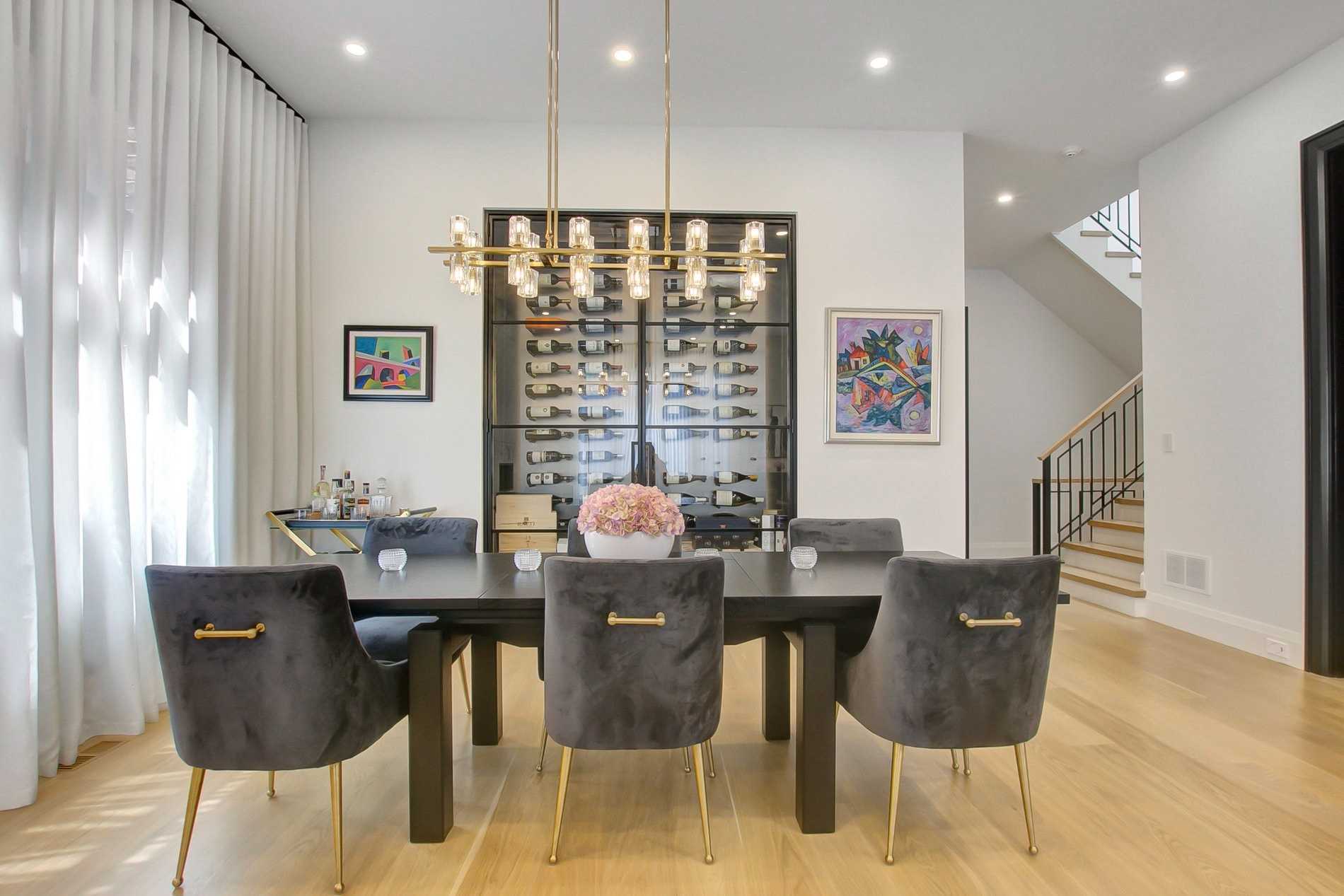
And here’s a close-up:

It’s not just about the wine, of course.
Anybody can run downstairs to the wine cellar – located in the corner of the basement and not in prime real estate in the dining room, to grab a bottle. But these main-floor, dining-room wine cellars, er, fridges, aren’t about convenience. They’re about showing off.
Look at the photo above. Notice the wooden boxes? These are accessories! They’re only present to provide a “display.”
I’ve never felt that the main-floor, glass-panelled wine-cabinet is about convenience, and a home-owner would be hard-pressed to argue otherwise.
Here’s another example:

These guys are clearly broke since they can’t afford to put wine in there.
(shame)
So what do you think? Yay or nay?
This is a nay for me. The main floor of a home is prime real estate and worth five times as much as the basement, so I’d rather have a wine cellar/room/cabinet downstairs, but that’s just me, and I think the vote would be split 50/50 on this one.
–
Do you want to be bold?
Er, bold?
How about some bold design statements?
What do you think about this bold green bathroom?

It really depends on the house, of course.
This likely isn’t a $900,000 semi-detached home, but rather it’s probably a very high-end, 5,000 square foot home, with an owner who wants to be different.
I give it a nay for myself, my home, and my tastes, but I give it a yay for the person who has the confidence to be this bold.
Now, what about a bold kitchen?
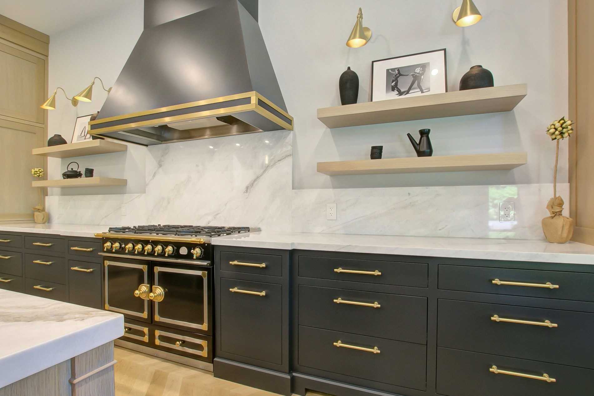
Oh, that’s gold bold!
Bonus points to the reader who provide the brand name of that oven, just from looking at it. I had clients purchase a house in Sunnylea two years ago with one of these. If you’ve never seen an oven that costs twice what a Wolf range costs, well, now you have!
So what do you think about the gold handles, walls sconces, and accessories? And the $20-$30K gold oven?
Again, this is a nay for me, but a yay for the person who’s home I’d love to visit!
–
Continuing the kitchen theme for a moment, do you like those waterfall kitchen islands?
I do!
They’re sleek, clean lines, and they appeal to my OCD.
So what in the world is this ornate, awkward island?

Yes, I ran out of ideas, so I called it the “ornate, awkard island.”
Huge nay for me. I hate this.
–
Who was the first person to put gold and blue together?
The rest of the design community has he or she to thank!
But what about blue lowers with traditional white uppers?

Yay or nay?
Nay for me, folks. I’m too traditional. But it’s very pretty!
–
What about minimalist kitchens, like this one?

In this case, “minimalist” also seems to mean “exceptionally uninviting.”
Give me the blue kitchen above over this one, any day of the week! Definite nay here.
–
An overwhelming majority of bedroom walls are simply drywall.
Some have wainscotting, some have chair rail, some have crown moulding.
But what about panneled walls?

I love everything about this design, and not just because these paneled walls remind me of my home office.
Pannelled walls are a big yay for me.
–
Speaking of paneled walls in a home office, how about this:
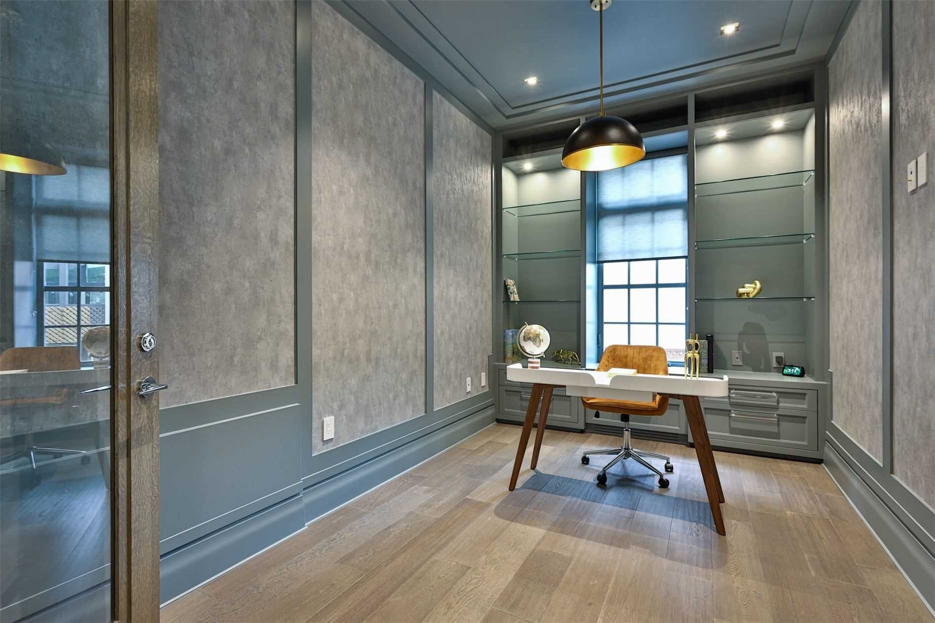
We’re so accustomed to seeing higher-end home offices featuring rich, dark wood where you might think there’s a globe that opens from the top and contains scotch and glasses inside, but whereas I once thought that’s the style I wanted, I’ve come around on the more modern look.
This is a yay for me.
–
How about floating stairs?

I’ve heard just as many people say, “I’m worried that my cat might slip through there,” as I’ve heard say, “I’m worried that my kid might slip through there.”
Floating stairs have lots of pros and lots of cons.
While I don’t have them in my home, they’re still a yay for me, in the right house.
–
If you have six people sitting at a dining room table, how many chairs would you expect to have?
It’s not a trick question. The answer is six.
But many dining sets come with a bench on one side, and two chairs on the other. I assume this is to break up the monotony of that look:

But what happens when two people are sharing the bench, and one needs to get up? I suppose both of them need to get up to push the bench out?
I know a lot of you have these in your homes but this is a nay for me, always has been. At least this bench has a back, unlike those benches that remind us of breakfast at summer camp or sitting on the sidelines in gym class…
–
Bathroom faucets are usually silver in nature; chrome, nickel, or stainless steel.
But sometimes we see brass. Sometimes we see see bronze.
And sometimes we see an outside-the-box bathroom fixture like this one below that has a fitted-pipe look, complete with an old-school wheel:

I’m a hard critic of bathroom sinks and bathroom fixtures and I don’t like when they prioritize look over function.
I give this one a nyay which is to say that I’m completely indifferent.
–
Wallpaper choices will never reach a consensus.
And when it comes to flowered wallpaper, it’s really, really tough to find anything that more than fifty percent of people will agree on.
How does this flowered pattern sit with you?

I’ve said before then when it comes to artwork, I despise paintings of flowers. Paint a horse, paint a building, or paint abstract, but don’t give me a vase of flowers. I’d rather see a painting of a bowl of fruit.
So when it comes to flowered wallpaper, this is a nay for me.
–
I’m not sure what to call this, so here goes…
How do you feel about five dark black doors in a nine-foot radius?
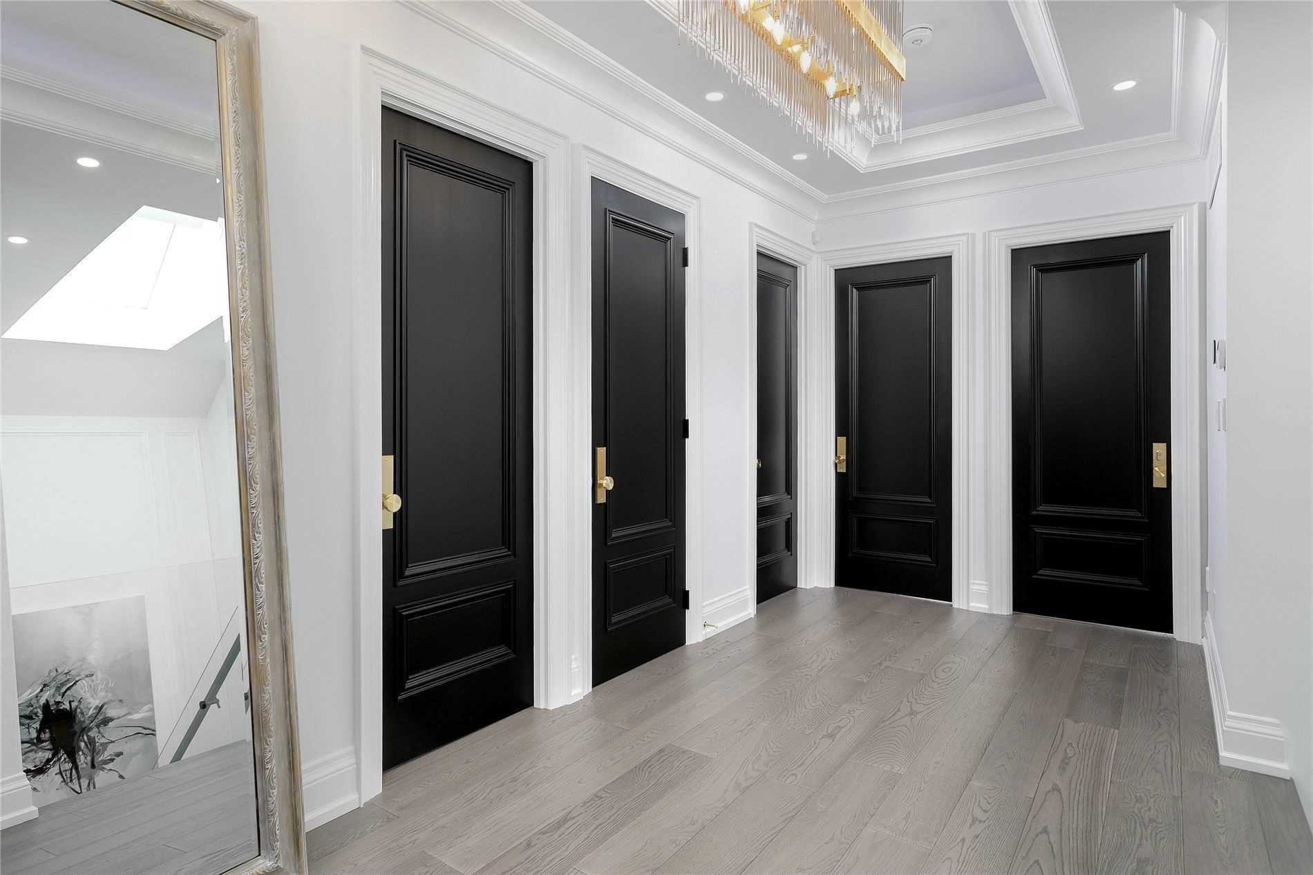
This has less to do with the interior design, ie. the black doors, and more to do with the architectural design, ie. whoever decided that three bedrooms, one bathroom, and one closet should all front in the same area.
Hard nay for me.
–
I absolutely love my basement!
It’s mine. It’s the one area that my kids don’t frequent.
Once upon a time, the basement was the least-cared-about space in a home. Today, I think it’s more important than ever.
Some people have a rec-room or movie theatre, others have a gym, some have a kitchen or a bar.
But what if you couldn’t decide? What if you combined all of the above and ended up with the kitchen in the rec room gym?

If there’s one thing that really gets to me, it’s when developers kill the flow of a basement rec room by putting in a kitchen that nobody needs!
That’s not just a bar where one can get a beer or make a cocktail while watching a movie, but rather it’s a full kitchen with a stove! Who’s making Kraft Dinner on the gas range in between sets of chin-ups?
Hard nay for me. I would tear that out.
–
Last, but certainly not least, how about the framed Danny Woodhead jersey?
Wait….who?
Danny Woodhead! A completely obscure former NFL football player who played parts of nine seasons as a backup, at best.

I know what you’re thinking, and I checked – this house is not being sold by Danny Woodhead!
But I also called Danny Woodhead’s mother and she said she has a Tom Brady jersey in her house, and she had to be reminded who Danny Woodhead was…
For those not familiar with the NFL, obscure scatbacks, or both, this would be like having a framed jersey of former Toronto Mape Leaf, Frederik Gauthier.
To each, their own. I suppose.
If everybody else has a jersey of Joe Montana, Jerry Rice, Peyton Manning, or Barry Sanders, it might just make you scream “DANNY WOODHEAD!”
Have a great weekend, everybody!













Appraiser
at 7:16 am
If there is one thing that can be said that is true about taste and preference – it’s personal.
Rebecca
at 8:22 am
Nay to floating stairs. They’re impossible to clean because the dirt keeps falling in between the gaps!
JL
at 8:42 am
Or you could consider them self-cleaning, for the same reason = )
(sure you get a pile of dirt at the bottom level or underneath them, but it wont accumulate on the steps themselves)
Personally I think they look cool, although appreciate they may not be practical in all circumstances.
Caterina
at 8:41 am
David, the oven is a La Cornue. Gorgeous but reviews are not outstanding given the price.
Nobody
at 1:49 pm
Oven is also WAY more than twice the price of a Wolf!
Given the dollar, supply constraints, etc it’s more like a $60k oven.
It’s also handmade in France to order. There are a range of standard colours but you can also get a custom enamel colour (like your Porsche/Ferrari) .
Wolf/Bluestar/Thermador are for performance, La Cornue is for style. Porsche vs Bentley.
Generally the chef uses the Cornue, or they use the Wolf/Miele/Thermador in the catering kitchen.
Drake’s (gorgeous) kitchen with a La Cornue being an excellent example.
Kyle
at 11:21 am
Big nay on the glass wine displays, they look like they’re trying WAY too hard to look expensive and they make one’s home look like its design inspo was a subrurban restaurant
Nobody
at 2:07 pm
It’s one thing to do wine storage as a display item in a condo/apartment with ambient temperature wine racks. Generally less than 20 bottles and nobody expects or has anything worth more than $50/bottle – usually not more than $25.
These big pieces in detached homes are both vulgar and impractical. They’re showing off presumably expensive wine which is super tacky. They’re also not great for wine storage in terms of light, heat, humidity, inventory tracking, or efficiency. If a developer/flipper (rarely) actually puts in the HVAC for temperature and humidity control, the side on presentation is a huge waste of space vs a traditional racking system. Also not a secure place to put your investment bottles (i.e. from kids, guests, or thieves).
Better to get a Subzero wine fridge in the kitchen for some display along with actual functionality. Or get a properly designed cellar in the basement with cedar racking, a scanner, proper HVAC, and secure access control. Let the teenagers and guests help themselves to the affordable stuff in the kitchen rather than accidentally open up vintage Burgundy or Bordeaux.
Yes this is pretentious AF but if you’re going to spend the money, spend it WELL!!! Porsche 911 Turbo rather than a Lambo, Bottega Venetta bag rather than a logod out LV bag, steel Rolex rather than a blinged out Hublot…
Geoff
at 11:41 am
I’m with you on your nays David except for the blue lower with the white top. I think that looks sharp.
House Keys
at 11:52 am
I assume the thought of the full kitchen in the basement is that it preserves optionality to turn the space into a rental apartment, while also being somewhat useful if you don’t. Agree it probably doesn’t belong in a 5-bed detached family home, but for a smaller home where it could be split, it might.
Nobody
at 2:19 pm
Also can be handy for Orthodox Jews if the main kitchen doesn’t have enough room to duplicate things. Keeping dairy and meat separate is a HUGE PITA so a second kitchen is an excellent solution.
The optionality can also be for teenagers/grandparents..
Personally I prefer a basement bar with a fridge, icemaker, dishwasher, kegerator, and a microwave (need popcorn!). Add a smoking gun and a handheld butane torch for fancy cocktails. But there are so many people with different restraints/requirements
Nobody
at 2:26 pm
Great thing about most of the colour choices is that they’re just paint. So easy to change walls/cabinets. Can’t change the La Cornue but change the cabinets to white and it’s a whole new kitchen!
I don’t like the flowered wallpaper bathroom for myself but it’s very nicely done. Like a guy in a very nice suit that’s just too much colour for me personally.
Panelled walls you showed are well done and show real thought. Expensive to execute and expensive to change so not fantastically practical but…
Marina
at 2:28 pm
I’m fine with the green bathroom – you can always repaint. But how did you even see the colors of the walls. All I saw was the sink – it’s is vomit-inducing!
I love the blue and white island. And the paneling.
The stark bare kitchen looks like a morgue. Hard pass.
As for the kitchen with all the gold, I can see why someone might like it. I don’t. I think in general bold design is better on something that can easily be changed. Paint? Light fixture? Sure go big. But if it’s hideous and a pain to change, that’s not a great move.
Island Home Owner
at 2:50 pm
How dare you disrespect the pride of Chadron State!!!
GinaTO
at 5:12 pm
I’m full of nays today! Some from your list, some are my pet peeves:
– floating stairs: nay
– kitchen bench: nay
– wine presentation: big nay, I don’t drink wine
– floating shelves in the kitchen need to die a very quick death
– bowl sinks in bathrooms: hate hate hate
– open vanities in bathrooms that leave you no space to put the toilet paper: why?
I do like the blue and white kitchen though!
R
at 5:33 pm
A framed shirt on the wall is only ok if you live in a dry cleaning shop.