Tastes and preferences can change over time, right?
When I was a child, every time we went to McDonald’s, I insisted on getting a plain hamburger.
But the traditional McDonald’s hamburger came with ketchup and mustard automatically, so my parents were always forced to “special order” and I had to wait at the side of the counter for a burger in blue-and-white wrapping, with a yellow sticker, to come down the chute and be presented to me.
Geez, times have changed.
Now everything is a special order! Vegan, gluten-free, non-GMO, vegetable-free, meat-free, air-free, invisible; you name it, people are ordering it.
Today, I will put everything on my burger. Tomatoes, onion, lettuce, dill pickles, and banana peppers are my go-to at family barbeques.
But it’s hardly a surprise that my tastes and preferences from childhood changed versus adulthood though, right?
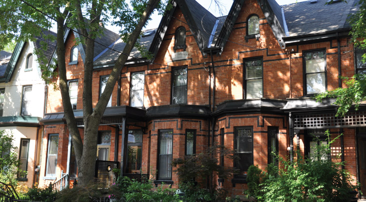
When I used to think about my dream home, it was always red-brick.
I grew up in Leaside where most of the houses are brick, but a traditional red-brick home, perhaps Georgian-inspired, is something that I always coveted.
This is kind of funny, or ironic, but I just Googled “red brick home” to find a photo of a house that I like and could post below, and the first three search results offered were from a blog post on TRB.
June 16th, 2023: “Yay Or Nay: These Fancy Brick Homes!
Is it possible that I’m bordering on unoriginal?
Wait…don’t answer that…
My dream home was always red brick. If you had asked me if I would ever end up buying a home that wasn’t red brick, I’d have said you’re crazy.
But tastes and preferences change.
Or maybe I just valued the location, size, style, layout, and price of the home more?
I ended up buying a brick home but the brick colour is more of a tan/buff.
And yes, I Googled this…
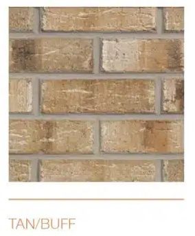
At least now we know the name of it! I might have called it “sand” otherwise.
Most Toronto homes are brick, but we’ve also seen a lot of modern homes built over the last twenty years, specifically over the last five years.
For some reason, this style simply doesn’t resonate with me.
To each, their own. Right?
But try as I might to understand, accept, and admire the style, I feel that the exact opposite of something that you like is going be really hard to like in itself.
Today, I want to show you a few of these houses and I’ll provide you with my thoughts, and I encourage you to comment below with your thoughts as well. I’m interested to know what the demand for this style of home is, and if perhaps I’m just out of touch and out of date.
Let’s start with a few wider homes in landscape format:
Modern House #1:
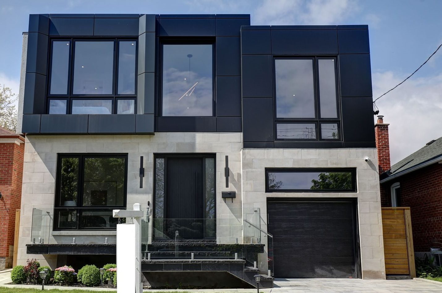
Considering that I prefer brick homes, and I like traditional and not modern, I suppose I’m not going to LIKE^ any of these.
But grading on a curve, I suppose I can play.
I don’t like how the right-third of the house has a lower roofline than the rest of the home. While this might be an architectural feature, it feels uneven to me.
I like the black window frames and I don’t mind the dark blue siding, but I really don’t like cinder-blocks. They’re industrial and this feels cold to me, but maybe I’m just way past the “cool guy loft” phase of life?
–
Modern House #2:

Instead of cinder blocks, here we get grey stucco or something like it.
I like how the house is light grey on the left, dark grey in the middle, and light grey on the right. It’s an interesting pattern.
But again, I really don’t like how the rooflines are all different. I know that traditional, red-brick homes have peaks, as would a Victorian, but the roofline is at the same level.
The right-third of the house just feels “short” to me, and although this is a hallmark of modern homes, especially those on the west coast, I think my OCD just won’t allow me to accept it.
–
Modern House #3:
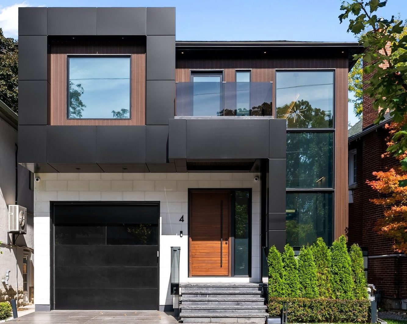
I want to like this. I do.
But I’m starting to think that I don’t like any modern homes!
I like the contrast of the black and brown on the upper level.
I love the front door. And again, I love black window frames.
But I also see cinder blocks again, and I find it so odd that the front-left bedroom extends about 4-5 feet out over the garage below.
All of these houses are so…………uneven. Perhaps I need to speak to a psychologist about this… 🙂
–
Modern House #4:
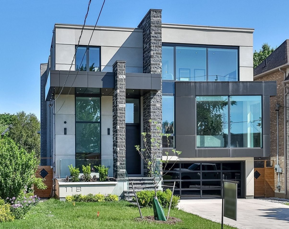
This is an example of where the phase, “There’s a lot happening here!” directly applies.
Because there is. A lot.
And while I’m no architect and in no way qualified to provide insight as to modern architectural styles, there are just way too many levels, lines, and materials here.
I don’t understand the two stone columns running vertically up the front of the house. We see this a lot in modern homes but there’s usually one of these. In this case, there are two, but one is shorter than the other.
I don’t get it.
–
Modern House #5:

So far, this is the one I favour.
But that’s only because I’m simple, and this house is simple by comparison.
Again, I would prefer a more homogeneous, continuous front facade, but it’s clear that this isn’t a feature of traditional homes.
–
Modern House #6:
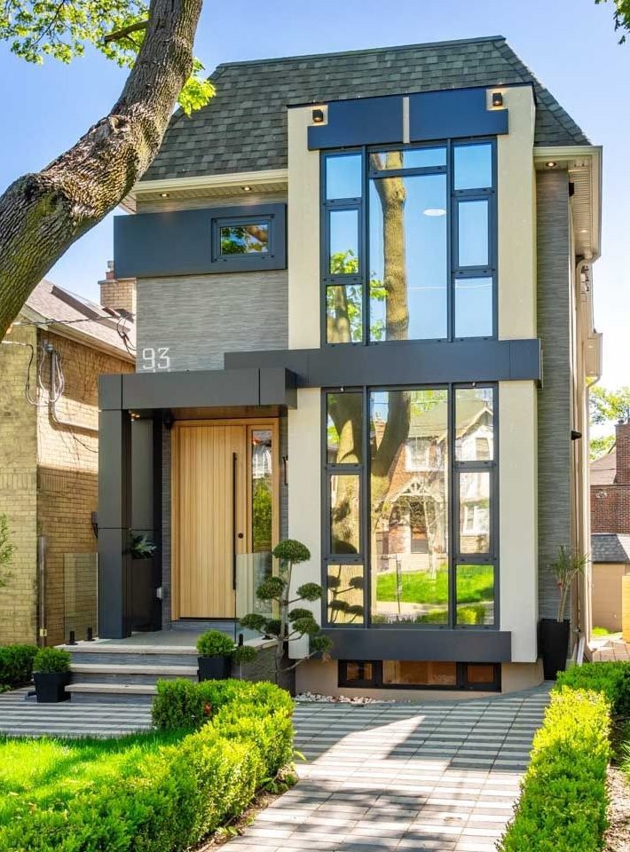
Moving on to some homes on narrower lots and vertical/portrait photos, I actually don’t mind this house.
I don’t care for the large “93” out front, and again, I don’t like how certain sections of the front are indented, or convex/concave, but like the style of the front door, and I sort of like the window pattern on the right.
–
Modern House #7:

There is nothing I like about this house.
I’m sorry.
I bet it’s an incredible home, and I bet that some of you reading this post own a house just like it.
But I’m the kid that ate plain hamburgers from McDonald’s…
–
Modern House #8:
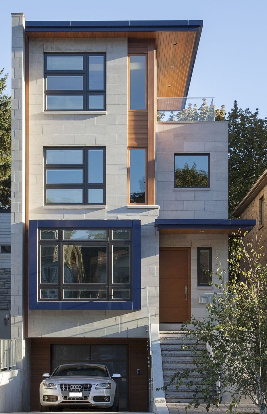
I also don’t like this house.
Notice a pattern here?
I could have called this post, “Why I Don’t Like Modern Style Homes,” but that’s assuming I dislike them all.
What these houses all have in common is that they’re expensive and most people in the city would KILL to live in them. And yet here I am, critiquing them, while risking offending my readers who own similar homes. But there’s just “too much happening” with the facade. I’m dizzy just looking at this.
Note Bene: Isabelle from our accounting department just walked into my office to get a signature on a trade and said, “Hey, wow, I like this house!” How is that for irony?
–
Modern House #9:
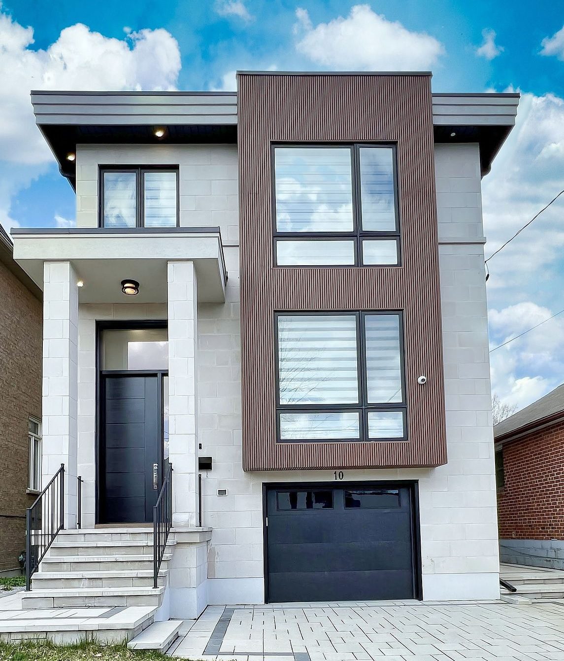
Again with the cinder block, but for some reason, I don’t dislike this house.
So it’s me, right?
I like simple?
Nota Bene: Isabelle came back into my office and looked at EVERY house in this blog post and liked them all. Then I showed her my own house on Google Maps and asked, “What do you think of this one?” and she said, “Meh. That’s kinda boring. Like, that’s a boring house for boring people, ya know?”
–
Modern House #10:
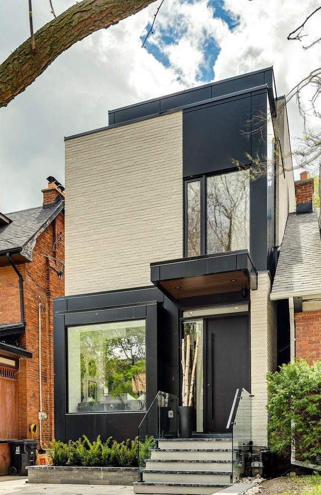
This makes zero sense to me, and this is where I feel like I’m going to provide a reasonable piece of insight:
I’m a practical person. Form over function. The design of this house is trumping the usefulness, as evidenced by the fact that the left-side of the house, second level, has no window!
So in order to get the “look and feel,” you sacrifice something significant.
Not for me.
–
Modern House #11:
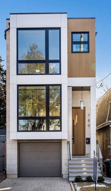
Is it just me, or does that front door look really narrow?
I think it’s just the angle that at which the photo was taken, but either way, the two rectangular concrete pillars on either side of the door makes that porch look really, really small.
The garage also looks like it’s better suited for the kids’ bikes rather than a sedan, let alone an SUV.
I sound like a broken record here, but this just looks cold and uninviting to me.
Then again, I’m a loner, so do I really want a house that’s “inviting” to people?
–
Modern House #12
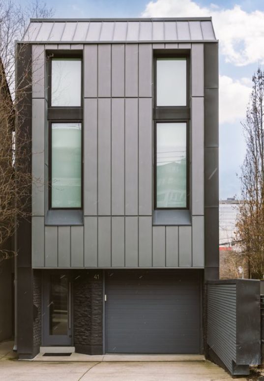
Oddly, I don’t mind this.
Perhaps the front door is too small compared to rest of the house, as is the garage. And that wall on the right-hand side tells me that there’s something the owners are trying to block out.
But for a mid-city infill project, this looks cool.
I don’t know that this would “fit” in a traditional, mid-town, family neighbourhood, but then again, that’s exactly why many people build modern homes in the first place; they want to be different.
–
Modern House #13
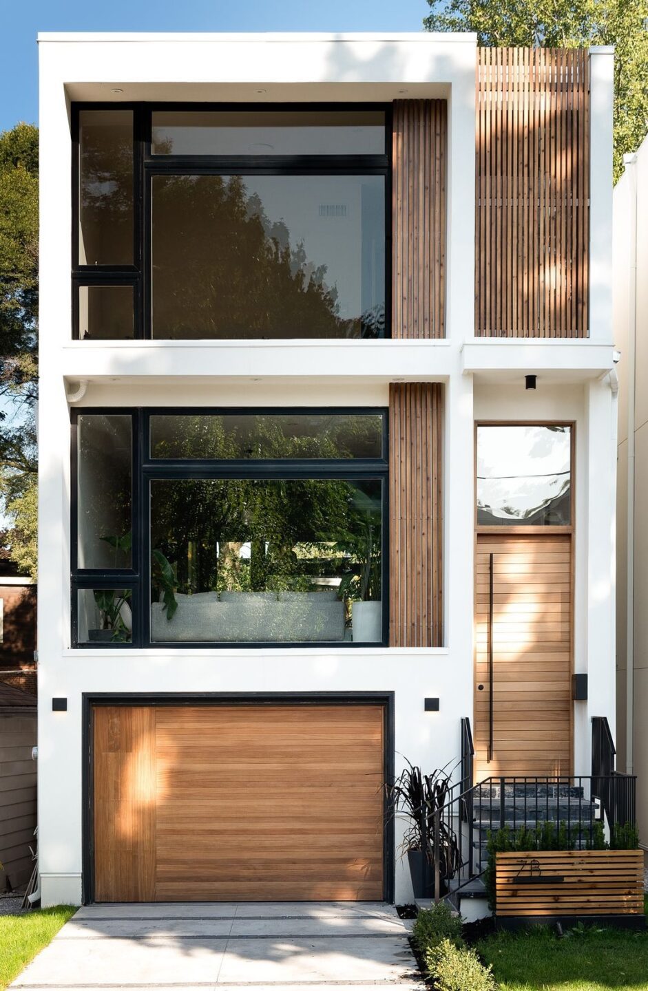
Maybe the style is growing on me, but I actually kind of like this one.
It looks similar to house #11, but there’s something about it that “finishes” the look for me.
Perhaps it’s the more refined, homogeneous, consistent look, or maybe it’s the additional wood elements.
But while I’m still a red-brick guy at heart, this is a modern house that I really like the look of.
Go on, tell me that you love this style!
Tell me that I’m boring, I can’t think outside the box, and that I’m unoriginal.
But we all have our own tastes and preferences, and while I would like to think that I’m open to new things and that I’m a creative person, I just really don’t love any of these houses.
Let me know which is your favourite. Or your least favourite…
I was hoping that the June TRREB stats would be released on Wednesday so I could write about that today, but alas, we’ll have to wait until next week! For the record, I’m predicting ridiculously low sales data and a GTA average home price that’s declined from May.
Have a great weekend, everybody!


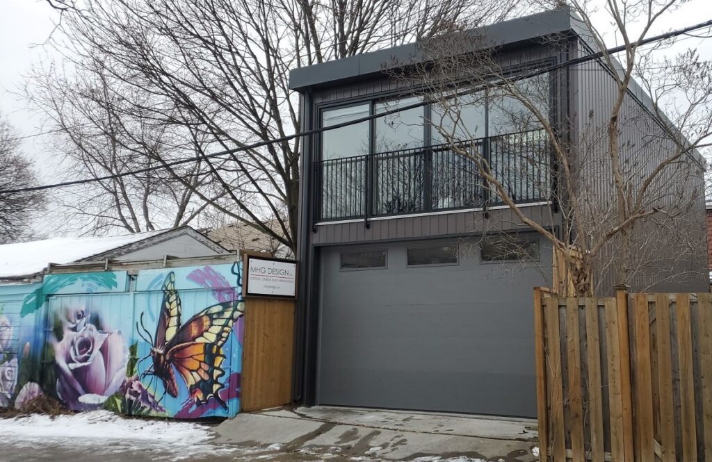





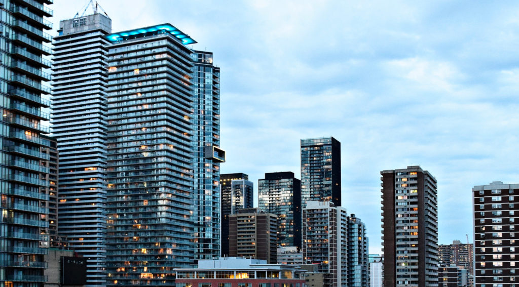



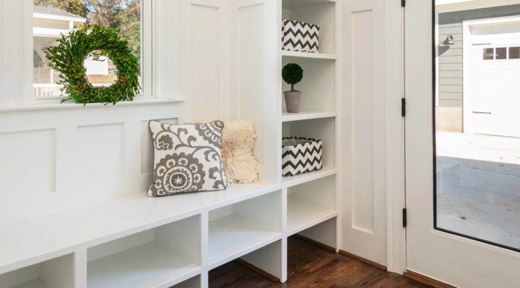












Francesca
at 8:29 am
I’m someone who enjoys modern homes, maybe because in the 80s and 90s my parents were always wanting the modern homes vs traditional ones mostly for the amenities modern, newer homes come with. My area of Yonge and Sheppard has new homes being built constantly and I always love seeing what kind of design the new house has from the outside and then looking at the indoor photos if the house ends up being for sale. Some are absolutely gorgeous others are hideous! David you should come up my way one day and we could go for a neighborhood walk to see what you think. My favourite is actually number 13 too: I love the white with the wood elements and everything seems to fit the proportions of the house. I think this house will still look nice in 10-20 years. My absolute least favourite is number 12: I hate how cold and industrial it looks and how “Simple” it is with no interesting details to look at. The all grey is very boring to me too. I would rather one of the other houses that may have some odd features but look interesting compared to this one.
hoob
at 9:04 am
Every time I walk around Calgary I notice how ugly everything is. Prairie Modern is a special category of low budget aesthetic where no one seems to know what to do to be creative. The basic recipe seems to be
1. Staggered Offset Walls
2. Veneer Rock Lower Cladding
3. Stucco
4. Disproportionate columns
It all ends up looking like 2000s McDonald’s store basically.
Graham (the real deal Generally Accepted Accounting Principles)
at 9:24 am
I think Isabelle from Accounting needs to have a quarterly feature on the blog to discuss real estate style and design.
Ed
at 9:58 am
I love lots of natural light in a home and I love large windows but I would not want floor to ceiling windows in any rooms facing the street. How would I walk around in the buff?
Ed
at 10:00 am
Oh and I find #6 and #10 extremely fugly
Marina
at 10:46 am
I hate all of these. Every single one looks like it could house a Bond villain.
It’s even worse when they do it with townhouses. There is a patch of townhouses off the 404 heading north that we drive by when we visit my parents. It’s affectionately known as Cell Block A.
The last house is the least offensive, but I think that’s because I love the pop of modern-y wood. There are a couple of old brick homes in my area that were reno-ed, but they kept the original facade and just added modern wood accents in the porch, window frames, or rear addition and I absolutely love the look.
Maybe what I really object to is the overuse of steel and glass – it’s cold and uninviting.
Caris
at 12:46 pm
Thoughts on 179 Palmerston Ave?
https://www.realtor.ca/real-estate/27124712/179-palmerston-avenue-toronto-trinity-bellwoods
Graham (the real deal Galway Hooker?)
at 1:37 pm
I get houseboat vibes from the exterior photo. Not sure why.
Marina
at 3:44 pm
I was going to say tugboat, but same difference.
Actually aside from the tugboat likeness, it’s a good looking house. I think it’s the wood that softens the look for me.
R
at 8:53 pm
Those are all the same house. They aren’t modern. They are new.
They aren’t designed. Builder specials. I call it “fake modern”. I highly doubt an architect was involved in any of them.
It’s no more “modern” design than a McMansion brick veneer new build with fake columns, a giant front door (with huge script address on top, of course) and useless portico is “classic”.
Pattycake
at 9:11 pm
I agree with R. Done properly Modern can be appealing. I live in a craftsman now but maybe next time.
R
at 11:24 am
If you are looking for real, good modern design, try checking out some of the following local architects that do it well. I don’t have any association with any of them, but enjoy good design.
Studio AC
VFA Architecture
AKB
Odami
Wayback
rzbld
Designlines magazine among others frequently features excellent residential projects from Architects doing nice modern residential projects.
As an aside, I find it surprising that most real estate agents know nothing about architecture (or interior design or design in general), when it’s essentially what they are selling. Paul Johnston specializes in modern design, but most agents couldn’t tell the difference between Bauhaus and a bee house. I suppose if it’s just a commission check it doesn’t matter if it’s a non-functional box you don’t need to live in it after the sale closes- why bother?
QuietBard
at 4:57 pm
It seems like you are a bit of a downer. There’s always positives and negatives in everything. We decide which one we look at. Its also possible that you “needed” a negative view to make the blog post interesting
Nobody
at 4:14 pm
David I think you are misidentifying large stone tile as cinder blocks.
An actual cinder block is used as a structural element and is made of concrete. They’re rough and have a dark/medium grey colour.
You can’t use cinder blocks on top of a large horizontal opening like the windows in house 1 or the garage door in house 3. Blocks need to be resting on something and in neither case is there a large steel beam to act as a lintel Plus while cutting tile/stone to keep symmetry is a bit tedious it’s a task that’s unfeasible with actual concrete blocks!
These white/very light gray tiles are somewhat similar in appearance to the aforementioned blocks and have excessively visible grout but across many factors they simply cannot be what you think they are. I’ve seen them used in better situations where they’re more obviously a stone product. Here used alongside lots of large openings the desired effect is lost.