We’re only in April – so don’t tell me I’m “overreacting.”
But this new listing at King George Square is quite simply the best property I’ve seen on the market since we turned the page on 2009.
Dollar-for-dollar, I haven’t seen anything like this. And no, I’m not biased because of the incredible patio…
I don’t think I’m over-selling it. Do you?
When I say that this is the “best property” to come out so far this year, I’m not putting it on a level playing field with the $5,000,000 houses.
They say that Georges St. Pierre is the best “pound for pound” fighter in the world, which is to say that, yes, he would likely loose a fight to a man who outweighs him by 60 pounds. But he is the “best” on a relative basis.
This new listing at 168 King Street in the heart of the St. Lawrence Market is the best new listing of 2010.
I’m in tune with every single property that comes onto the market, and there are few units like this one.
If I could describe it in a single word, I would call it “UNIQUE.”
Let’s look at every aspect of this property.
Area
Sure, I’m biased because I live in the St. Lawrence Market neighbourhood and it’s probably my area of expertise. But dare to compare this historic, authentic piece of Toronto to any other neighbourhood in the downtown core, and I’d be interested in hearing your argument.
Whether it is “The Furniture District” that tickles your fancy or the shops, cafes, restaurants, and bars that you frequent, I think King East has a very low-key vibe when you compare it to that of King West or Queen Street.
And if you’ve never had lunch in the basement of the St. Lawrence Market, please, for me, go and order a back bacon sandwich as soon as humanly possible.
Building
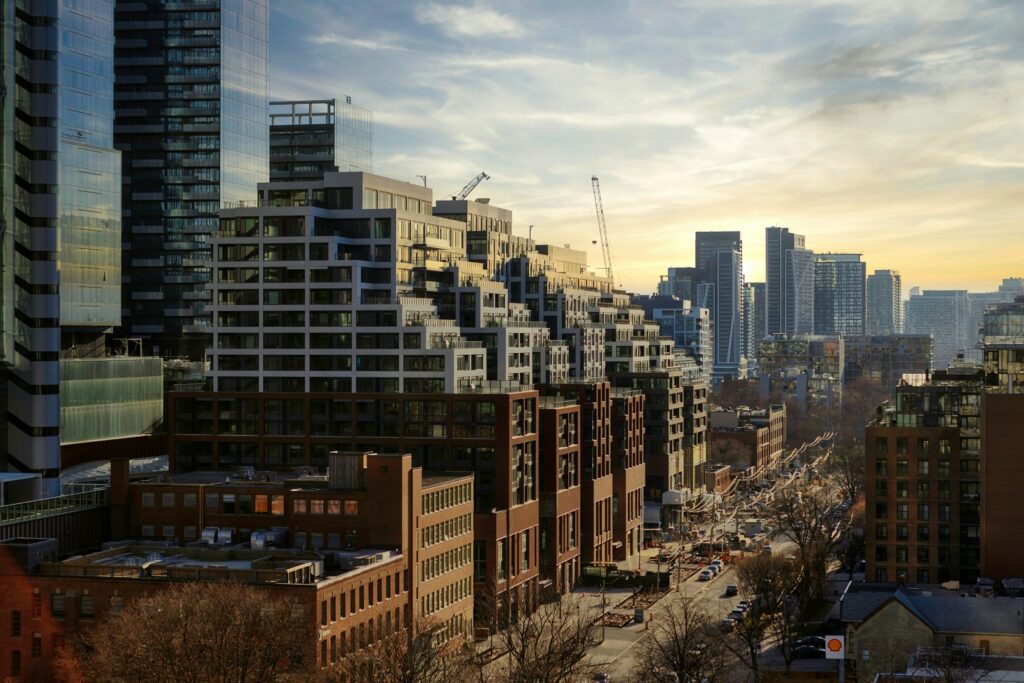
“King George Square” has long been the crown jewel of the St. Lawrence Market neighbourhood, and even with increased competition via new buildings in the past few years such as Vu, Rezen, and East Lofts, KGS is still holding firm.
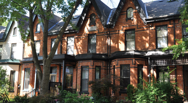
There is something so classic-looking about the front of the building with its red-brick facade and gated-entry:
Features, Finishes, & Upgrades
When my clients bought this unit in 2007, it was what they referred to as a “blank canvas.”
It was completely bare bones and while it didn’t need to be “gutted,” it certainly needed a complete overhaul.
The owners have made every conceivable upgrade to the interior of the condo, including the “little things” that you would never think of. For example, they lowered the sill over both sets of sliding doors to cover the curtain-rod. This way, the rod is hidden and you only see the curtains on the left and right side.
See below:
You may ask, “Who cares about a curtain rod?”
Well I’m just pointing out that everything has been done to this condo; even the things you would never notice unless they were pointed out to you.
The owners put up crown mouldings throughout the entire condo, including den, living/dining, bathroom, hallways, and foyer.
They removed the sliding doors in the den to open up the space, and replaced the plexiglass sliders on the cupboards with French doors.
They replaced every single light fixture in the condo with very tasteful, exquisite fixtures that were all likely $250 – $350 a piece but would seem much more costly to the naked eye.
The kitchen counters remained the same – about the only thing they did not change, but they installed a gorgeous glass subway tile backsplash seen below:
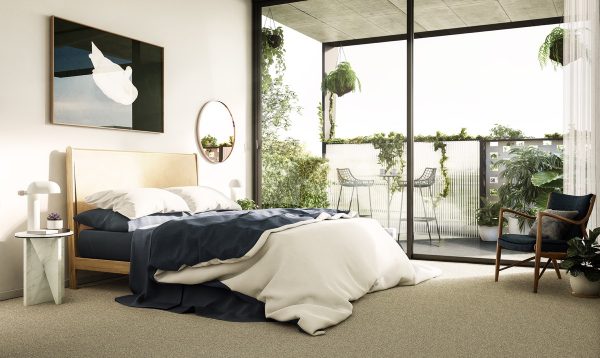
And the master bedroom is unlike anything I’ve ever seen.
How many condos do you see that have wainscotting in the bedroom?
Tell me that this doesn’t show A+:
They also installed colonial door trims around every single door frame in the condo; another aspect I have yet to see in this building or any other, really.
The floor is laminate, but it is also three-years-new. It’s a high quality and the color matches the kitchen perfectly so there is no rush to head out and install hardwood just to say you have it.
If you can think of it, these owners have done it. It has every upgrade you can imagine.
The Terrace
This is the biggest selling feature, in my mind.
The terrace is 330 square feet and it is open air meaning there are no balconies above your head. It isn’t exclusive or private, but since there are no balconies above it, there is no reason for any neighbours to peer down at the goings-on, unless they happen to smell BBQ…
The patio comfortably sits ten people, but it could accommodate more.
It faces east over King Street and George Street, and gets a bevy of morning sun:
The wicker lattice you see in the background there is $400 a piece; nothing was done on the cheap in this condo.
Each deck tile is hand painted so there are no stains or drips on the concrete tiles below, just in case for some bizarre reason you decided to go old school. But it just goes to show you that every detail has been thought of in this condo.
I’m what you call “a terrace guy,” so clearly this feature helps me to believe it is “The Listing of the Year,” but judge for yourself.
What kind of value does this add?
While the interior space of a condo might run $400, $500, or $600 per square foot, some people believe you put a $100 – $150 per square foot value on a patio.
Others believe you give it a lump sum of say $25,000 like parking.
Personally, I think this terrace is worth $40,000. If you had the exact same unit next door with no terrace, I’d subtract $40,000.
The unit is priced attractively at $379,900, and although to hazard a guess on what it would sell for might be called “price fixing,” I will say that I think this unit will attract multiple offers and the rest will play itself out.
Last week was very busy in our real estate market, but there was a lot of “junk” that came out each day with the 120 – 140 listings in the downtown core.
If only we saw one listing like this per day, surely we could call it a buyers market….























MattO
at 9:58 am
personally, I don’t really like the wainscot panels in the master bedroom, that’d actually be a negative for me as I’d have to pay to have that removed..
Patrick
at 10:29 am
That patio is unreal — and just in time for summer. I wonder what your readers who claim they would “never use outdoor space” think (I’m looking at YOU, LC!)…
fidel
at 10:48 am
Pimpin’ patio, nice subtle upgrades, you won’t have any trouble moving this one
Paul
at 11:33 am
What does the terrace look like in the afternoon?
PPD
at 1:51 pm
Marvelous. The owners did a fantastic job with this place and that patio is incredible.
Mike
at 3:22 pm
David, never expected this from you, where did your full disclosure go? “my clients” ? I think you can tell your readers a little more than that. I am a realtor and I read your blog cause its informative, funny, well written and you dont use it to simply advertise your own listings which most realtors do..until now of course.
David Fleming
at 4:53 pm
@ Mike
True – I don’t use this blog as a format to advertise my own listings.
I don’t consider this post to be “advertising” my listing, and I don’t think I need any help selling this, since the market has responded as it should.
It’s an incredible unit, the best I’ve seen this year, and yes, I’m the listing agent.
I thought it warranted its own post.
earth mother
at 6:31 pm
MattO can’t be serious about removing wainscotting… must be joking…
LC
at 8:07 pm
@ Patrick
I said that? I love outdoor space and always use my balcony. But a large patio overlooking a tall brick wall is not something I would enjoy or probably ever use. But this unit has a gorgeous patio with a gorgeous view. I’d definitely use it year-round if I lived there.
BobbyV
at 11:19 pm
outdoor space is great …… if you’re in the south. Comon’, why would anyone pay a huge premium for a patio that can only be used for 2-3 months out of the entire year. Hello!!!? … this is Toronto, where it gets cold, nasty, and uncomfortable outside!!!??.
David Fleming
at 11:24 pm
@ BobbyV
I respectfully take the complete opposite side of your argument.
If we really only have 4-5 months of excellent summer weather (note I’ve added from your 2-3 month estimate), then I, for one, plan to maximize those months by using my gorgeous 440 square foot patio.
I BBQ every night.
I sunbathe naked.
I write my blog at my patio table every single night and sit outside for hours on end on my laptop. It sure beats sitting on my couch and doing the same.
Oh – and I garden. Boy, do I garden!!
MattO
at 11:38 pm
@ earth mother
dead serious about the wainscotting…I personally like a more modern style, especially in a condo, and to me, wainscotting is more of a classic look suited for a traditional house. I can appreciate that it may add value to the unit, just not to all buyers (like me!).
But just goes to show, one man’s garbage is another man’s gold!
Mike
at 8:10 am
maybe it was just the way the post was written cause in the beginning i kept thinking why is he acting like this isnt his listing..oh well it is a beautiful space and definitely one of the nicest i have seen in about 6 months actually..i just needed it to be a 2 bedroom for my client.
Patrick
at 12:37 pm
@ LC
I guess I was thinking of this quote from March 15:
“I went to see 205 when it was listed, and I wasn’t impressed. Yes, the location is probably the best in the SLM area, but it just wasn’t doing it for me. Too small an interior, and too large and relatively useless an exterior.”
But re-reading it now, I guess your point was that on that one the space was useless. Certainly not the case here…
@BobbyV — then why even have a backyard at your house? We might as well all live in air-tight boxes in the sky… you should move to the south if you feel that way about TO…. go Thrashers!
George
at 6:28 pm
Just to add to the “one man’s trash…” theme, I actually prefer a covering on a patio (either half or fully covered) so that I can sit outside in the rain and not have to fuss with taking cushions indoors.
Great location though.