How do you eat an elephant?
One bite at a time.
You’ve all heard that one before, right? Perhaps in different contexts and for different dramatic purposes, but we’ve all been given this proverb at one point in our lives, personally or professionally.
When it comes to the real estate market, I often apply that proverb in a slightly different way:
How do you climb a ladder?
One rung at a time.
If I had to describe the real estate market right now, that’s the vibe I would offer.
We’re climbing, no doubt about it. But it’s a slow, methodical plod. We’re not channeling our inner American Gladiator here and ascending with record speed while skipping entire sections of the apparatus – all while having muscular men and women shoot tennis balls at us, but rather we’re hitting each rung on the ladder with all four limbs and pausing as we go.
I’ve spent the last couple of months talking about inflation, interest rates, unemployment, the Bank of Canada, the Canadian economy, and what I believe lays ahead for the real estate market in Toronto. So at the risk of being redundant or overly-bullish, let me layout the October TRREB stats without pumping the tires in advance.
The average home price in Toronto increased 2.5% month-over-month, from September to October, pulling us out of the summer slowdown and back in line with on-paper prices as they were some time around mid-March:
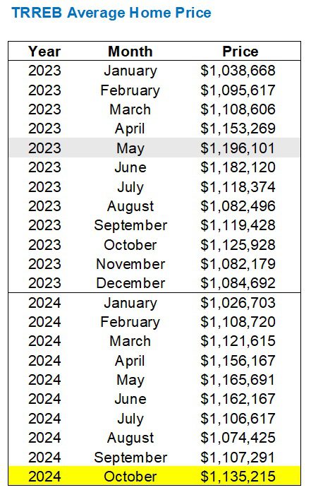
On paper, the average GTA home price in October is up 2.5%, month-over-month.
Call this “in practice,” if you want to, but the point I’m making is that every average is made up of many other averages, whether that’s based on geography, housing style, price point, or something else.
So let’s test that theory and look at the month-over-month increase by TRREB district:

Oh, wait, it’s not increases across the board, since the average home price in Durham and Halton actually decreased.
While the TRREB average may have been up by 2.5%, we saw Toronto leading out at 4.7%, while Halton trailed behind at 3.4%.
This goes without saying, and yet I’m having these conversations with many buyers and sellers who are using data points to create their own arguments.
So let’s try this again:
On paper, the average home price in the GTA in October is off 2.6% from the “peak” in May of this year.
If we were to look at the five major TRREB districts and find the peak from earlier this year, then work backward to see the percentage change, it would look something like this:
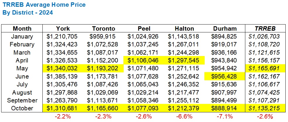
As I said: every average is made up of other averages.
That 2.6% GTA-wide decline contains smaller declines, such as York and Toronto, and larger declines, such as the substantial drops in Halton and Durham.
Now, as for what we should have come to expect for the month of October, let’s look back at the average increase from September to October since 2002:
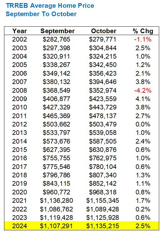
A pessimist says: “Who cares about a 2.5% increase at a time when prices are only increasing because of seasonality.”
An optimist says: “That 2.5% increase is the largest in this time period since 2014.”
Have your pick.
As for sales, they were up massively from September.
33.3%
That’s huge!
From a mere 4,996 in September to 6,658 in October.
But when we look historically, once again, we can see that the data can be used to draw a different conclusion:
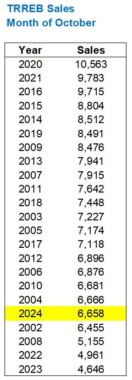
For the record, sales this past September were the second-lowest in any month of September.
So should we be holding pom-poms and popping champagne now that October sales are only the fifth-fewest in any month of October?
Once again, I would suggest that a historical context is necessary in order to put this in perspective.
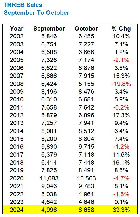
Say what you want about the overall sales figure from October, compared to the historical sales in October, but comparing the increase or decrease from September to October shows us a completely different angle:
That’s not just a record; that’s an outlier.
The highest increase in sales, month-over-month, September to October was 17.3%.
Last month, we saw an increase of 33.3%.
A pessimist says: “That’s only because September sales were so low to begin with.”
An optimist says: “Something changed in October. The entire market shifted.”
Now, what of volume of inventory?
In September, we saw the second-highest number of “New Listings” in any month of September.
Not much changed last month…
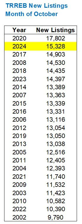
The average new listings in October, from 2002 to 2023, was 12,933.
Last month’s figure of 15,328 is well ahead, but it’s not like it’s double or triple.
We’re talking an 18.5% increase over the 22-year average.
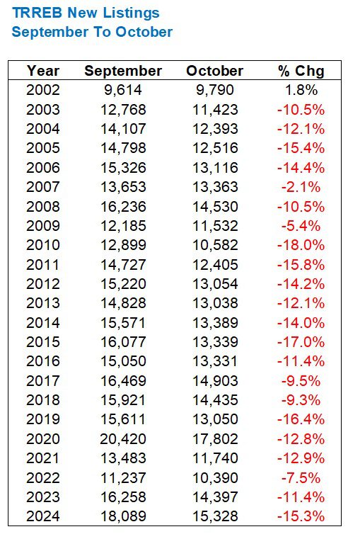
New listings declined from 18,089 in September to 15,328 in October; a decrease of 15.3%.
History shows that this is exactly what we would expect to happen:
But what of the relationship between sales and new listings?
Specifically, how does supply intersect with demand out there right now?
The absorption rate in October was 43.4%.
From 2002 through 2023, the average absorption rate in October was 58.6%:

How could this possibly instill confidence in the market?
Put in a historical context over twenty-plus years, it might not.
However, put in a short-term context, I would offer a major trend reversal:
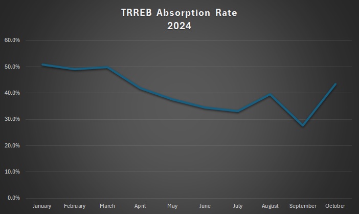
The absorption rate hit a paltry 27.6% in the month of September, which is a figure that made me triple-check and then scratch my head like a cartoon!
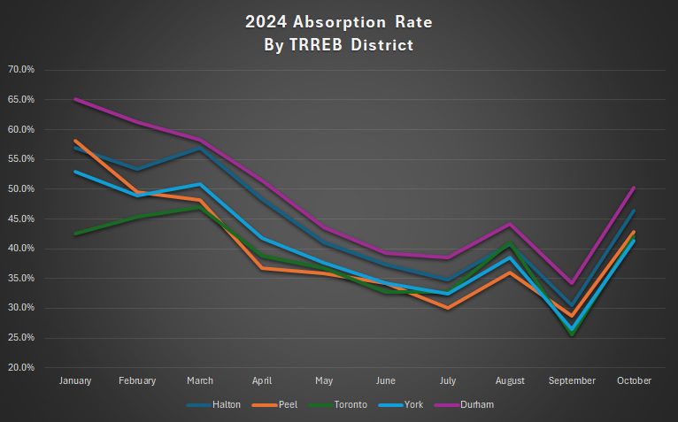
But the absorption rate shot up massively in October, from 27.6% to 43.4%, which is still below that 50% threshold that, theoretically, represents the dividing line between a buyer’s market and a seller’s market, but along with the 33.3% increase in sales, would potentially signal a market shift.
And even if we were to examine the absorption rate by TRREB districts, including those that have been hammered over the last six months, we still see the rates moving in tandem:
Hmmm….I said I would leave the rose-coloured glasses at the starting line today, so maybe I didn’t fully commit to that.
But sales were up, prices were up, inventory was down, and interest rates were cut once again.
What conclusion would you draw from all this?









Appraiser
at 8:45 am
Excellent information as usual David.
As you have illustrated, no doubt there are baseline effects that have skewed the sales data somewhat this month. However the magnitude of the rise is undeniable and clearly represents a turning point in the market.
Derek
at 12:42 pm
Anecdata update: The home in my area which held an OFFER NIGHT, listed at $1.898M, appears to have sold on or about offer night for $2.01M, i.e. $112k over list. Woot Woot!
Ace Goodheart
at 1:47 pm
Interesting situation developing in our area. There are almost no “quality” listings. Quality would mean a semi or detached house that a buyer could theoretically move into without needing to do anything first. Tenanted properties are not selling (this may be due to all the negative press coverage of “bad tenants” and endless delays at the tribunal- no one wants tenants it seems).
The interesting thing is, gut job, unlivable properties have once again been selling in bidding contests.
Quality listings sell immediately. Bully bids are back. If you are waiting for offer night, bad idea. The last three that came up sold within a few days to bullies.
The prices are still down though. They are off the peak by six figure amounts.
However from what I am seeing, if you have an un tenanted property that requires major repairs, or a move in ready house, there is a well financed, unlimited buyer pool and you likely won’t make it to offer night without meeting at least one bully.
The buyers are back (albeit, at lower prices)
Steve
at 8:03 pm
That’s right …. nobody wants tenants! We continue to favour owning here in Canada. The difficulty of removing bad tenants in a timely manner has ironically made it worse for renters in the long run.
QuietBard
at 3:54 pm
I wonder once we reach the terminal interest rate the BoC is aiming for what the real estate market will look like. I cant imagine the froth and euphoria we saw in 2021 will happen again. Then again, all the “desirable” listings seem to have attention no matter what the situation is.
Oh, also, now that The Donald is back. The smart economists at the banks are saying his American first policies could raise prices and along with it inflation. But the tariffs could also hurt the Canadian economy. Rising rates and falling GDP? Lets hope not
Appraiser
at 6:07 pm
Looks like it’s not just a Toronto phenomenon:
“Montreal’s housing market hits record October sales…October saw a dramatic upswing in Montreal’s housing market, with sales surging 44% year-over-year—the strongest October sales increase in over 20 years.”
“The average price of a single-family home rose to $589,000, up 8% year-over-year, while condominiums reached an average price of $414,250, marking a 6% increase.”
https://www.canadianmortgagetrends.com/2024/11/montreals-housing-market-hits-record-october-sales/
Steve
at 7:58 pm
It’s all about affordability, isn’t it? Rates are down, insurance now up to 1.5 million, and re-establishment of 30 year mortgages.