For those of you that don’t know, I send out an eNewsletter each and every month to my subscribers and clients, where I go over the last month’s top blog posts, the top newspaper articles, and of course – stats.
You can sign up HERE if you’re interested.
I bring this up, not to self-promote, but rather to explain why I’m writing this column today.
In the spirit of “You can make numbers say anything you want,” as well as, “For every argument, there’s a counter argument,” I realize that any statistic used to talk about the Toronto real estate market in a positive or negative light will also have a corresponding negative or positive statistic to oppose it.
When going through the TREB stats on Tuesday and writing my e-Newsletter, I wondered if, subconsciously or otherwise, I was looking for positive stats.
I know, I know, you can’t believe that a person who sells real estate for a living would be looking for positive stats. But maybe, just maybe, I was being biased.
So upon finishing my e-Newsletter, which looks at the exact same stats every month (just for continuity’s sake), I jotted down five statistics that I found the most interesting, and tried to find other statistics to oppose them.
For those of you who were on the debate team in high school (while everybody else was talking to girls…), you know that a good debater will argue one side, and then for practice, turn around and immediately argue the other.
You could also call this “Playing devil’s advocate,” which I think is a more gentle way of describing the process.
So let me show you five statistics that make the market look great, and then the accompanying arguments against them.
1) Average Home Price
The average home price in Toronto in January was a paltry $748,328, which absolutely shocked me. Not only because this is a pronounced drop from the $800,000 mark, which was the defacto “target” in each month of 2018, but also because it was actually lower than December!
So when we saw the average home price return over $780,000 this past month – $780,397 to be exact, it felt like a huge win for the market.
After all, a 4.3% increase in one month is significant.
That’s probably the strongest number to come out of the February TREB stats, and again, consider that TREB stats are generally viewed GTA-wide. We’ve spent a lot of time in the past either differentiating between the GTA and the 416, or specifically looking at the 416. I’ve made no bones about the fact that I see weakness in the 905, strength in the 416, and the combination of the two results in a relatively “flat market” that isn’t indicative of either area code on its own.
But any way you slice it, a 4.3% increase in the average home price, month-over-month big.
Not only that, the average home price remained up 1.6% year-over-year from February of 2018.
So having looked at this 4.3% “big win,” I decided to compare it to previous years.
There are two things I want to know:
1) In how many previous years did we see the January average home price decline from December.
2) What is the typical increase in the average home price from January to February?
The former is important because, as I noted above, I was shocked to see the average home price actually decrease from December to January. What this means, of course, is that the 4.3% month-over-month climb might be exaggerated if we’re not accustomed to seeing a decline in the previous month.
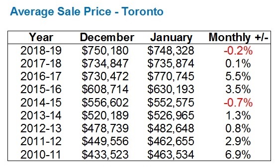
So I looked at the eight years previous to this December-January period, and found the following:
Previous to this past December-January, only once in the past eight years have we seen the average home price in December actually decline into January.
This tells me that when looking at the “big” 4.3% increase in average home price from January to February, we have to consider that the January price was already historically depressed.
Now to take things a step further, I wanted to know whether or not this “big” 4.3% increase was actually all that big.
On an absolute basis, it’s huge.
4.3% per month? Imagine that over an entire year? Those returns would make the spring of 2017 look like a warm-up!
In any given month, a 4.3% increase is huge. But how is that specifically for January to February?
That’s what I wanted to know.
So I put together the following:
Well, it seems that a 4.3% gain from January to February isn’t actually all that significant.
In fact, this ties with 2018 for the lowest such increase in a 9-year period!
2017 is an outlier, we know that. So take the average of the years 2011 through 2016, plus 2018, and we get a figure of 6.6%.
4.3% is not a big number up against a 6.6% average, especially when we’re knocking out 2017 as well!
So all told, this 4.3% increase in the month-over-month average sale price is a misnomer.
It looks fantastic, but it’s based on an already-depressed January figure, and it pales in comparison to the better part of the last decade.
–
2) Sales
While price is typically what most buyers are concerned with, a favourite measure of the market for economists, brokers and agents alike, and newspaper columnists is sales.
How much is selling is, to some people, just as important a measure as how much it’s selling for.
Personally, I think sales figures have to be taken in a relative context, with listings right along side them. If listings are down, and sales are down, then what’s the story?
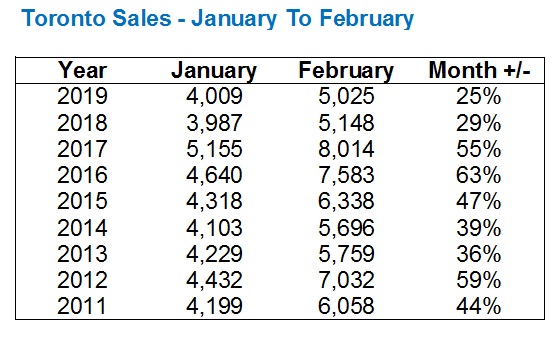
This past month, we saw a whopping 25.3% increase in sales from January to February, or from 4,009 to 5,025 in real numbers.
This is yet another number that’s being touted as a measure of success for our market, and I for one was drawn right in. January was slow, no doubt. February felt much busier, and it showed in the numbers.
But as with price, I wanted to get a clearer picture of just where things stood on a relative basis.
So I went back and asked two similar questions
1) How does this past January’s 4,009 sales look historically?
2) What percentage increase in sales should we expect to see from January to February?
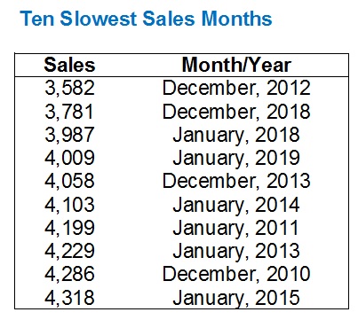
Well in terms of the 4,009 sales this past January, it’s the 4th-lowest total in any month in the past ten years. To be fair, all of the slowest months occur in December or January. I made a a “Top Ten” list just for fun:
Always consider that if you’re looking at TREB Market Watch, every number is adjusted when the next year’s edition is released, ie. if you look at the 3,582 sales in December of 2012, in the December, 2012 edition of TREB Market Watch, it actually shows as 3,690. Every stat is updated/adjusted the following year, so I always use the following year’s number. That’s just a disclaimer in case anybody else is following along.
In any event, January of 2019 was the 4th-slowest month in the past ten years for sales, but January of 2018 was actually slower.
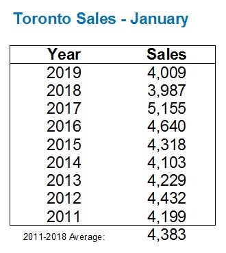
In terms of the month of January over the same 9-year period examined in Point #1 above:
The average at the bottom is 2011 to 2018, and not including 2019, because I don’t want to use the subject month within the comparable average.
So we see an average of 4,383 over the preceding 8-year period, and the 4,009 sales in January represents a drop of 8.5%. Not massive, but worth noting.
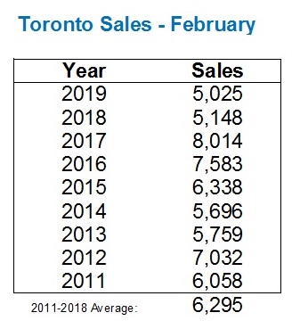
The February sales were 5,025 as explained above, with that “huge” 25.3% increase over January.
But here’s where things get interesting! Because while we saw sales increase 25.3% month-over-month, the February, 2019 sales figure is the lowest in the past nine years!
This is a full 20.2% lower than the 2011-2018 average, which actually makes February look like a worse month than January!
So can we completely disregard this 25.3% increase in sales from January of 2019 to February of 2019?
Absolutely.
When viewed in a relative context, February was a complete bust.
Oh, and in case you want to take things even one step further and see how that 25.3% increase from January to February looks in a historical context (now we’re comparing comparisons…), here it is:
–
3) Inventory
Here’s where, in my opinion, we can really make sense of both sales and price figures.
We can look at either “New Listings” or “Active Listings,” the former of which needs no explanation, but the latter of which is every listing available for sale on MLS on the last day of the month.
I prefer to look at New Listings because I want to know what’s coming onto the market.
New Listings were down 6.2% in February of 2019 over February of 2018. That’s not a good statistic for our market.
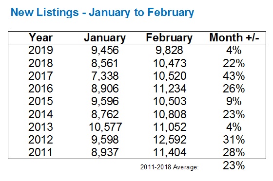
New Listings were up 3.9%, month-over-month, from January to February.
Take what you want from those two statistics, but I’ve been saying since January 1st that “inventory is low” and while the TREB stats from January didn’t exactly prove me right, I think the following will.
We’re accustomed to seeing a “jump” in new listings from January to February each and every year, and while we saw an increase of 3.9% this past month, that pales in comparison to what we’re used to seeing:
That 3.9% increase in new listings from January to February trails the 2011-2018 average by about 19%.
That’s massive.
There’s just absolutely no way of understating how important that is, and it absolutely, positively explains why sales are the way they are.
You can’t sell something if it’s not for sale.
Buyers can’t buy if sellers aren’t selling.
And while the price and sales figures being thrown around look positive, and can then be turned on their heads in a relative and historical context, they can be explained by looking at inventory numbers.
–
January to April of 2017 was the craziest market I have ever witnessed.
But through two months in 2019, I will say that this is one of the more confusing markets I’ve seen as well.
What buyers and sellers are feeling out there is not always lining up with what the numbers say, and vice versa.
There are hot and cold pockets of the market everywhere you look, whether it’s property type (house/condo), neighbourhood, price point, size, or style. Properties that you might think will sell in a day, are sitting. And properties you think might not get interest, are selling in multiple offers.
But the one constant in all of this is the lack of inventory.
February saw the lowest sales figure in nine years, but it also saw the lowest number of new listings. That, to me, points to an efficient market. One that is difficult for buyers, confusing for sellers at times, and in the end, results in higher prices – even if ever so slightly.
I’m eager to see what March brings. And hopefully it’s more inventory…











Derek
at 9:58 am
“Buyers can’t buy if sellers aren’t selling.” What came first, the chicken or the egg? There may be so many fewer sellers (and sales) because people are not interested in becoming buyers themselves. Who knows…..?????
Housing Bear
at 10:59 am
January 2019 sales will probably end up being revised lower than January 2018. The original January 2018 release reported 4,019 total sales vs this years reported 4,009 number. 10 sales seems like nothing but its worth pointing out that last years January numbers were said to be depressed by people who rushed to beat B-20 in DEC 2017.
Also for the annual price gains, not only have the past two months been below inflation (losing value in a real sense), but the YOY gains have been trending lower since October…… Could argue it has been trending down since July.
April 2018 YOY = (12.4%)
May 2018 YOY = (6.6%)
June 2018 YOY = 2.0%
July 2018 YOY = 4.8%
Aug 2018 YOY = 4.7%
Sep 2018 YOY = 2.9%
Oct 2018 YOY = 3.5%
Nov 2018 YOY = 3.5%
Dec 2018 YOY = 2.1%
Jan 2019 YOY = 1.7%
Feb 2019 YOY = 1.6%
Chris
at 11:18 am
Forgive me for playing Devil’s Advocate with your final point regarding inventory.
I’ve previously raised my concerns with New Listings as a metric. Scott Ingram summarized it perfectly when he said:
“New listings is a bit of a garbage stat as TREB tracks it. Last year had tons of terminations and relistings, making “new listings” very distorted. I pay way more attention to active listings, which are real.”
So why don’t we look at Active Listings instead. Here’s the number for January and February 2011 to 2019, with the average calculated below:
https://imgur.com/a/TvG2u8Y
We can see that this February’s active listings are at their highest level since 2014, and above the average.
We also know, from your table under 2) Sales, that February 2019 had very few sales when compared to previous years.
Put these facts together, such as through the Months of Inventory metric, and it seems that, while inventory remains low (MOI of 2.64), it is higher than recent years.
Derek
at 12:01 pm
I don’t understand the narrative that low sales is explained by low listings. The highest active listings on Chris’ chart in (Feb/2013) appears to have had below average sales. High sales did not follow high listings. The lowest active listings on Chris’ chart (Feb/2017) had the highest sales. Low sales did not follow low listings. It strikes me that listings together with sales define the market, but one does not explain the other.
Housing Bear
at 12:32 pm
Its spin. As you pointed out, some of the highest sales were in periods with lowest new listings and lowest sales in periods of highest new listings. The only time that narrative might have a bit of truth is when the market is in an absolute frenzy. In the late 2016-early 2017 when sales to new was like 90%+ and every sale had 10-12 bidders………… than sure, had there been more available supply demand would have most likely absorbed it resulting in even higher total sales. I think this relationship is more explained by price expectation and human psychology. When prices were going up 5-10% month over month, or 20-30% YOY everyone wanted to buy and no one wanted to sell.
Peter
at 12:43 pm
I was wondering the same thing, as David has repeatedly pointed out the fallacy of a house being taken off the market for a day and then relisted being counted as a “New” listing. I’m surprised he focused on that instead of active listings. Perhaps he didn’t shed all his bias? 🙂
Housing Bear
at 1:07 pm
Have read a few points made on here that seem like stock RE spin to me, but I think David looks for data that justifies his honest personal experiences within the market. He might omit or ignore some data points that go against his view (what sales person doesn’t) but to me David seems like an honest agent who works hard for his clients and as such I am sure he is doing much better with the sales slow down than a lot of other agents out there. DT condo segment which is where I believe he is mostly focused has also up to very recently has not shown any signs of weakness.
Damian
at 8:27 pm
You can’t call a David biased or doubt his integrity when he just told us that a “large“ increase in price is meaningless. That’s something that no other agent would do. He just took two points that other agents are using to spin the market, price and sales, and ripped them apart. I give him credit for that. He’s probably not going to attract a lot of new buyers with this, so I think he’s putting the integrity of his blog first.
Jennifer
at 1:09 pm
Ok but isnt the problem with active listings that it’s only a snapshot of a certain point in time. Or would you average it for each day of the month?
Your point is certainly valid but, in Toronto and this market, low inventory explains low sales. Maybe doesnt explain it all away but it plays a huge part. There are people out there who want to buy, there’s just nothing to buy. Everyone is at a standstill because the sellers are the buyers! What is that magic thing to get people moving – lower the cost of moving.
Chris
at 9:02 am
To my knowledge, TREB’s measure of Active Listings is a snapshot of listings available at the end of a given month. It would be preferable if it were an average of active listings on different days, but I still think it is better than New Listings.
I don’t agree that low inventory explains low sales. That argument seems to imply that demand for Toronto real estate is static, and it is only supply which changes, resulting in variations in sales volumes. But that seems absurd; demand can, and does, change.
The foreign buyer tax has impacted demand. The B20 stress test has impacted demand. Prices falling in 2018 has likely impacted demand.
And as Derek points out above, the times with the highest active listings had lower sales, while the times with the lowest active listings had the highest sales. February 2019 had far more active listings than 2017, and yet far fewer sales. This casts serious doubt on claims that low inventory explains low sales.
daniel
at 10:14 am
I think the argument that low listings explains low sales, at least within central neighbourhoods, is that every time something decent hits the market it’s snapped up, and for pretty good pricing (i.e. at least near the peak 2017 pricing). How much of this latent demand is out there, i don’t know. Every listing near where i live in midtown that’s well marketed is going in multiple offers these days.
Maybe there’s a very thin layer of this demand waiting, maybe it’s deep. Only a good push of spring supply will prove it out.
Chris
at 10:32 am
I don’t doubt that there is still demand for real estate. An attractive home, in a good neighborhood, priced appropriately, well it’s not surprising that it solicits bids.
I’m just questioning the assertion that low sales volumes can be explained away because of low listings. It seems to imply that demand is perpetually high, and the only reason there aren’t more sales is that there aren’t more listing.
February 2019 had 146% more active listings than February 2017, yet had 37% fewer sales. From my perspective, this appears more a result of waning demand, than low supply.
The Spring market will hopefully provide some clarity.
Condodweller
at 3:38 pm
“From my perspective, this appears more a result of waning demand, than low supply.”
I would tend to agree with this. It seems FOMO herd has thinned out.
autocorrelation
at 1:34 pm
Curiousity’s sake? Why jump through all these hoops of pseudo-seasonal adjustment (i.e. benchmarking the raw numbers against the past) instead of just looking at the actual TREB reported seasonally adjusted numbers?
TREB reports it as -7.7% on sales, -2.3% on average price.
Appraiser
at 2:01 pm
February was a terrible month weather wise. More than 50% more snow that last year. Always a factor in home sales.
Housing Bear
at 3:01 pm
Very nasty month weather wise. Could definitely see a lot of people deciding to hold off and list in the spring.
Condodweller
at 8:13 pm
This is a classic. Whenever the numbers don’t make sense, or one doesn’t like them, blame the weather. This is typical of retail earnings reports on consumer spending. David hasn’t thrown in the weather so why don’t we leave it out. Aren’t December/January normally slower due to weather in the first place? Multi month/year averages should smooth out things like weather.
autocorrelation
at 8:57 am
I’d suggest looking into the daily patterns of weather instead of the whole month. Yes it was worse but largely on weekdays and one Sunday, hardly something that would hit open houses and the like.
Appraiser
at 1:06 pm
Fewer people list their homes during stormy / crappy weather. It’s not just about buyers and open houses.
Jimbo
at 9:36 pm
Why are the numbers adjusted after a year? It is good that they don’t go back to the old pdf and adjust the as well.
I wonder if the lack of new listings is due to people who have to reqaulify IOT sell and trade up? I agree that lack of listings supports the supply Vs demand theory of increased prices
Jose Tavares
at 2:43 pm
This is quite educating and would like to sign up to this….