
Have a guess, folks!
What would you think the natural rate of turnover is in the downtown Toronto condo market?
What percentage of units successfully sell in any given year?
5%?
10%?
15%?
Please, have a guess! Give it a thought, and when you’re finished the blog post, provide a comment with your prediction. I’m willing to bet you won’t be off by much.
Fifty-dollar follow-up question: what are the factors affecting the rate of turnover?
Location?
Age of building?
Demographic?
All great questions indeed, and having gone through over one-hundred downtown condos, breaking them down by location, size, and year built, I think I can shed some light on this.
Last month, a colleague and I were talking about a buyer-client who was holding out for one specific type of unit, in one building. We told him it was a needle in a haystack, but he wanted more than a metaphor thrown his way; he wanted stats to back that claim up.
My colleague and I figured that if 10% of a building sells in any given year, and he’s looking in a 250-unit building, then there will be, on average, 25 units up for sale. With recent building trends dictating that, for argument’s sake, 20% of new units are bachelors, 50% are 1-bedrooms, and 30% are 2-bedrooms, then the 25 units up for sale would represent 12.5 (he’s looking for a 1-bed model) in that building.
We pulled the floor plans for that building, and there were nine different floor plans for 1-bedroom units, so assuming there were an equal number of each built (which is an assumption to say the least), that meant that on average, there would be 1.39 listings in any 12-month period for the unit he’s looking for.
So we asked him, “Is it worth waiting until one comes out, when you will likely have to wait 8.63 months, on average? And the unit might not be high enough, or the right view, or have the finishes you want?
He said, “Absolutely.”
Go figure!
This all got me wondering about the true rate of turnover in the downtown core.
So over the past two weeks, I’ve spent an hour each day putting together a list of all the sales in the past 12 months (11/1/2017 – 10/31/2018) in 130+ condos located in nine different downtown Toronto neighbourhoods:
St. Lawrence Market
King West
Entertainment District
Liberty Village
Waterfront
CityPlace
Fort York
Canary District
Regent Park
The most common feedback I’ve received thus far, from the people I spoke to:
“Why not look north of Bloor?”
“What about Corktown, The Distillery, Yonge/College, etc?”
“How did you choose the buildings?”
“What’s the difference between CityPlace & Fort York?”
For the first two questions, let’s just say that I chose areas that are of interest, but also where I know I can find a lot of buildings, and specifically avoid lots of small buildings that are susceptible to small sample size errors.
As for how I chose the buildings, in areas like Regent Park and Canary District, I’m using all the buildings, because I want the best picture I can get. In areas like King West, where there’s a ton of buildings, I went from memory, and made sure old, middle-age, and newer, were all represented.
As for CityPlace vs. Fort York, the latter is on the west side of Bathurst.
So here goes.
I started with the St. Lawrence Market area, which subjectively runs from just east of Sherbourne (including, say, 138 Princess, and 318 King), down to Front, over to Yonge, and up to Richmond:
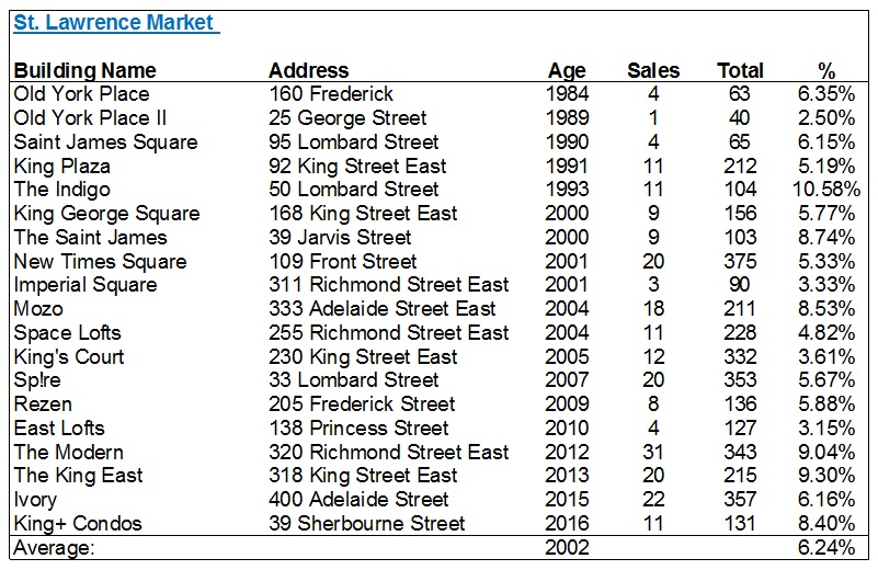
In a perfect world, I would avoid buildings with less than 100 units.
But the problem is – this would eliminate some of the older buildings, and I want the entire area to be represented.
The Indigo is an outlier at 10.58%, but I know they’ve had problems in the past (look at the monthly fees…) so that might add some perspective.
The average turnover is 6.24%, and eliminating the buildings with less than 100 units would bring it up to 6.68%, so nothing data-altering.
The average age of the buildings was 2002.
Next, I looked at the St. Lawrence Market area’s evil twin: King West:
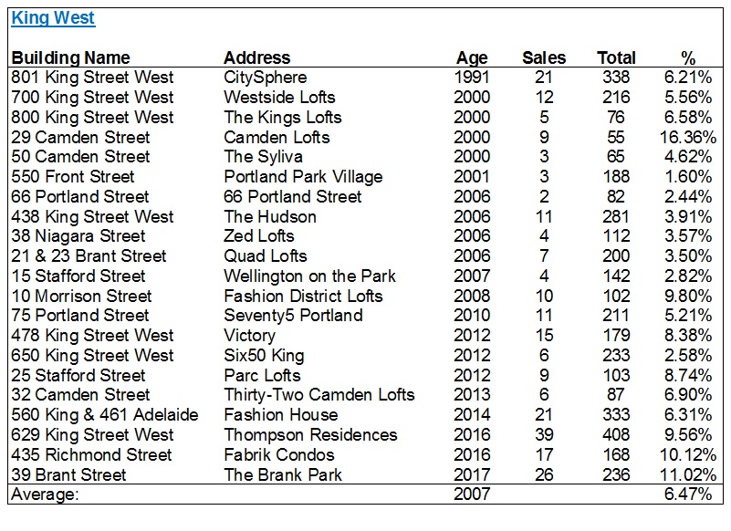
I fully expected this number, based on the 6.24% in the St. Lawrence Market area, to be around 8%.
But I was wrong.
And this 6.47% number, compared to the 6.24%, led me to believe that perhaps there is far less variance from area-to-area than we would believe.
King West is newer on the whole, as evidenced by the average of 2007.
If we eliminate buildings with less than 100 units, the average actually decreases to 6.18%.
Next, I had to look at the offshoot of King West, which is the Entertainment District. I used Spadina as the dividing line between the two areas, but I allowed for buildings on Spadina (ie. The Hudson and Zed Lofts) to remain as part of “King West.”
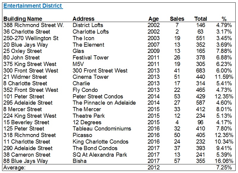
The Entertainment District average is up over 7%, but still not even a point higher than King West!
Look at a building like Bisha, which was just registered. 16.06%. That’s how new buildings typically work, as investors look to get out upon registration.
There are a few over 10% here – Cinema Tower, 101 Peter Street, and Picasso. They’re not all “brand-new,” so you can chalk these figures up to a combination of coincidence, location, and percentage of investor-owned units.
The average age here rises to 2012.
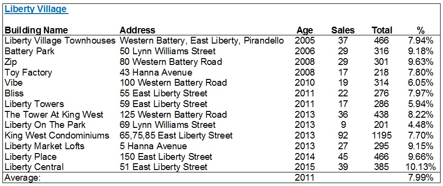
I kept the theme going, moving west to Liberty Village, where I expected to see the turnover rate increase substantially.
Why?
A couple reasons.
First, this area, for the longest time, offered the lowest-prices. You could argue today that CityPlace or Fort York are cheaper, but for from about 2006 onwards, when you wanted a good price per square foot, and/or didn’t want to live in CityPlace, you went to Liberty Village.
The second reason is because so many investors buy in this area, and while that might also be true of CityPlace & Fort York, I know a lot of agents (myself included) that push their investors to Liberty Village. The reasons are many, but time doesn’t permit a full explanation here.
In any event, I was correct about the higher rate of turnover in Liberty Village:
I was incorrect, however, in my assumption that both CityPlace and Fort York would follow that trend:
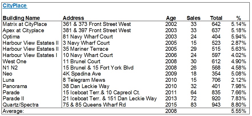
I’m absolutely shocked by that 5.55% average! Almost 2.5% lower than Liberty Village!
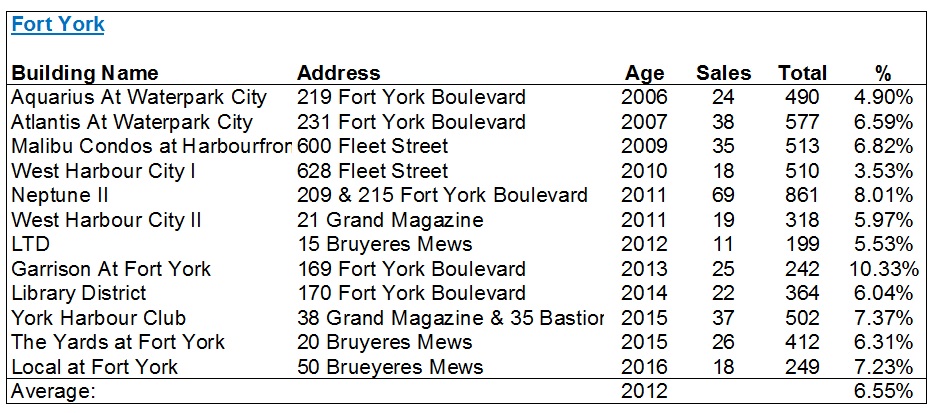
Here’s Fort York:
Having been in real estate for 14 years, I have always found myself very rarely venturing down to the Waterfront.
In fact, I have probably sold less than ten condos in the Waterfront, and it’s not as though I don’t like the area, but rather I simply go where the business goes.
Tell me if the following surprises you:
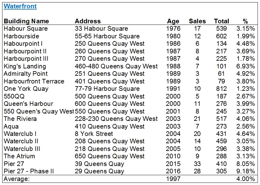
4.00%?
The lowest percentage by far?
Yes, indeed.
We can likely draw an inference here from the average age of building, but let’s come back to that.
Last but not least, I wanted to look over on the east side in two newer areas: Regent Park and The Canary District.
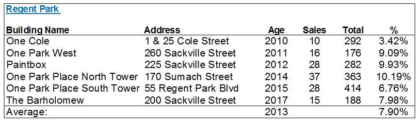
Regent Park comes in as the second-highest with that 7.90% average, and that’s not surprising.
This is the best “value area” on the east side, and while I won’t draw comparisons to Liberty Village, I will say that I’m not surprised to see these two atop the list.
Then comes the Canary District, which for those of you who don’t know, is down at Front Street & River Street. This is where the athletes village was for the Pan Am Games, and while there are a few dedicated rental buildings, these are the five condos in the area:
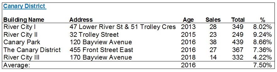
I should mention at this point – any building which was registered in 2018 was not used in these lists. I wanted to ensure there’s a fully 12 months of data, and there were a couple of buildings in Canary District, Regent Park, King West et al that didn’t make the lists for this reason.
As this blog post is slowly becoming a runaway train, I’m going to take this post into Wednesday.
For now, I welcome your thoughts…


Appraiser
at 8:42 am
Great research. Excellent data.
Tyler
at 10:16 am
Absolutely love this!!
Enough with the Friday funnies. Give us more like this!
JK. Sort of. 🙂
Chris
at 10:44 am
You missed The Richmond at 313 and 323 Richmond East, aka Melrose Place! haha
498 units, year 2000,
Libertarian
at 11:40 am
The section about the Waterfront is missing. There’s a sentence referring to it above the chart for Regent Park, but the sentence doesn’t even finish. There’s lots of buildings down there. I don’t expect the turnover rate to be high because it’s mostly older people as residents. They don’t move after five years.
And what about the Esplanade? Wouldn’t that be in St. Lawrence Market?
David Fleming
at 12:46 pm
@ Libertarian
Thanks for spotting that. Not sure what happened with the formatting there.
I had considered putting 38 The Esplanade, 25 The Esplanade, and 1 Scott Street in with “St. Lawrence Market,” but then debated another location, ie. Financial District. I simply moved on as I had 20+ buildings already for SLM. To Chris’ point below, I should have/could have included “The Richmond” as well.
Libertarian
at 10:14 am
David, thanks for the quick reply. Look forward to the continuation on Wednesday.
crazyegg
at 3:38 pm
Hi All,
David, you have outdone yourself. This is excellent data that is most likely unavailable elsewhere. Thanks!
If I could improve on your analysis, I would suggest sub-dividing each neighbourhood into 3 categories (buildings less than 3 years old, 3-10 years old and more than 10) and recalculate the average rates.
I think that this will reveal greater diversity in the data…
Regards,
ed…
Derek
at 8:22 pm
Cool deep dive.
Makes me wonder how the turnover rate changes over time from registration to 20 years old and what factors impact the changes in rate, over time. Also makes me wonder which clients seek a high turnover building and which clients seek a low turnover building.
BillyO
at 8:56 pm
Really enjoyed this deep dive David. Love how you are still bringing the goods after so many years of blogging.
jamie Johnston
at 2:36 pm
Always enjoy your blogs. Data probably most valuable for agents who do geographic farming. My guess for turnover would have been 15%. Always learning.
Denise
at 2:49 am
This was excellent, I haven’t seen information compiled like this before. Any chance it can become an annual thing? Updating it with the new numbers and some new insights each year and reposting would be awesome.