

I think the very first thing to address in today’s blog is recap from Monday’s blog post.
We looked at nine downtown neighbourhoods and examined the turnover rate in each building, to come up with an area average.
This is obviously an inexact science, as I didn’t take all the buildings in that given area, but rather a generous sample – around 20 buildings in each area, where the area provided.
There’s also potential debate about geography, but I’m labelling the areas as I see them through my Realtor-lens.
Here’s how the nine areas stacked up against each other:
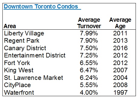
From high to low, we have almost precisely double the rate of turnover.
That’s a generous spread, no?
Average out those nine areas, and you’ll conclude that the average rate of turnover is 6.61%.
However, I took looked at the total sales from the 133 buildings I examined (exactly 2,800), and all the units, (44,071), and found a more true average of 6.35%.
So that’s it, folks.
Your answer is 6.35%.
That is, in my opinion, based on my examination of these nine areas and 133 buildings, the “average rate of turnover in the downtown Toronto condo market.”
Coming into this, I think most people would have provided a wild guess of between 5-10%. And in the end, I think 6.35% is marginally lower than what I would have predicted, which would have been about 7.5%.
But let’s look at the numbers again, and try to identify other patterns.
First and foremost, how does the age of building affect the rate of turnover?
We already have a guess, based on the “Waterfront” district showing only a 4.00% rate of turnover, with an average building age of 1997, when the next-lowest average is 2007!
Dividing a line at the year 2000, here’s how the average turnover looks:
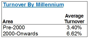
That’s a massive swing!
Nearly double the rate of turnover once again.
And from this, you might generalize, or conclude, that the waterfront is home to older condos, and many older people, who stay for a longer period of time. I think that’s fair. And I also think it’s fair to suggest that the “condo boom” of the last 10-15 years has been driven by a younger generation who buy condos downtown because it’s closer to work, and thus they’re far more likely to sell before a retiree. The condo boom has also been driven by investors, who often sell units that they purchased in pre-construction, as soon as the buildings are registered.
Now if that year-2000 dividing line isn’t exact enough for you, then let’s look at by decade:
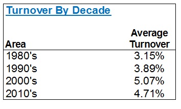
Once again, we see the 80’s and 90’s provide for turnover at sub-4% rates, and the newer construction is higher.
For those of you who live and breathe stats, you might wonder how the first graphic shows such a huge swing for Pre/Post-2000 condos, and by decade, the data looks a bit skewed. This is because the sample size for Pre-2000 was much, much smaller.
The second way I wanted to look at the data was by building size, and here’s where I’m a bit more surprised.
I fully expected there to be far less turnover in smaller buildings, but in the end, the data suggests otherwise.
Let’s start with 200-units as our dividing line:
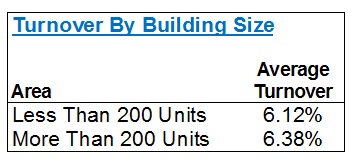
There’s almost no difference. 6.12% vs. 6.38% is essentially a rounding error.
So what if we flush this out a little more? Perhaps look at 0-200, 200-400, and 400+?
We’re basically looking at the same thing:
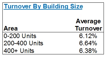
And in case you’re wondering, the rate of turnover for units of 0-100 units is 5.31%.
That’s the only place where I see any difference.
Considering the average in the downtown core is 6.35%, as established above, the fact that we see these 6.12%, 6.38%, 6.64%, and 6.38% figures tells me there’s almost zero impact on the average rate of turnover, by the size of the building.
It’s worth noting that a few of the 133 “buildings” I looked at were composed of two towers (ie. you could have two 170-unit buildings together, as “one” building of 340 units), but I don’t believe that has any impact on this data.
So let me show you one last chart, and for this, I want to go back to age once again.
With the average rate of turnover at 6.35%, and the average rate, post-2000, of 6.62%, are there any real differences if we segment those post-millennium years even further?
Yes. Yes there is.
And it’s exactly what you would expect:
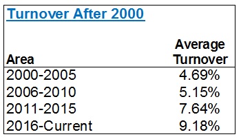
That data set reads perfectly!
From the “newer” buildings, post-2000, we still see the ageist trend.
2016 and 2017 condos (recall I didn’t use 2018 as I wanted a full year of data) are turning over at a 9.18% rate. And I would assume that an annualized rate for any condos registering in 2018 would likely show a 10-12% turnover rate, based on this trend.
As you go back in time, the turnover rate cools.
I was having a conversation today with a client about the lack of detached homes, in his neighbourhood, and the reason for that low inventory. I explained that his house is a 15-20 year house for a buyer who has the desire, and wherewithal, to stay there. This is the $2,000,000 market, FYI. I further explained that in areas where you can still find a two or three bedroom semi-detached for $800,000 – $1.1M, many buyers consider those to be 6-8 year houses. For some, that’s 3-5 years.
So when we look at condominium turnover, we have to consider the location, the age of the building, and thus the demographic that is attracted. We also have to consider the price point, and market trends.
I don’t have statistics on the length of ownership of condos versus houses, but I would make a very educated guess that there is less turnover in the housing market than the condo market. Would you not agree?
In the condo market, we have more first-time-buyers than in the housing market. We also have a lower average cost, and thus we’re looking at a much younger buyer, for the most part.
In fact, the only place this trend skews off point is with respect to downsizers who sell in the housing market, and buy in the condo market. Their time horizon is much longer, and I believe, as noted above, this explains the 4.00% turnover rate in the Waterfront area, which is home to a lot of older condos.
On the flip side, your typical 25-year-old condo buyer does not expect to live there forever, and grow old(er).
That buyer is more likely to find a partner, get married, start a family, and move to a house, a larger condo, our out of the core (another growing trend).
And the last part of the turnover-explanation is something I have alluded to several times now, and that’s the investment-buyer factor. Some investors will purchase in pre-construction, keep the unit through occupancy and into registration, and hold it long term. But many, and I’d say more, look to sell upon registration. This explains why the newer buildings have higher turnover – a horse I believe we’ve successfully beat by this point.
All told, I think a prospective condo buyer who is tartetting any building in the downtown core would be wise to consider this data.
I can’t tell you how often a buyer tells me, “I want to live at the such-and-such lofts,” without having any idea of the extremely low-percentage chance that he or she has of actually finding a unit up for sale, and having that unit be the right size, style, and price.
Happy hunting!


Derek
at 1:36 pm
I guess I’ll be the first to say it: that there is some fantastic information about how condo markets function. [hands slowly clapping]
Condodweller
at 4:49 pm
With the recent boom in the condo market, I actually find these turnover rates low. I wouldn’t think that building size makes a significant impact on the stats as fewer sales of fewer units should still provide an accurate turnover percentage. Lower turnover for older buildings may be a function of more and more people settle in for the long term as time goes by effectively removing units from the potential for sale pool. People wanting to buy new units probably also influences the high turnover in the newer buildings.
What I’d be curious about is how the runover rates correlate to the quality of the building. I would expect the better buildings to have a lower turnover rate though investor sales the last couple of years who took advantage of the recent price runups probably have skewed the numbers.
Appraiser
at 7:01 pm
“GTA house prices are trending up 5% midway through November even though sales are down 14%. Why? Likely because new listings are falling at an even faster rate – down 24% over last year.”
Supply and demand…what a concept.
That will be 6 months in a row of GTA sale prices surpassing last year’s y/y numbers.
Meanwhile stock market taking a major dump…shhhhhhhhhh! don’t tell anyone.
PS Condos up ~8% and detached ~3%.
Oh SNAP! don’t tell Ben Rabidoux – clown still jokes about “shoulda-bought-a-condo.”
Yeah – Bears
Condodweller
at 8:00 pm
Appraiser you keep spinning your wheels. How about you save your keyboard and post when prices have surpassed April 2017 numbers?
Chris
at 10:12 pm
Check the latest Teranet HPI publication. Shows when peaks attained in various Canadian markets and where they are today. Toronto peaked July 2017 and is down 4.02% now.
NotBullNorBear
at 4:17 pm
So the 11,630 homes that changed hands in April 2017 (about half of one percent of all GTA homes) are the absolute benchmark against which the entire GTA market is to be measured? Why, exactly?
Condodweller
at 4:42 pm
Because the permabulls around here would have us believe that prices are only going up and April 2017 was a highwater mark set for SFH. The July high Chris is referring to I’m guessing is an average not that couple of months make a difference anyway.
Chris
at 9:07 pm
The figure I referenced is Teranet’s HPI. Their metric typically lags the TREB average price, hence the different timing in peaks.
Chris
at 10:08 pm
“Is this bullish or bearish for housing?”
“I think it’s still pretty neutral. Sales and listings were both skewed up last year because of stress test. The market is still balanced right now”
– John Pasalis, in response to the above replied question
NotBullNorBear
at 4:18 pm
Yup, sounds “pretty neutral” to me as well.
FreeMoney
at 4:39 pm
Taking a simple average of the twelve monthly TREB averages in 2017 gives a figure of about $806,000 (the actual 2017 average price was $822,597). The same calculation for the ten monthly averages thusfar in 2018 gives a figure of about $786,000 which is less than 3% below the 2017 “average of averages” figure, and about 4.6% below the $822,597 figure).
Even assuming the November and December figures dip to the levels seen last November ($761,757) and December ($735,021), the 2018 “average of averages” would be in the $780,000 region, about 3.2% below the corresponding 2017 figure. Neither “sky is falling” nor “to the stratosphere.”
Chris
at 9:11 pm
Agreed. Market suffered a downturn mid-2017 and doesn’t seem to have moved significantly since then, despite appraiser’s juvenile and cringeworthy efforts.
BillyO
at 9:01 pm
Could you do something like this, but for renters? As in what percentage of a building is renters? I’d imagine certain districts would be way higher than others (CP and LV leading the way? Versus SLM having the least amount?). Not sure if this is feasible but just throwing it out there as if you are not busy enough! Regardless, thanks again for these insightful blogs David!