

I don’t know what got into me today, but apprently I felt like doing two hours of data entry!
That, and I really wanted to know the answer to a question that I had proposed…….to myself.
Does price relief exist outside the 416?
I mean, does it really exist outside the 416?
We all think it does, and hope it does. I’m selling more and more houses outside the core to buyers who can’t afford to live in it, at least, in a house that they want. And overall prices are lower.
But are they lower on a relative basis? That is to say, have prices outside the core been slower to appreciate than prices in the “red-hot” Toronto market?
That’s what I wanted to find out today.
So I decided to look at a thirteen areas (the unlucky number is a coincidence) where a lot of buyers are moving in lieu of buying homes in Toronto:
Burlington
Halton Hills
Milton
Brampton
Caledon
Mississauga
Aurora
Newmarket
Whitchurch-Stouffville
Ajax
Oshawa
Pickering
Whitby
Apologies if I didn’t include your area, but while I didn’t feel like anything in Simcoe County was relevant (Scugogites, don’t hate me…), and I also didn’t include areas like Markham because prices are already so damn high, and my clients aren’t really looking for “relief” there.
So before we being, just as a refresher:

“Toronto” for our intents and purposes is not the GTA, but rather the area noted above which is the waterfront, to 427/Humber River, to Steeles Avenue, to the Scarborough/Pickering Townline.
Keep in mind this is not the central core, but rather this area encompasses lots of “cold(er)” real estate pockets. Rexdale, Agincourt, Malvern – these areas are all included in our “Toronto” area, so this is not an exercise in pointing out how hot the central core is, but rather trying to see how prices have fared in areas outside it.
I’ve decided to look at detached houses in this experiment, since detached houses are the “Holy Grail,” and it’s what everybody would want, in a perfect world.
I’m also going to look at not one, but three months: April, May, and June, which typically represent “peak season” in our market, but also because we want to include 2019 numbers in this experiment.
So I’ve inputted all the sales and average prices for April, May, and June, for 2015, 2016, 2017, 2018, and 2019, in all thirteen areas.
Then I’ve taken a weighted average to find an overall price, which is to say that if April saw 100 sales and an average price of $500,000, and May saw 250 sales at an average price of $520,000, then surely an averaging of the two would not paint a correct picture, since 2.5x as many houses sold at the higher price in May. I’ve left the calculations out, and simply presented the findings by year for each area.
Starting with Burlington:

So let’s start here with the 27.1% appreciation from April/May/June of 2015 to the same period in 2019.
In four years, the average price of a detached home is up 27.1%, or roughly 6.8% per year, not compounded.
That’s a reasonable return in any market, and while Warren Buffet wouldn’t be impressed, most pension funds would be.
I’ve also included the year-over-year, figures, as I think this will shed some light on the peaks and valleys, and the volatility.
–

In neighbouring Halton Hills, we see a whopping 41.4% appreciation in four years, which is just uncanny.
The other items to note here are twofold:
1) The decline in prices from 2017 to 2018 is only 3.0%, which as you’ll see later on, is
2) Unlike Burlington, the 2019 average price did not drop. In fact, while 13 of 13 areas saw prices drop from 2017 to 2018, only 6 of 13 areas saw a further drop in 2019.
–

Here in Milton, we see another big number – 37.9% in four years.
As we’ll note throughout, Peel and Halton have done much better than York and Durham.
–

There’s far more volume in Brampton than in any other area on our list, and that simply takes the potential for volatility out of the equation.
–

Here’s our big winner; I won’t try and save the surprise for the end.
There’s so much to note here with the Caledon numbers, I almost don’t know where to start.
First, see the 35.7% increase, year-over-year, in 2017. That’s atop the list.
Second, see the 57.3% increase inside of two years. That’s positively mind-blowing.
Last but not least, the 46.1% increase from 2015 to 2019 tops our list.
–
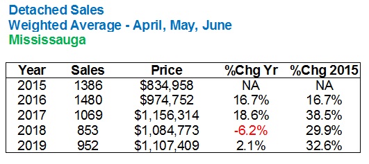
I have nothing to note here except that Mississauga’s numbers are unspectacular, on a relative basis.
–

Here’s where I notice another trend: although Halton Hills, Brampton, and Caledon hold 3 of 4 top spots for the appreciation since 2015, none of them saw back-to-back, year-over-year increases in average sale price over 20%.
Aurora saw a 26.2% increase in 2016, and that was followed by a 23.5% increase in 2017.
And yet Aurora, when all is said and done, will hold the second-from-the-bottom spot for appreciation since 2015, as well as the second-biggest decline in 2017.
–

The Newmarket numbers follow Aurora very closely, as you would expect, given their proximity.
–

Here’s an interesting coincidence, if you want to call it that: the 57.2% increase in value from 2015 to 2017 is 2nd of the thirteen areas on our list, only by 0.1% to Caledon’s 57.3%. And yet, Whitchurch-Stoufville not only has the worst appreciation from 2015 to 2019, but also the biggest drop in 2018.
Good time to buy in Stouffville, wouldn’t you say?
–


Let’s look at these areas all together, since many of you driving along the 401 toward your cottage really don’t notice a difference between Ajax, Oshawa, Pickering, and Whitby.
But Pickering does have some pricey areas! Detached homes peaked here at just less than $1M in 2017.
Oshawa remains the cheapest area on our list.
–
So what do we make of these numbers?
I mean, some of them are just bonkers, and we could talk for days about 2017.
But is there actual “relief” to be seen here?
I suppose it all depends on what we’re getting relief from, so why don’t I share the same numbers, run for Toronto?
Here you go:

Wow.
These numbers look pretty tame in comparison to several of the areas above!
I would note that sales are up significantly in 2019 over 2018, but that’s after a massive drop from 2016, to 2017, to 2018.
The increase in prices, surprisingly, pale in comparison to some of the other areas, and that’s whether we’re looking year-over-year, or from 2015 to 2019.
So is there any relief here?
To be honest, not really.
Look at where Toronto ranks on the list of respective increases in average detached home sale price from 2015 to 2019:

Damn, Stouffville is looking good right now!
And for the life of you, did you ever think that Milton would out-appreciate Toronto by 10% over a four-year period?
Just for “fun,” let’s look at the decline in each of the thirteen areas from 2017 to 2018, just to put that crazy year in perspective:

I still can’t get over Caledon. The region is 4th from the bottom on this list, but still saw a 57.3% increase over four years.
–
So what do we make of all this?
Well, I suppose that every time I hear radio callers suggest that the government should “seize” all houses so that we can “start from scratch” with the housing market, and offer properties to everybody, in a “fair” system, where prices are more reasonable, I’m reminded that people have no idea what the hell is actually going on in the market.
Toronto is hot.
Ontario is hotter.
Tell me that it’s really the “Greater Toronto Area,” but do you know what’s happening in Niagara-on-the-Lake right now? or Hamilton? Or Port Hope?
Let’s split the difference and say that it’s the “Golden Horseshoe” that’s hot.
And since the Golden Horseshoe counts for 55% of Ontario’s population, and 21% of Canada, I think it’s reasonable to say that these prices are simply the new normal.
If you’re looking for “relief,” well, I think you’re better off with a Rolaid…


Appraiser
at 7:20 am
“New York City population shrinks for second year in a row” https://www.nydailynews.com/news/politics/ny-city-census-population-declining-population-county-error-20190418-u2kghjrorvddjpenjdt4xi2pwe-story.html
“Toronto Is The Fastest-Growing City In U.S. And Canada” https://www.huffingtonpost.ca/entry/toronto-population-growth_ca_5cf28f26e4b0e346ce7eef73
Ed
at 8:17 am
In Welland prices are up around 35-40% from 2016.
There was a ton of activity in 2016 and 2017, 2018 held steady and it appears to be hot again in 2019. No doubt this has a lot to do with people moving here from the GTA.
R.E.M
at 10:40 am
Maybe I’m not understanding but there appears to be “price relief” which to me is simply – what is the cost of two similar housing styles in their respective municipalities and is there a difference in dollar values. Caledon, Mississauga and Aurora are the only regions with average prices over a million dollars in 2019, which is a lot lower than Toronto’s $1.375 million. Sure the delta increases in the smaller municipalities are higher over the 4 year period but the overall price is still significantly lower. Over a quarter million cheaper which is approximately $1200/monthly (25 year amortization). Which is nothing to sneeze at, in my opinion.
JL
at 11:08 am
I was going to suggest the same. The data above shows that the level of “price relief” available outside Toronto is falling (with price appreciation higher than Toronto, thus closing the price gap), but the costs are still lower overall. In other words, you can still get price relief by buying outside the city; its just not nearly as tempting with the price gap having narrowed over the last several years.
Condodweller
at 8:37 pm
Agreed, for price relief, we’d be interested in the absolute $ amount. In the decline chart if we were to multiply the average house price for each region by their percent decline I think the $ amounts will be similar (just eyeballing it and a sample calculation) meaning if houses are cheaper, to begin with, one would still get relief.
Definitely interesting numbers. Well worth the two hours, thanks!
Andrew
at 9:23 am
Yeah I think there are two kinds of relief:
1) Absolute relief. Prices compared to Toronto.
2) Relative relief. Price appreciation relative to Toronto.
Personally I find the second point to be more helpful. We all know that prices are lower in Ajax and the like. But how are prices rising? That’s information we can’t easily obtain. It’s also something that would probably surprise most people. I never would have thought this many areas out out-appreciate Toronto.
Condodweller
at 2:48 pm
As Einstein said it’s all about perspective. Greater GTA started outpacing Toronto after huge increases in the city to the point of unaffordability. I suspect if David did this exercise between 1996 (bottom of the market) to today Toronto still outpaced outlying areas.
Professional Shanker
at 7:46 pm
I believe the common knowledge/myth of urban real estate outpacing it’s outer suburban regions by a significant % is largely inaccurate, similar to my vacation property vs urban real estate point I made successfully days ago, well eventually once I dug up the stats.
TREB started to keep track of 416/905 split in 2012. 1996 to today would be a great exercise.
Using June averages:
416 Detached – $1.333k (2019), $804k (2012) – 66% increase
905 Detached – $922k (2019), $573k (2012) – 61% increase
416 Condos – $637k (2019), $365k (2012) – 75% increase
905 Condos – $484k (2019), $287k (2012) – 69% Increase
High and low end of the markets covered. Why would the value of the land in Toronto appreciate quicker than the burbs? Isn’t the rate of increase relative? Toronto land gets more expensive and constrains affordability more people will purchase suburban homes, and vice versa which David showed above.
Why would Toronto land appreciate at a higher rate? One reason I can think of is infrastructure congestion making commuting too long. What is your take?
Professional Shanker
at 11:35 am
I suppose what it really comes down to mathematically over the long term is what % of the property is land value vs. structure value. Typically in suburban areas the structure value will represent a larger proportion of the property’s value vs urban areas, therefore urban wins out, by how much is dependent on the ratio above.
ORHM
at 10:46 am
I wonder if the trends similar for Oakville, Richmond Hill, and Markham?
Was there a particular reason why those 905 areas where not included in the analysis? I wonder if they would be high or low on the 2017 to 2018 decline in value list….
SW
at 11:08 am
Fascinating analysis. I’d also be interested in seeing this over a longer period, and to see if the relative discount ($ / %) of each region vs. Toronto has changed.
For some of those regions, including Caledon, I wonder how much new builds being completed affects sales prices. That can dramatically alter the sales mix depending on how large the houses are that are being built, and they are being stood up by the dozens.
Speaking of Caledon, the completion of GO stations has likely helped quite a bit.
CBDXYZ
at 12:21 pm
you got to look at price/sq ft; and the age of the house too. I am sure the Toronto stock is smaller and older houses too. So, with that the gap on a comparable basis is going to be even larger. So, i think there definitely is relief to be had, esp if you dont have to commute to work everyday for there to Toronto proper.
Appraiser
at 6:33 pm
The house price relief experienced from buying in the outer GTA does not always measure up so favourably when balanced against the cost of living increase.
Time and money spent commuting is no bargain. It’s a trade-off which is worth it for some people. Not all.
Jimbo
at 11:11 pm
Completely agree. I don’t think you can accurately put a cost on time away from family. Anything over 30 minutes adds up. I believe the average commute from inside Toronto is about 30 minutes so that is my baseline.
IHaveASemi
at 3:51 pm
Semi-detached homes in the 416 went up 38% from June 2015 to June 2019 – 10% more than detached homes. The reason – affordability.
Appraiser
at 3:56 pm
It’s called the Golden Horseshoe for a reason.
Oh, yeah – great stats and data David. Well done.
cyber
at 2:50 pm
Oshawa will be an especially interesting one to watch more closely after the GM plant closes this year. Durham Region government says ~5000 direct jobs will be affected (GM says ~3000), and ~15,000 indirect at suppliers and other businesses affected.
Obviously this could take months or even years to actually materialize in a local “dip”, especially as David has pointed out there has been a lot of appreciation in the market and a lot of these folks will have access to HELOCs to tap into for a bit. However, it will almost certainly happen as we all know the employees with their current skill sets won’t be able to find comparable-paying jobs even as the job market has been running pretty hot.
Angeline
at 7:47 pm
Can you do this again for 2020? It would be very interesting to see the numbers with COVID-19. Or maybe you did already…. I’m interested in 2017 to 2020