
What’s the only thing worse that a bad idea?
How about five bad ideas?
The five finalists for the design of the new North Market have been released, and each one is more awful than the next….in my humble opinion.
If the sink ain’t broke, don’t fix it…

Hey, remember a few years ago when that space ship crashed in downtown Toronto?
Yeah….it crashed into a building around Bloor and Avenue Road.
Oh, wait….sorry….that’s just the new design of the Royal Ontario Museum…
I can’t remember what I first thought when I saw the “new” ROM for first time, but it was something along the lines of “what the” followed by characters like @#$%* and others…
Some called it “a fusion of new and old” but I called it bizarre and quite out of place.
But I understand; it’s art, afterall. So why not get a little crazy?
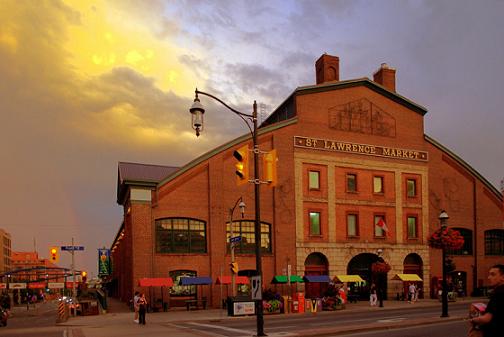
Last Friday, five short-list designs were unveiled for the St. Lawrence Market’s new North Block building.
The designs have been in the works for quite some time, as the plans themselves to rebuild the north building have been in the making for over a decade now.
The existing building on the north side of Front Street (not the actual St. Lawrence Market itself, which is on the south side), was built in 1960 and has been criticized for its ugly design ever since. Plans to replace the building are almost as old as the building itself.
The “new” building, according to Toronto City Councilors, will consist of a marketplace on the ground floor that will continue to accommodate the farmer’s market on Saturdays and the antique market on Sundays, but there will also be traffic courts on upper levels.
A seven-person “jury” will be accumulating feedback and decide on a winner to be unveiled on June 7th. The “jury” consists of designers, architects, and a Toronto newspaper columnist. You can read their bios here.
Personally, I hate all the designs. Perhaps my cynical nature would lead you all to expect nothing less, but seriously, let’s think about this for a moment…
The St. Lawrence Market is one of the most beautiful buildings in our city, as it is both architecturally pleasing as well as functional even a century later.
The new designs are all gaudy and completely clash with the classical, under-stated, and historic styles of St. Lawrence Hall, St. James Cathedral, The Daniel Brooke Building, 81 Front Street, and a host of other 100 – 200 year-old buildings within a city block, in addition to the St. Lawrence Market itself.
Let’s take a look at each of the designs, and I will give you my straight-from-the-hip feedback…
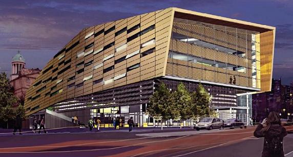
This is absolutely awful.
It looks like a huge block of cheese, or maybe a piece of Lego.
It looks more like a hockey arena in Los Angeles than it does a suitable venue for a quaint antique market, or a place to buy vegetables on a Saturday morning.
Why must all the designs be so futuristic? Can’t we design something that is brand new but looks timeless?
See the clock tower of the beautiful St. Lawrence Hall in the background? Can’t we design something to match that?
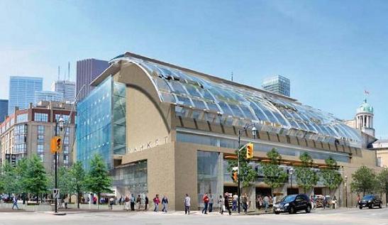
This is the only one of the five designs that I don’t hate, but I can’t say that I love this one either.
The large letters that spell “MARKET” on the east side of the front of the building give it a nice touch, although it could be argued that this too looks like a hockey arena.
I like the glass facade on the east side, and the building just seems to fit in a little better with the area. The beige/grey exterior won’t draw as much attention as that yellow block of cheese in design #1.
I like this design the most because it is simple. But that’s merely a starting point for me!
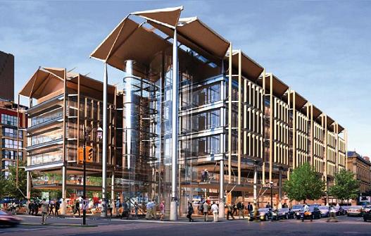
This is just ridiculous.
We’ve seen designs like this before – the ROM, the AGO, and part of U of T on Spadina.
Aren’t we trying to come up with something that actually fits with the area?
This is just another block of cheese…
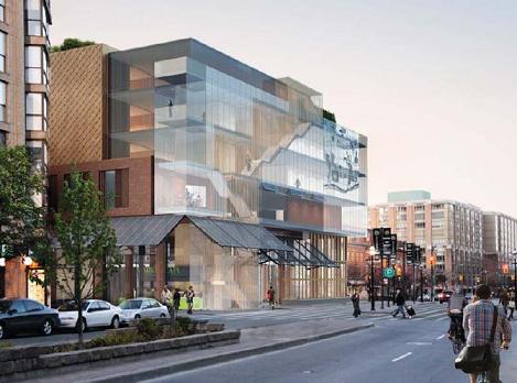
“Nobody can be told just exactly what the Matrix is…”
“Beam me up, Scotty!”
The front of the building looks like a time machine mixed with a test-tube from grade-six science class. Is that an elevator, or a laundry chute?
What’s with all the glass? Why does every design have to be ripe with glass and completely see-through?
Two words: RED BRICK!
This one is just really, really boring!
Not that I want something flashy, because I don’t. But this is just a glass block!
Do you remember what the market looks like?
What would be so wrong with constructing a red brick building on the north side of Front Street that won’t look completely out of place when compared and contrasted with the buildings around it?
Why must we build a futuristic glass structure that is round on one side or looks like a spaceship?
I’m not an architect, so I’m hardly going to draw you a rendering of what I have in mind.
I just think that we should preserve MORE of Toronto’s history, and a way to do that is to construct timeless-looking buildings instead of “new-age” monstrosities.
If you think I’m wrong, I’d like to give you an example of a terrible “futuristic, new-age, architectural gem” gone awry.
In the mid-1980’s, plans were in place to build a baseball stadium in downtown Toronto that would catch the eye of every sports fan on the planet. The futuristic “dome” would even have a retractable roof!
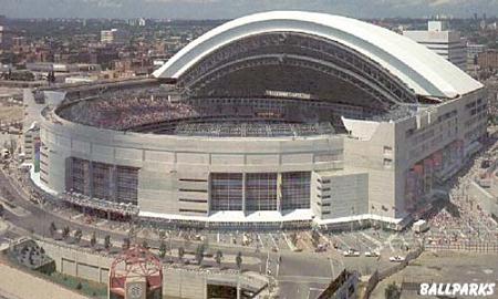
Skydome, Opened 1989.
This concrete monster opened its doors in 1989 to much fanfare, but within a few short years, the styles and tastes in the baseball world changed, and fans began to favour the classic-looking ballparks once again.
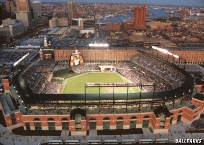
Camden Yards, Opened 1992.
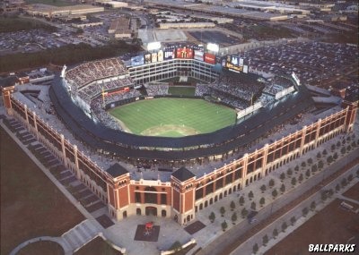
The Ballpark in Arlington, Opened 1994.
I dare you to tell me that Skydome is a nicer ballpark than either the home to the Texas Rangers, or that of The Baltimore Orioles.
Red brick, green grass, treed cobble-stone paths, outdoor games, and bright lights will trump dreary indoor concrete any day of the week.
Skydome is laughed at in the baseball world and widely considered the worst stadium in the league now that the Metrodome has been replaced in Minnesota. But when Skydome was in the process of being created, its designers longed for something revolutionary and different.
If the designers of the new St. Lawrence Market North decide to create another ROM, I think it will be a mistake that we regret for years.
It might take until the year 2092 for the space-age design to fit in with the rest of the city….unless the aliens invade earlier than expected, in which case they’ll feel quite at home…


Patrick
at 10:14 am
Couldn’t agree more. These 5 designs are awful, and I don’t get why people like the modern look so much. Maybe if everything else around it had a modern look, but it doesn’t!
There is something to be said about a timeless, classic look for a building — especially when everything around it is actually 100+ years old, as we see in the SLM.
Luckily some builders have tried to make new buildings fit in with the neighbourhood. The condo at Adelaide and Jarvis/George (I forget what it’s called)… when you look way up sure you see hundreds of windows, but at least at eye level they’ve used mostly red brick, and classic looking stone on the south and east sides of the building.
Other than the cold parts of the season, I agree the Jays need a fresh start — an open-concept baseball stadium on the water… big homers go into the lake and create a stir among boaters with nets (like in SF)… although a VWells homerun ball won’t fetch much on ebay. Trouble is Rogers uses the Jays as a loss-leader to sell cable and wireless, and realistically no one can compete in the AL East, with NYY, Boston, Tampa. So they figure why bother?
Billy
at 4:05 pm
You are a true jerk! Hope you die mother fucker!
Mike
at 11:10 am
100% in agreement.. why not just renovate the interior of the structure and save some of these wonderful old buildings.. oh wait then the city wont get any new money.. ok nevermind
not one of the designs even keeps the original facade..what a joke..
Destructicus
at 11:14 am
#1 looks like Shockwave’s chest plate from G1 Transformers. No dice.
But 3 and 5 actually look pretty good. Then again, I’m one of the few people who like how bold the ROM and AGO look. The copper of 3 is a great idea. 5 has some great textures to it, with a conservative outer shape. I think it’s my favorite for being bold, but not too bold.
Conceptually, all that glass creates a more open space inside the building, and practically it’s more energy efficient to build with glass, and light during the day. Also, the new materials being used in construction today are stronger and lighter than I-beams and red brick (btw, we aren’t Boston so we don’t need more red brick).
The way a building lives is the real test of it’s effectiveness, and the reason I think the ROM deserves less criticism than it gets. In fact, some praise would be nice. It’s just trendy to rip on it because it’s so bold. The outside of the SkyDome looks great. It’s the inside people don’t like (especially when it’s empty).
I like classical architecture. My favorite building in the city is Whitney Block. But to build another would be a mistake. Next to that Mies’ TD Centre is king, with a blend of innovation and conservative design.
OCAD pushes things too far. I think the best example of innovation in design, mixed with the classic style of the area, is the Okinawa Churaumi Aquarium.
I like how Toronto is creating a new identity with bold architectural designs in and around existing buildings with more classic designs. We just need to replace OCAD. Primary colour schemes!?!?! really!?!? Give me glass and copper any day.
Kyle
at 11:29 am
Architects have become name-brands. And those foolish high-brows in charge of choosing design lap up the name-branding like boxing day teenagers at Vaughn Mills. In their zeal to bring TO a “Libeskind”, “Gehry” or an “Alsop”, they forget that maybe a building should actually be attractive and functional for a long time.
So yes, now our city has it’s name-brand buildings, but unike the Sergio Valente jeans that we are all embarrassed to admit we owned, we can’t just hide these buildings in the back of the closet.
DP
at 1:47 pm
I simply find it ironic that the writer contradicts himself by criticising the last one. Too boring? “But this is just a glass block!” I’ll let the name dropping while ranting about King West go, but it is dishonest to suggest that you do not like something because it is boring while ranting about others for trying too hard. Plus glass boxes are likely quite functional – another item the writer longs from in other designs but does not see when it hits him in the face.
I do not really care what the building looks like. Every style has its merits if they are well done. Brutalism is generally regarded as the worst style of the 20th century but that is only because it was so often poorly done. When done well (Boston City Hall) it can be quite something.
On the designs themselves, I would only comment that the fourth one looks a lot like Centre Ponpidou in Paris. Parisians hate everything (much like the writer) so there is no surprise there. My only concern is that this building needed a 560 million French Franc (remember those?) or 125 million CAD renovation only 20 years after it was completed because the complicated design made it have poor resilience to the weather. Remember that they do not even have real winters there. If the Canadian Dominion building and Union Station are indicative of how much we like to maintain buildings in Toronto, #4 would not be advised.
LM
at 9:47 pm
I’m all for modern architecture, in fact, I love it. But like everything else it has a context. And I agree that so far, the contestants look like they are trying too hard, for absolutely no reason, and to the detriment of the surrounding area.
Oh, and, I’m all for modern architecture…. when it isn’t shockingly ugly, or worse…. boring!
Surely there is some architect in our city who can come up with something that gives a nod of respect to the old building/ that doesn’t look like martians or investment bankers designed it/ that still takes us forward into the next quarter century???
It’s not rocket science. It’s just acknowledging respect for your predecessors and adding a twist, yes?
earth mother
at 6:02 am
So many cities make great efforts to refurbish their old market areas, with great results… why does Toronto have to go for the ultra-modern look?? These proposed designs are eyesores… why not save the old market, renovate & enlarge it, but take pride in its historic charm… We don’t live on the moon. Aren’t there any architects today who can restore the SLM instead of bulldozing it and throwing up a space-station?
Whitfit
at 12:53 pm
Mike (11:10:31) :
-This is not actually replacing the South Market – nobody would want to keep the North Market facade that is there – it is a POS.
Destructicus (11:14:57) :
-I love the OCA building. It is bold, interesting, and fits the area. But, the SLM needs to be something that fits that part of town, and fits that purpose. I don’t really like any of these buildings.
I hate namby-pamby “it should look classic arguments”. It is like time froze when many of our current buildings were built. Buildings from different eras look good. No need to try to be some kind of throwback.
I do kind of think #2 is ok -there is the echoing of the curve of the roof of the South Market. I am also ok with no brick. But, what about some nice wooden beam and glass action kind of like the new AGO but mirroring the lines of the South Market? Unfortunately, the traffic courts on top limit the design options for this building.
Ticked off
at 11:54 pm
OK are you kidding? Ever single building constructed that you have shown here were created by true artists who worked day and night to render a mere 2 dimensional image into a life size fully constructed building! It’s BORING? You have got to be joking. If you dont like it then build your own damn buildings.