

How is this for a follow-up on Monday’s blog?
The timing is perfect.
There was no shortage of articles earlier this month about annual “UBS Global Real Estate Bubble Index,” which is published every year around this time, but most articles leave me disappointed, to be quite honest.
Like this article, for example, from the Financial Post: “Toronto Is Now The World’s Second-Most Overvalued Property Market: UBS”
Not only is this article a meagre 565 words, but I also don’t love the conclusion drawn: that Toronto is the second-most “overvalued” property market.
Is that what this article is saying?
Because UBS refers to this as a “Bubble Index” and that’s something different.
Without getting too cynical here, let me just tie this back to Monday’s blog post. On Monday, we looked at whether so-called “fundamentals” were accurate in predicting future market events, or even explaining past market events, as a couple of academics tried to do, unsuccessfully. We discussed whether data that “should” point to A, B, or C happening in the market place is at all accurate, and whether or not there’s a higher or lower chance that it ends up pointing at X, Y, and Z.
So let me throw you another bone here and ask if a “bubble index” is the same thing as suggesting a market is “over priced.”
Personally, I think these are two different things.
Labelling a market within a “bubble” seems to infer that it’s going to pop. A “bubble index” would then be a list of properties that are sequenced in order of pending doom.
Referring to a market as “overpriced” doesn’t, in any way, infer that the market is going to “pop.”
Once again, I feel like all the newspapers got this one wrong, as is so often the case, since they merely chose a sexy headline without giving two seconds worth of thought to how the headline tells the actual story.
And if we tie this back to Monday’s discussion, can we really make a claim that a market is “overpriced” just because it’s expensive?
Is a Louis Vuitton handbag overpriced? I think it is, but that’s my opinion. I’m frugal, and I don’t see value here.
And what if real estate keeps its value, and continues to rise thereafter? If a condo is “overpriced” at $500,000, because it’s worth far more than standard market fundamentals would otherwise have us believe, then what do we call it when it’s worth $600,000? And then $700,000? And then $800,000?
That seems to be the theme in the annual UBS Bubble Index, where the same cities, over and over, are ranked. And when real estate in these cities continues to appreciate, then the rankings seem a bit silly.
This year, as the newspaper headlines tell us, the city of Toronto ranked #2 in the world on the bubble index, which, as discussed above, may or may not mean it is also the #2 most “overpriced” in the world.
You must be a subscriber to get the full report, but HERE is a link to a pdf that I think you can access regardless of subscription status.
Here’s the full list of cities analyzed in 2019:

The report notes:
The greatest risk of a real estate bubble currently exists in Munich, followed by Toronto, and Hong Kong and Amsterdam.
On the whole, the report explains:
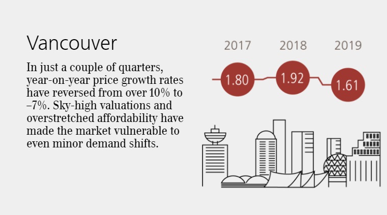
On average, in the cities analyzed, inflation-adjusted price increases have practically come to a standstill in the last four quarters. REsidential property only appreciated markedly in Moscow, Boston, and the cities in the Eurozone. Frankfurt was the only city to see double-digit price increases, which were common globally in previous years. By contrast, there were corrections of over 5 percent over the previous year in Sydney, Vancouver, and Dubai. New regulatory measures and lower economic growth globally have hit prices in the owner-occupied housing markets. The more overheated a market, the easier it is to trigger a correction.
Despite the worldwide collapse in interest rates, the negative trend in home prices will probably continue. Mortgage rates in many cities had already ceased to be the bottleneck in recent years when it came to buying a home. Rather, many households lack the funds required to buy a home or meet banks; financing criteria. Amortization payments also tend to place a greater burden on household budgets than mortgage interest. Furthermore economic uncertainty in a recessionary environment more than outweighs the positive contribution of falling interest rates on demand growth.
So first, what does UBS say about Toronto?

This is the basic slideshow that UBS provides on their website, but it’s enough to serve as an introduction for now.
Interesting that even as prices have risen from 2017 in Toronto’s central core (ie. the GTA average has been dragged down by the Newmarkets and Scugogs, but the 416 HPI has soared), the UBS Bubble Index has declined.
I might conclude here, as I did in Monday’s blog, that data and headlines don’t always tell the true story of the market, but I digress.
Here is the same shot for Vancouver:
–
Once we dig into the full report itself, we see trendlines for Eurozone, Rest of Europe, United States, and of course, what we care about, Canada:
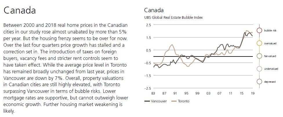
Again, I would point to comments as “while the average price level in Toronto has remained broadly unchanged from the past year,” as examples of how some selected data may not tell the same story as what’s actually going on in the market.
The average home price GTA-wide in September, for example, was 5.8% higher than in September of 2018.
Since this report was published on September 30th, perhaps the August data was used. But prices were still up 3.6%, year-over-year in August.
While I recognize that the GTA is Toronto, I wonder if that’s how UBS intended to showcase their findings.
There are two interesting “benchmarks” that UBS used in their report, and once again, I would ask how relevant these are:
1) Price To Income
2) Price To Rent
They sound…….well…….fundamental in nature.
But after looking at the data, and considering relevance as it pertains to our market, you might change your tune.
Here’s how they define the first benchmark:
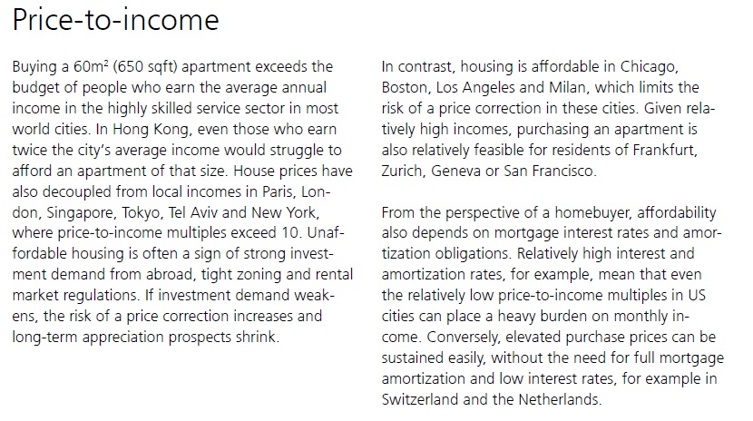
“In Hong Kong, even those who earn twice the city’s average income would struggle to afford an apartment.”
So what?
Why does this point to a “bubble” or to “overpricing?”
Maybe there’s a shortage of housing, too many people, a societal norm in renting, or all of the above.
“Unaffordable housing is often a sign of strong investment demand from abroad, tight zoning and rental market regulations.”
Well no kidding.
But at this point, I’m feeling like UBS is using “unaffordable” interchangeably with “bubble” and “overpriced,” and those are three different things!
Here’s the data:
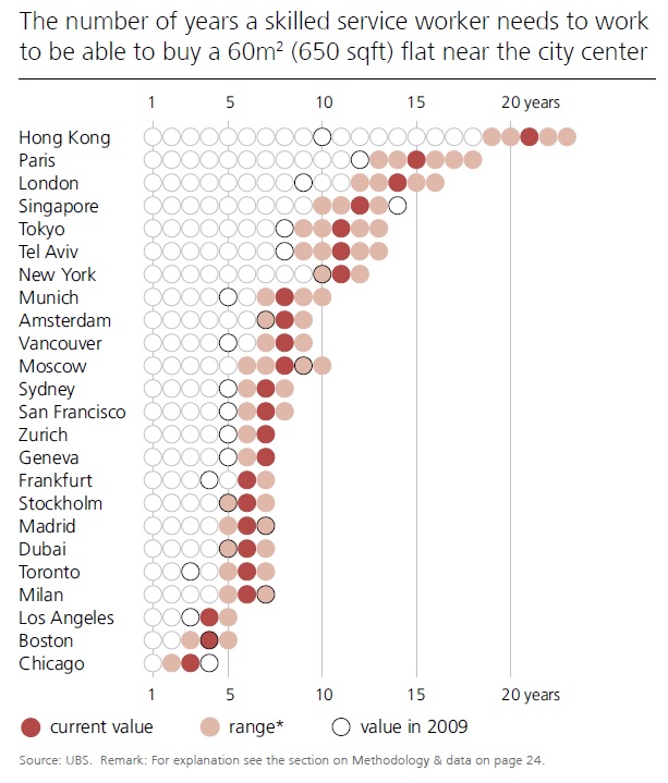
Again, I would ask, “Has society decided that everybody should be able to buy, rather than rent?” Or is this a metric merely provided for educational purposes, and comparisons from city to city?
Note that Toronto is fifth from the bottom.
–
Here’s how UBS defines the second benchmark:
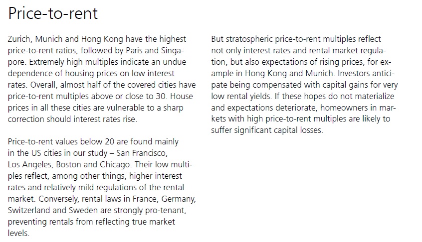
I’m honestly not sure what this benchmark is supposed to teach us.
I’m even less sure that it’s relevant.
Take a look at the heading of this data set:
What does this mean?
“The number of years a flat of the same size needs to be rented in order to pay for the flat.”
Why is this relevant?
It’s a metric, I get it. But by this logic, we could come up with so many other metrics, which may or may not be helpful.
Trust me when I say that the “Methodology and Data on Page 24” did little to explain both methodology and data! What I want to know is: if a condo currently rents for $2,200 per month, and it costs $550,000, then are we simply dividing $550,000 acquisition price or “value” by the annual rental price of $26,400, to come up with 20.8 years? That’s my assumption, but it’s not explained anywhere, and I don’t know if it’s inflation adjusted.
Last, but not least, we have a chart that I find far, far less interesting than the last sentence of the blurb on the left:

“However, a major price correction seems unlikely in the short term, given improving mortgage conditions, a weakening Canadian dollar, and falling supply.”
So I ask you, please explain to me: what the hell is Toronto doing as the #2 city in the WORLD on a “bubble” list if the authors of the report don’t believe a price reduction is coming?
What does this all mean, exactly?
Nothing.
It means absolutely nothing.
And therein lies my issue with all of these think-tanks and analysts consistently making incorrect predictions, based on metrics, benchmarks, and indicators that they believe shape the market.
It’s quite simple, folks. If you want to know what’s going on outside, you don’t need to Google it; just look out the goddam window…


Kyle
at 9:54 am
Another day, another list based on garbage “fundamentals”.
I think someone should start a list of most overvalued and laughable analysis, where you take their # of their wrong calls divided by the average number of wrong calls by all Analysts over time. I think IMF and UBS would be right up there with Garth Turner, Hilliard MacBeth
Appraiser
at 10:46 am
It’s difficult enough for local housing analysts to get it right, let alone foreign economic “think-tanks.”
Economics is full of perfectly logical, empty theories.
It’s known as the dismal science for a reason.
Professional Shanker
at 11:56 am
Another list of “garbage fundamentals, it surprises me that educated people would ever make this assertion.
Question: What is the single most important factor in paying for a house? The answer of course is income as inheritance, capital gains, etc. are of course secondary or tertiary factors.
If wage growth isn’t supporting house price growth, the next logical step would be to assess investor impact or at least attempt to.
Question: What is the single most important factor for an investor in RE? The answer of course is rental income as capital appreciation is secondary.
Outside of the most important fundamental factors, others come into play:
-Supply/Demand (Population growth/immigration vs. new dwellings).
-Financing incentives (tax deductibility or interest, capital gains, etc.)
-FDI (foreign direct investment)
-Generational wealth transfers
-etc. (the list could go on and on)
Unfortunately these are not included in these studies, likely because data compilation is potentially too intensive or is accuracy difficult to achieve and compare across jurisdictions? Or is the simple answer that over the long term the secondary and tertiary factors don’t matter?
House prices are higher in Toronto than Windsor because the local population earns more!
If a business is to be successful over the long term, profits must support the growth in share price. Growth without profit ends at some point.
By no means am I saying this is a bible for understanding real estate prices, but to dismiss the analysis as garbage when it quite clearly uses the most important KPIs to compare regions is mind blowing.
What is does clearly state is that other factors are at play which is the point of David’s analysis
Kyle
at 2:07 pm
It surprises me that educated people are so willfully blind and continue to cling and pin their hopes to these garbage metrics, years and even decades after they’ve long been failed by them.
No one is saying Income isn’t important, we’re saying the 50th percentile income isn’t important when it comes to home prices because those people aren’t the ones buying homes, at least not in a big city.
Who says wage growth isn’t supporting house price growth? The right tail of the income distribution has been growing, and that’s the part of the curve that matters. The bears keep wanting to use the median income as the proxy for what a house “should be” priced at because that suits their narratives, but guess what if the median income household can’t afford a home, what happens to their wage growth is irrelevant to prices.
Jimbo
at 1:09 am
How many households are owned and lived in as a primary residence in Toronto? (Within the complete housing stock available) My guess is 58%-67% shot in the dark
I think you are right, the average can’t and probably won’t be able to afford to buy in Toronto anymore but when did that become the case? My guess is between 2003 and 2008.
Also if you have less people to sell to hopefully they can be replaced by transplants getting the high income job offers and there better be growth in that right tail or it could be trouble overall. Not saying crash, just more balanced less leverage on the selling side.
Kyle
at 9:06 am
My feeling is 2003 is when house prices started to pick up, but not sure when the average income houseshold got priced out, i think it was a very steady gradual erosion of affordability.
I’ve been watching real estate prices in Toronto for a long time, and i remember (not long ago even) when detached houses were viewed as the gold standard, semis and towns were considered second class, and condos were some kind of consolation prize. And over the years people have had to adjust their expectations down as affordability changed attainability. Nowadays, i often hear people refer to the largish detached houses in the core as mansions, not because they are huge and lavish, but because they have become unattainable for most. Condos are now the standard housing type for most people getting on the real estate ladder
The right tail has been expanding, as the higher paying jobs have been expanding. Toronto is always on the lists of top tech hubs, finance hubs, research hubs, innovation hubs and as other commenters have pointed out, it is a very desirable place to live. Every month or two you read articles about how some huge tech company is opening a new headquarters here, and creating a few hundred new high paying jobs. And over the course of the year, all those announcements add up to a few thousand new high paying jobs. Those few thousand new high paying jobs per year, may not push up the median income numbers much, because the denominator is the 6 million GTA population, but i think rational people can appreciate that those few thousand new high paying jobs will have a big impact to home prices, because the denominator is about 100K transactions each year.
max
at 12:57 pm
We are well into the age of globalization of everything. is it any surprise that the best, livable cities in the world are exponentially more expensive now because there are no borders when it comes to money.
Jimbo
at 7:27 pm
I agree with what you said below on pretty much all of the points.
The only thing I would add and it is not to detract from what you have said. The tail needs to grow in the younger cohort, so tech sector is a good example. New grads and persons under 34 get the good pay. If you rely on the tail growing in the 40 plus group, they probably are already on the ladder.
If you are adding all these jobs and attracting more people, you need to have the planing in place to get them from A to B or have residences closer to business etc etc. We are good at adapting to change faster than cities can provide it i.e. We let people work from home. That can only go so far.
In my opinion Toronto falls well below the bar when it comes to being innovative with city planning and basic infrastructure maintenance, this could be a hurdle that upsets growth. That being said who am I to say when that happens… Maybe there is room for 1 million more people before it becomes an affect.
Appraiser
at 12:51 pm
Essentially the IMF and UBS reports identify and rank the most desirable cities in the world to live / invest in and note that it is very expensive to do so.
Thanks.
Marina
at 4:01 pm
We were just in Munich 3 days ago visiting family. They said when they rented their apartment, they were one of 30 people interviewed. For renting.
The demand far outstrips the supply. So yeah, the “bubble” metric is just a bunch of empty calculations that are too simple to encompass reality.