
Am I guilty of giving away the ending before we’ve even started?
Maybe.
But trust me when I say that there’s still plenty more surprises ahead.
There are many ways to skin a cat, and likewise, many ways to look at housing statistics in Canada.
And with the firey-hot market out there for housing in Toronto right now, one question has to come to mind: who the hell skins cats?
I mean, seriously? What in the world is this? Who skins a cat, outside of some psycho in a movie? Good Golly! Why do we use this saying in our daily-lives? Don’t we realize just how sick that is?
Okay. I lost it there for a moment, but let me bring it back…
There are many, many ways to look at housing stats in Canada, whether you use an average home price (sale price), a home price index, a single-family home price index, seasonally-adjusted or not seasonally-adjusted, and so on.
We can compare city to city, or province, or district, or housing type or style.
But if we really want to look at national, or in this case, provincial housing stats, we have to use the CREA Home Price Index.
What is the Home Price Index (HPI)?
Here’s an explanation:
The MLS Home Price Index (HPI) is the most advanced and accurate tool to gauge a neighbourhood’s home price levels and trends.
Average or median prices can change a lot from one month to the next and paint an inaccurate or even unhelpful picture of price values and trends. The MLS HPI is based on the value home buyers assign to various housing attributes, which tend to evolve gradually over time. It therefore provides an “apples to apples” comparison of home prices across the entire country.
Each month, the MLS HPI uses more than 15 years of MLS System data and sophisticated statistical models to define a “typical” home based on the features of homes that have been bought and sold. These benchmark homes are tracked across Canadian neighbourhoods and different types of houses.
So this past weekend, I set out to look ALL of the areas in Ontario and compare and contrast with the national average.
The data goes back fifteen years, but what I’m really after here is the past five years.
In Toronto, if we look at the TRREB average sale price, we see that prices have increased by 53.0% in five years’ time:
December, 2015: $609,110
December, 2020: $932,222
I don’t have data for the “average sale price” in all the Ontario areas, but more importantly, if I did, I feel the data would be skewed. We’re accustomed to seeing enough sales in Toronto that you never run the risk of a sample size error, or the volatility we would see in smaller regions.
But consider that the MLS Home Price Index for “Greater Toronto” shows a 59.0% increase from December of 2015 to December of 2020, and I think we can trust the HPI to compare apples to apples for us across the twenty-four areas in Ontario that are tracked.
Twenty-four areas, you say?
Yes indeed!
There are a slew more across the country that are tracked, and that’s a topic for another day.
As far as the country-wide HPI goes, we’ll use that as a basis of comparison as we go through the province of Ontario.
For reference, the Canada-wide HPI in the last five years is up 47%:
December, 2015: $443,900
December, 2020: $654,100
Here’s how the Canadian Real Estate Association divides the province of Ontario:
Barrie
Brantford
Cambridge
Greater Toronto
Grey Bruce Owen Sound
Guelph
Hamilton-Burlington
Huron Perth
Kawartha Lakes
Kitchener-Waterloo
Lakelands
London & St. Thomas
Mississauga
Niagara Region
North Bay
Northumberland Hills
Oakville-Milton
Ottawa
Peterborough & the Kawarthas
Quinte & District
Simcoe & District
Southern Georgian Bay
Tillsonburg District
Woodstock-Ingersoll
I’ll be honest, I had to look a few of these up on a map!
Now, of the twenty-four areas, which one do you think has seen the greatest increase in HPI in the past five years?
We know it’s not Greater Toronto, since I let that cat out of the bag early on (although I didn’t skin it…).
So what do you think?
Mississauga? Oakville?
Is it cottage country?
There are twenty-four areas, so I want to give you the Top-10, and we’ll work backwards just to keep you in suspense.
The following ten charts will show the appreciation in HPI of the “Top Ten” areas in orange, with the Canada-wide HPI in blue.
–
10) Huron Perth: +96%
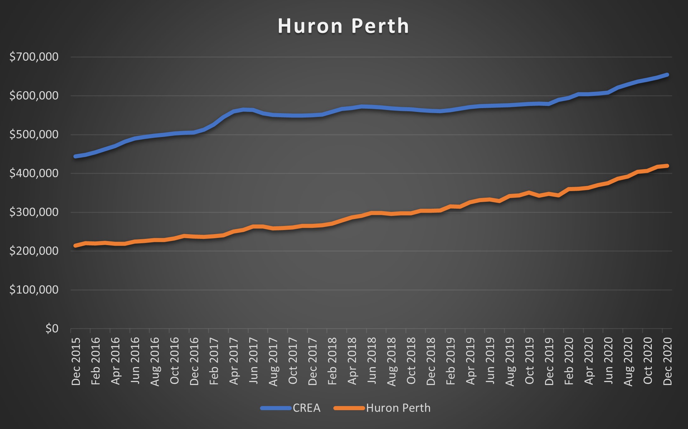
Prices have almost doubled in Huron Perth in the last five years, with the MLS HPI going from $214,300 in December of 2015 to $419,400 in December of 2020.
For those who don’t even know where this area is, just go west of Kitchener, north of London, and stop before you hit Lake Huron, and you’re there!
I’ll be honest, I don’t know a single person who lives out this way. Not in Cranbrook, not in Milverton, nor Millbank, nor Brodhagen. I don’t know anybody in Atwood, or Donegal, or Blyth, and not a sole in Hensall.
Where the hell are we?
–
#9) Kitchener-Waterloo: +99%
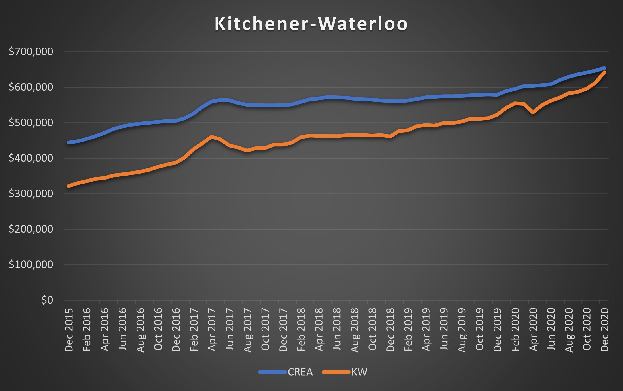
Ah, of course I know where this is!
I went to McMaster University and in my fourth year, after a year off for an internship, I had a girlfriend that went to school at Wilfred Laurier University.
I got to know “Kay-Dubbya” quite well in 2002! It seems that the “Dubbya” was much more sought after than the “Kay,” and the people were a wee bit different as well. That’s changed today, of course, as both areas are housing hot-spots for people who can’t afford to live in Toronto, especially Kitchener where prices have risen dramatically.
Interesting to note; look at the sharp drop in HPI in the spring of 2020. You might be thinking that this is due to the pandemic, but none of the other orange lines look like this!
Also interesting to note; look at the absurd increase in the past six months. A 14% increase!
–
#8) Kawartha Lakes: +105%

Our first truly doubling of prices, or HPI, comes in the Kawartha Lakes area.
This is the only other area, along with Kitchener-Waterloo, that sees dip sharp enough that it can be considered a “line” rather than a “curve,” but it’s still not as sharp.
With a lot of of cottages falling into the Kawartha Lakes area, it’s no surprise we’ve seen such a sharp increase in the last couple of years.
–
#7) Southern Georgian Bay: +105%

What did I just say about Kawartha Lakes? Something about cottages?
Look at the steep increase in the summer of 2020!
How about an 21.5% spike from January to August?
All those Toronto Life articles and anecdotes from your friends about how hot the cottage property market was, seemed to prove true in the end.
That 2020 spike is the sharpest of any line on these ten charts.
–
#6) Quinte & District: +108%
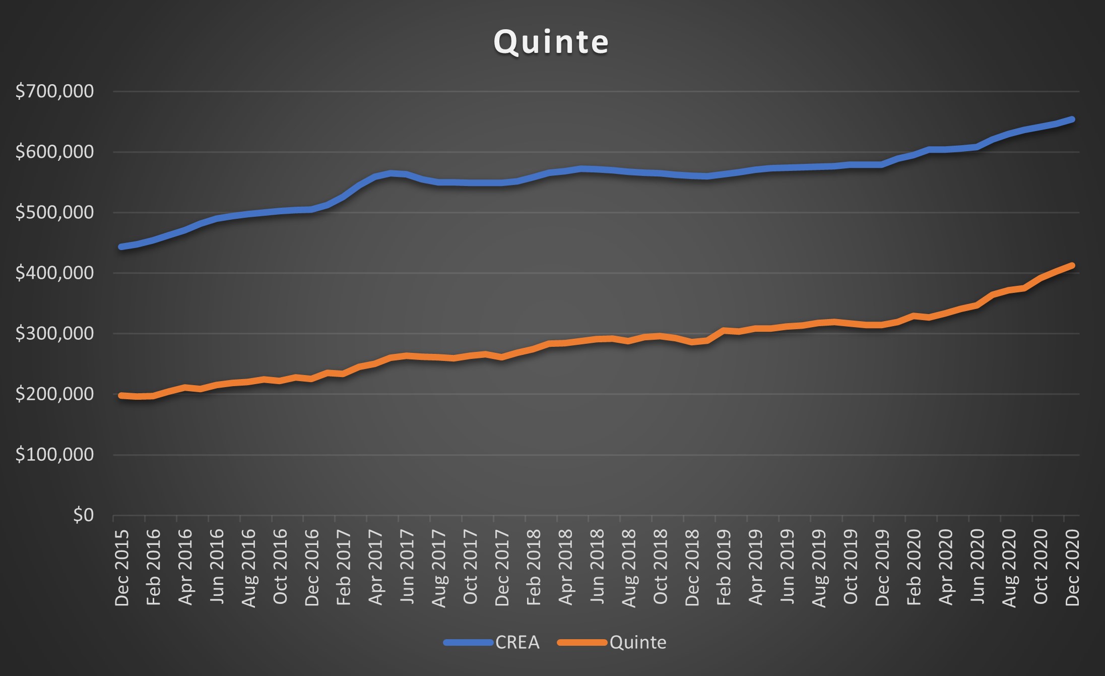
–
Have you been to Prince Edward County in the past five years? I have. My wife and I went on our “Baby Moon” in January of last year, and despite it being the dead of winter, it was quite enjoyable!
So what would it be like in the summer?
Ask any of your friends. Or colleagues. Your your boss. Your uncle. That snotty cousin you don’t like. Ask just about anybody, because all I’ve heard in the past five years is how lovely Prince Edward County is!
And how many people have moved out there, or bought investment properties out there?
It’s no wonder this area has seen a 108% increase in five years. More to the point: this is the smoothest orange line you’ll see. Prices gains have been substantial yet not volatile.
–
#5) Niagara Region: +112%

Last year, I sold a house on behalf of clients who lived the last two decades of their lives in the Allenby area, raising their kids, who then bought a house in Niagara Region.
I had another couple of clients who sought to sell their condo in downtown Toronto and move to Niagara Region, knowing that they’ll be working from home for the rest of their lives, but the poor internet signals in the rural area they had sought ended up kyboshing their plans!
I surprisingly know a lot of people who have moved out here, and our Bosley office in Niagara-on-the-Lake was on fire last year.
Note the big upswing at the end of that orange line. That’s a 23.1% increase from December of 2019 to December of 2020.
–
#4) Simcoe & District: +117%
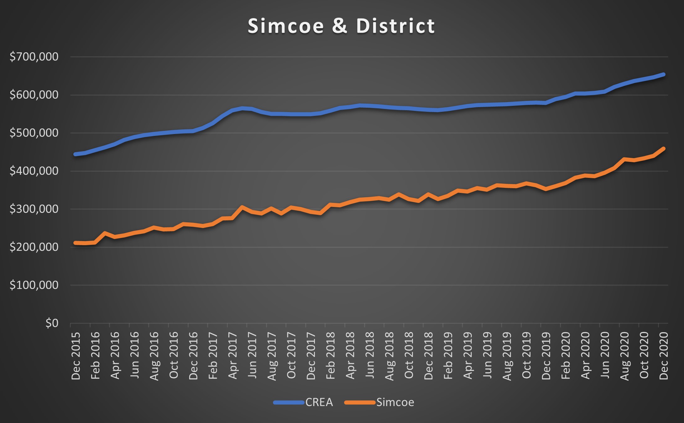
Maybe I’ve been staring at lines all day, and I’m just going nuts. But does that orange line have more sharp ups and downs than most of the others, which are curvy for the most part?
In any event, this is yet another area I had to look up on a map, and I was only able to recognize approximately where it was when I read “Port Dover,” because my mother attended a few motorcycle rallies down there in her mid-60’s. Seriously…
Before we move on to #3, go back to #5. Now #4. Now when we proceed to #3 and onward tell me if you see a trend…
–
#3) London & St. Thomas: +118%
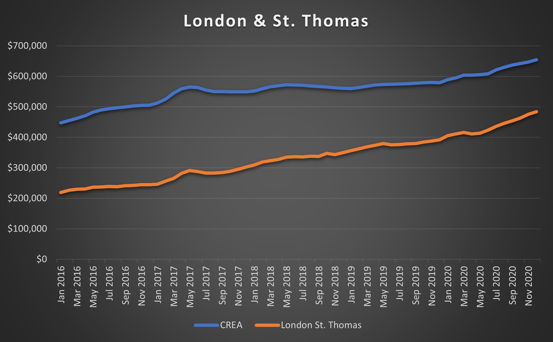
I always get London/Kingston, Queens/Western mixed up. I’m about 50/50 in a good week…
But how about a 14.4% increase in the past six months?
What’s driving this? The same thing, in my opinion, that’s driving every single one of these ten areas, and if you haven’t noticed it by now, then you likely won’t until I tell you.
–
#2) Woodstock Ingersoll: +120%
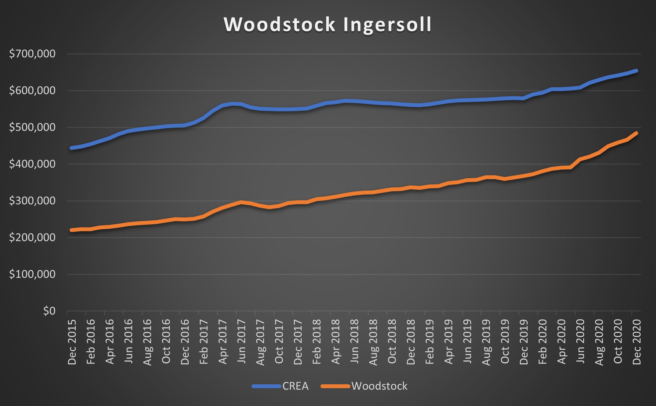
Woodstock is near London & St. Thomas, right?
And London & St Thomas are near Simcoe & District, right?
And these are, where, exactly, in relation to Niagara Region?
That’s one of the two trends I’m speaking of. The entire southwest of Ontario is hot real estate right now, and the Top-5 areas in the province, as well as on this list, are bordering each other.
If you’re looking at that sharp incline on the orange line above, and wondering what the stats say, you honestly won’t believe this: how about a 31.5% increase from December to December?
–
#1) Tillsonburg District: +121%
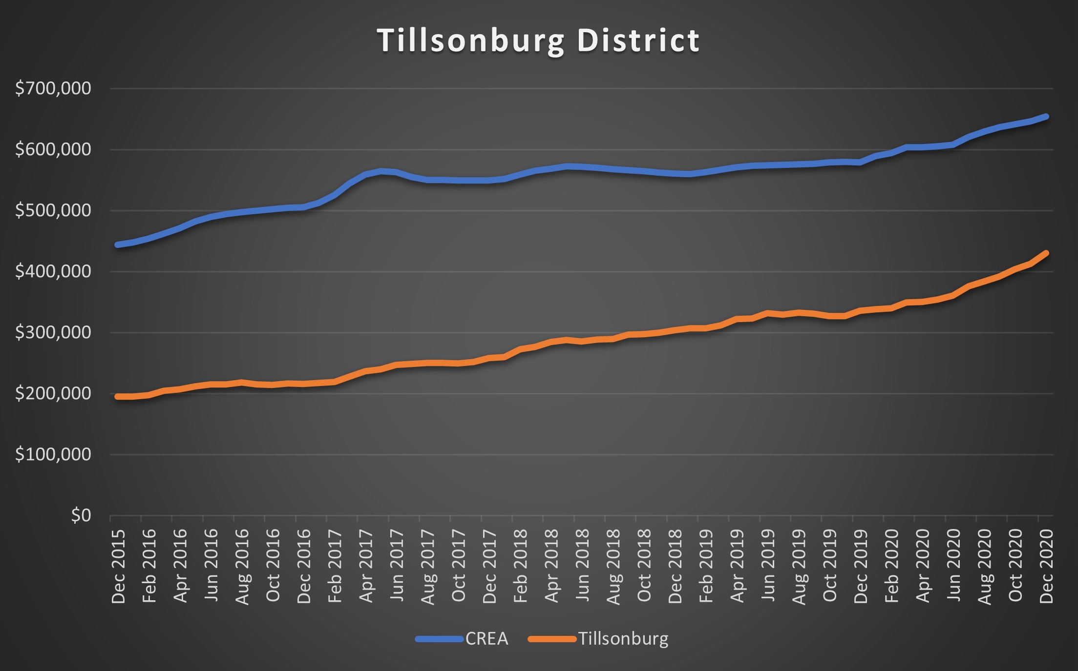
Clocking in at #1 is Tillsonburg District, which, once again, I had to map.
Tell me you know the exact location of all twenty-four real estate centres in Ontario, why doncha?
The MLS HPI in Tillsonburg has increased a whopping 121% in five years, from $195,000 in December of 2015 to $430,300 in December of 2020.
How many of you, the readers, own in Tillsonburg? Speak now.
Tillsonburg has only increased by 28.0% in the past year, which trails Woodstock & Ingersoll, but is still pretty spectacular!
So did anybody notice the one thing that all these areas have in common?
And I don’t mean that the top five area all in southwest Ontario, that was just another trend worth watching. For the trend that runs through all ten areas, we’ll draw far more of a conclusion, and apply far more significance.
Anybody notice?
Try again, just humour me.
Scroll up to #10 and look.
See the two lines, blue and orange?
Then #9. Blue and orange, right?
Then #8, same thing, right?
Yes, all ten charts have a blue and an orange line, but all ten areas have the blue line ABOVE the orange line!
What these areas all have in common is that their HPI is lower than the CREA average, and from that we can conclude that “cheaper real estate” has risen in value at a much higher rate in the past five years than average real estate, let alone expensive real estate.
Case in point: Greater Toronto.
Greater Toronto only saw a 59.0% increase in the past five years, compared to the ten areas above which start at 96%, but the Greater Toronto HPI was at $573,500 in December of 2015, compared to $195,000 for Tillsonburg, $220,500 for Woodstock & Ingersoll, $222,100 for London & St. Thomas, and so on.
The Canada-wide HPI started at $443,900 in December of 2015.
So does it come as any surprise that the cheaper real estate saw the highest increase? Shouldn’t this just have been a given from the start?
No.
Why?
Because North Bay only saw a 39% increase in five years, and the HPI in December of 2015 was $194,400. So we can’t simply assume that the cheaper the area, the more likely it is to increase in price.
For those of you that are wondering how all twenty-four areas look over the last five years, here’s that data:
Now, what was I saying about a “topic for another day,” I can’t quite remember…
See you Wednesday!


Jimbo
at 7:43 am
So over the last five years, Toronto has seen an annualised growth of 8.9%. Huron Perth was at 14.4%. If they kept this rate of inflation it would take Huron 21 years to catch Toronto prices.
Houses in Oshawa, Whitby, Brooklyn, Ajax and Pickering are closing in at $1M, this will probably have an affect on the Greater Toronto HPI as the houses have essentially doubled in value in the last six months….. I don’t think York or Peel will have much of an affect as they saw their values go crazy in 2017.
Halifax is still a gem with very little price appreciation.
hoob
at 9:00 am
Post-graduation in ~ 2000, I helped a friend move into a house they bought in “downtown” Tillsonburg. I think it was 4 bedroom. I think they had bought it for $60,000.
Times have changed a lot in 20 years. Who knew the tobacco farming economy was to have such sustain!
Ed
at 9:44 am
The sale prices were seeing in Welland over the last few weeks are blowing away the comps from the summer.
Marty
at 10:40 am
First of all, CATS CAN FLY had a great hit circa 1986 – Flippin’ To The A Side. They were from North Yok.
While I could place only a few on a map (I’m new here), only Lakelands, Tillsonburg and Quinte seemed like I might have never heard of them.
I will continue to hammer on this point, but high-speed wifi does not get enough credit for our ability and desire to move further away from major centres. Elon’s Starlink is going to make this even more possible.
Appraiser (formerly Rainmaker...)
at 1:23 pm
If speed and availability of communications is somehow related to the demise of cities, it would have happened long ago.
Appraiser (formerly Rainmaker...)
at 1:29 pm
“Urban population (% of total population) in Canada was reported at 81.48 % in 2019”
Chart of Canadian urbanization percentage since 2008: https://tradingeconomics.com/canada/urban-population-percent-of-total-wb-data.html
J G
at 2:16 pm
What is the definition of urban, Appraiser?
https://en.wikipedia.org/wiki/List_of_the_100_largest_population_centres_in_Canada
Add up the population of top 100 cities in Canada, it’s about 25M out of the ~35M total. But this includes cities like Kitchener (#10), London (#11), Windsor (#15), Kingston (#25), just to name a few in Ontario.
WFH is real, prices in smaller cities will continue to outperform Toronto on a %-basis going forward.
Marty
at 9:18 am
Even 5-7 years ago Zoom was not possible in most homes. Ditto Netflix and multi-player gaming.
“Real-time” speed of communications is a brand new thing.
J G
at 11:16 am
Exactly Marty, even 5 years tools like VPN and Webex were not a stable as it is today.
Not only is it much better now, there are also a lot more versions of these WFH tools available. Microsoft, Cisco, Google, Zoom, Slack, etc. etc. all in on it.
Joel
at 2:14 pm
I am originally from Tillsonburg and my family is there. My parents have been looking to downsize for a couple of years, but prices of what they would want to buy keep increasing.
Having grown up there, I find it hard to believe the prices, but maybe that is how people who grew up in Toronto feel about prices here.
Frances
at 7:54 pm
The market is depressing me right now. The gap in price between our 2 bedroom Toronto condo and the “starter-home” just keeps widening. I’m sure there are plenty of people like us who are stuck where they are and can’t afford to take the next step.
Woe is me!
Libertarian
at 8:25 pm
This seems to be an example of the “drive until you qualify” situation that is Toronto real estate. First it was the GTA, then the GTHA, and now it is all of southwestern Ontario.
Sirgruper
at 12:06 am
David
Something I’ve never understood about these annualized figures. It looks only at price but ignores that renovations and new builds are included in those figures. The renovation and new build industry adds many billions to the pot of housing each and every year yet are ignored. Wonder if there are annualized numbers that exclude renovations and new construction. What do properties that sold say 2 or 3 years ago and are maintained but not renovated increase by (ie removing the valued of the construction industry on pricing). Maybe a question for Appraiser or if you feel like going through thousands of stats for fun:) David something to look at on a snow day.
Condodweller
at 11:08 pm
The fact all these orange lines are below the average indicates to me that people are going after affordability. The exceptions are probably due to other reasons like the cold/snow/relative isolation of North Bay.
Professional Shanker
at 12:22 am
These numbers seem too high to me in some of the rural areas and I believe it has more to do with mix and specifically I mean larger home being built and resold driving up the average. Anecdotally, I know individuals in the KW region and their homes are not up 100% in the past 5 years. Same observation with the hammer.