

Are you tired of the stats blogs yet?
Longing for some funny photos or something less serious that you can casually peruse from the cozy confines of the TTC streetcar or office toilet stall?
Well, hang in there. My year-end “MLS Musings” is due Friday, and I’ll dump out everything I have left from 2021.
But in the meantime, yes, we’re going to look at more stats today. But how can we not?
The November TRREB stats didn’t just us a mountain of records as we learned in Monday’s blog, but also gave us, in my opinion, a snapshot of where this market is headed in 2022.
Every market onlooker has his or her own “go-to” statistic. Many people are primarily concerned with price, and that’s fair. What’s more important to know? But others are drawn to the sales data, since you can learn about price by looking at sales.
I enjoy all the stats, as I detailed on Monday. But the one I enjoy the most is sales-to-new-listings because it turns two stats into one! And once you’ve got this stat, figure, or ratio, you can learn a lot more about the market!
If you’ve ever heard the term “Months of Inventory,” consider that sales-to-new-listings, or SNLR, is simply the inverse of MOI.
In a given month, if you have 50 new listings, and 25 sales, then your SNLR is 50% (sales divided by listings) and your MOI is 2.0 (listings divided by sales).
But also keep in mind that of those 25 sales, not all have to come from the 50 new listings.
If there were 30 listings left over at the end of last month (called “Active Listings”), then some of the 25 sales can come from the 30 leftovers, and some can come from the 50 new listings. It doesn’t matter. What matters is the ratio of SNLR.
There are some months when SNLR can be above 100%.
In the case above, if we saw 55 sales, that means 55 of the 30 active and 50 new listings had sold, but SNLR takes the ratio of sales/new, hence 55/50, or 110%.
Why is this important?
Why do I fashion this my “favourite” stat?
Well, because the price is a factor of supply and demand. If we saw an SNLR of 20% every month, then inventory would build up, supply would massively outpace demand, and we’d see prices drop.
But in the GTA, we saw an SNLR last month that was downright scary.
If this is a sign of things to come, then I think 2022 is going to be madness.
By now, you all know the five major TRREB districts:
Halton Region (Burlington, Milton, Oakville, Halton Hills)
Peel Region (Brampton, Caledon, Mississauga)
City of Toronto
York Region (Aurora, Markham, Newmarket, Richmond Hill, Vaughan, Stouffville, Georgina, King)
Durham Region (Ajax, Brock, Clarington, Oshawa, Pickering, Scugog, Uxbridge, Whitby)
Let’s look at the sales-to-new-listings ratio in each area, in November, counting backwards…
–
5) City of Toronto: 84.4%
Interesting that of the five TRREB districts, the area where many of us would think we’d see the most pressure, actually shows us the least.
Then again, 84.4% isn’t exactly low!
In fact, this is dangerously-high.
It’s also the high-point for 2021, have a look at the chart:

Note that the SNLR was “only” at 57.1% in September, which represented the low point of 2021.
Imagine that?
Well, it seems to reason that with the annual dump in inventory we see in September, if sales don’t pick up tremendously, then the SNLR would be depressed.
In actual fact, the September SNLR was low in all five TRREB districts, and all five charts share a similar pattern with respect to a major drop from August to September.
For those looking to buy a house in 2022, it seems you want to avoid February. Again, contrary to popular belief, May and June look to be good times to buy, since there’s enough inventory to allow the buyer pool to spread out. However, we do see prices increase from January through June, so less competition comes with higher prices.
–
4) York Region: 88.1%
I still can’t get over these figures.
The fourth-highest SNLR is 88.1%.
Although unlike the City of Toronto, where we saw SNLR increase dramatically from 73.38% to 84.4% from October to November, the SNLR in York Region actually dropped modestly from 88.6% to 88.1%:

These curves might look the same, but they’re not.
Similar build up from late-spring through summer, and drop-off into the fall. But in between there are differences.
–
3) Peel Region: 94.8%
Alright, this is just nuts.
We’re now seeing an SNLR approaching 100% in Peel Region.
Over 90% in October led to 94.8% in November, but all of this is because of a drop in new listings!
We were seeing close to 4,700 new listings in March. September, October, and November produced 2,295, 2,090, and 1,810 respectively.
As inventory plummets, the SNLR rises, and so too do prices:

–
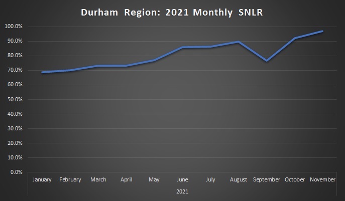
2) Durham Region: 97.0%
We’ve all heard about the madness in Durham Region, from 60% price increases over twenty-four months, to 30-40 offers on houses.
If you look at the supply data, it’s similar to Peel Region, as new listings dropped from a high of 2,838 in March to a low of 1,044 in November. As a result, we’re seeing an SNLR that’s spiked dramatically through the fall:
–
1) Halton Region: 97.9%
There were 798 sales in Halton Region in the month of November and only 815 new listings.
How in the world is this possible?
If ever there was any doubt that the cause of increasing prices in our markets were supply-driven, then these charts should quash any lingering thoughts about foreign buyers, investors, and flippers. It’s supply, folks. There’s just not enough for sale. There aren’t enough houses in the Golden Horseshoe.
And as demand remained consistent through the fall, the SNLR in Halton Region spiked:

Note how flat the curve is to start 2021. Sure, an SNLR over 70% isn’t a good thing, but at least it’s consistent.
There are a lot of buyers out there in October and November, in every market. But there just aren’t enough sellers!
Now, what does this mean in a historical context?
It’s one thing to talk about an SNLR that’s 70%, or 80%, or even 90%, but what does that mean when compared to previous years?
I wanted to look, again, at each region and view SNLR through a ten-year lens.
Once again, we’ll order these from low-to-high in terms of the cummulative SNLR.
An important point: the 2021 data only goes from January to November, and the SNLR in December will be higher than the yearly average, so these figures, although dramatic, would be even more dramatic if we adjusted one month from now to capture the entire year.
Alright, here’s the data…
5) City of Toronto: 69.4%
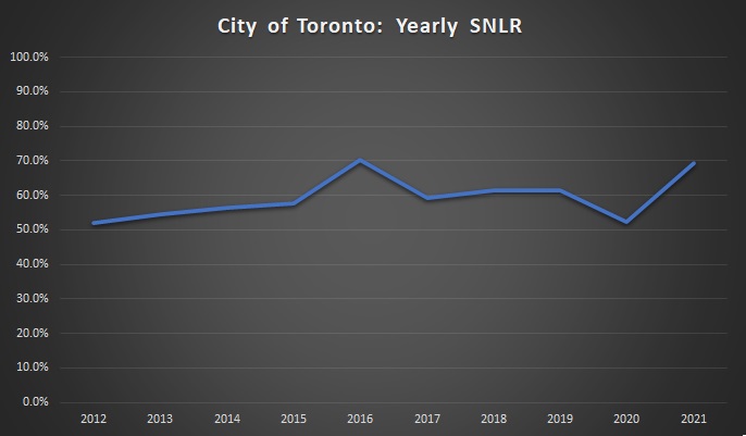
That peak you see in 2016 is 70.2%, so slightly higher than 2021. However, as I noted above, we’re not through December yet, so this figure is subject to change.
In any event, you can see that we’re at or above the highest point in the decade, and if we went back further, I don’t expect we’d see anything even close to this in the 2000’s.
Remember that the tight supply in the fall of 2016 led to the insanity of early-2017. I suspect this is a sign of things to come…
–
4) York Region: 70.9%
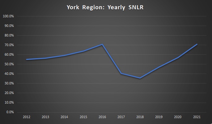
Like I said: these charts might look similar at first glance, but they’re oh-so-different.
We saw a spike in SNLR in 2016 in all TRREB districts, and York Region was no different. That peak of 71.0% is just ahead of the 70.9% figure recorded thus far in 2021.
Note that the SNLR bottomed out at 35.8% in 2018. Through five districts, and ten years, this is the only figure below 40%. It’s actually one of only two below 50%, as the 49.5% recorded in Durham Region in 2018.
York Region was hit hard after the government came in and crushed the market in April of 2017, and this chart shows what happened! But the recovery, as noted on Monday, has been impressive.
–
3) Peel Region: 75.8%

Once again, we see a 2021 peak similar to 2016, although this time, 2021 is higher: 75.8% compared to 74.8% in 2016.
Most people looking outside of the City of Toronto are going east or west, meaning Durham or Peel/Halton.
–
2) Halton Region: 79.7%

As with Peel above, the 2021 SNLR in Halton surpassed the 2016 SNLR: 79.7% versus 78.8%.
From 2018 onward, we’ve seen the SNLR increase from 51.7%, to 59.8%, to 70.8%, and now to 79.7%.
–
1) Durham Region: 80.7%

I wasn’t kidding when I said that prices are up 60% in two years in Durham.
If only we all had the foresight to drop $475,000 on some new-build townhouse on what used to be a farmer’s field, right?
I went to cut down a Christmas tree at the Prestonvale Tree Farm last weekend and as you turn off Bloor onto Prestonvale, you see houses on your right, and a field on your left. “That field is going to be houses,” I told my two children, who weren’t listening, because they’re aged 5 and 2 respectively…
No, the 2021 SNLR hasn’t surpassed 2016. Yet.
We should come back to this in the new year, except, I think the point has been made.
–
So, another day, another ten charts, and the same conclusion?
That’s one way of looking at it, but I hope you all gained a little more than just that.
I don’t want to come off as a market cheerleader here, but these charts tell me that prices are going to rise once again in 2022.
The December SNLR will be exceptionally tight, and while the average sale price will decline somewhat (it does every year), inventory will be exceptionally low in January. I just hope, for the sake of a balanced market, that buyers will take some time to come out of hibernating.
if you’re going to be active in early-2022, you should get started now.
Alright, see you Friday, on a lighter note!


Appraiser
at 9:30 am
BUILD BABY BUILD!
Dave
at 9:56 am
David – Good post. If you’ve got the time and interest, consider tracking on a monthly basis over several years the (i) absolute SNLR and month-to-month changes in SNLR (or some other proxy for the inventory of older listings that aren’t completely stale), and (ii) average price and changes in average price (for a few different categories). Then run some regressions to find the predictive value of SNLR on price. Clean it up and then see how accurately SNLR predicts changes in price over the next six months. I think you might be able to create an interesting custom statistic. You might say, “A new derivative stat is hard to explain to the lay person, so it isn’t worth my time”, but in real life even casual baseball fans now talk about thinks like WAR and BABIP (i.e., because when enough people use a phrase, it gets adopted). Anyway, just an idea for your consideration.
J
at 10:08 am
“SNLR, is simply the inverse of MOI…In a given month, if you have 50 new listings, and 25 sales, then your SNLR is 50% (sales divided by listings) and your MOI is 2.0 (listings divided by sales).”
Is that how MOI is determined? I thought it was the total number of listings (not new listings) divided by monthly sales.
Appraiser
at 10:14 am
Months of inventory is a snapshot of how long it would take to sell all of the current inventory of listings at a given point in time, at the current pace of sales (absorption rate).
Appraiser
at 10:16 am
MOI is mathematically unrelated to the SNLR.