Well, what is our option set? Is it price? Sales? Listings – active or new?
Are we looking month-over-month, or year-over year?
I suppose you could also ask, “Do you want to paint a positive picture, or a negative one?” After all, we can make numbers say anything we want.
Let’s look at the November TREB numbers, and if you’ve done so already, you’ve probably already noticed one massive outlier…

I’m always interested to see which statistic the various news outlets lead with.
Excuse my repetitiveness, but you can make numbers say anything you want.
And as I alluded to above, you can choose to focus on price, sales, inventory, or any number of statistics found within each month’s TREB Market Watch.
And you could put a negative, or positive spin on just about anything.
In fact, let me try that. Let me show you what the newspapers were writing about, and I’ll add a smile.
On Tuesday, when the TREB numbers were released, the Financial Post chose to look at price:
“Toronto home prices are down 8.8% since May,” the headline reads.
A postitive addendum here could read, “….but Toronto condo prices only down 1.7%.”
Over at the Toronto Star, they chose to look at sales:
Sales were, in fact, up in November, over October, but still down 13.3% in November 2017, over November 2016.
A positive addendum here could read, “….but the 13.3% drop pales in comparison to the 26.7% drop in October, and the 35.1% drop in September.”
It’s a reach, but not a long one.
The 13.3%, year-over-year drop in sales isn’t significant, in the context of September and October.
So while these two newspapers chose to look at price and sales, which are usually the #1 and #2 statistics people choose to use, bull or bear, it was a completely different statistic that caught my eye.
Wait. “Caught my eye” is an understatement.
If we’re going to stay on the theme of eyes, let me use a photo to accurately convey my reaction:

Yes.
It was exactly like that.
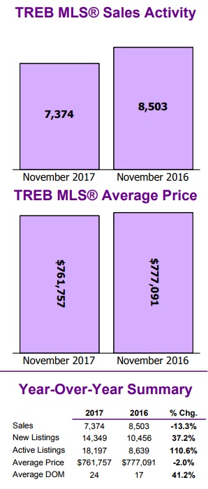
Folks, let me show you a screenshot of TREB Market Watch, and you tell me, what makes your eyes pop out:
Any ideas, folks?
I saw it right away!
And while I can read the TREB Market Watch like braille after 15 years, I still think even if you’re seeing this for the first time, there has got to be one figure that jumps out at you.
Any ideas?
Look again one more time before I highlight it for you.
Okay.
Check this out:
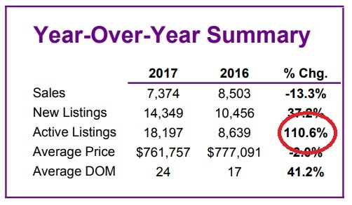
That is just mind-boggling.
Eye-popping, you might say!
110.6% of anything, in just about any context, is just crazy.
But a 110.6% increase in active listings, year over year? I just can’t believe what I’m seeing.
To put this in proper context, consider that in the months preceding, the active listing numbers were still high:
July: 65%
August: 65%
September: 69%
October: 79%
But over 100%?
As in double?
It’s downright nuts. And we’re all scrambling to make sense of it.
So I spent Tuesday night looking at past active listing data, to do exactly that; make sense of it.
First, consider the definitions that TREB uses:
“New Listings” are listings entered into the TREB MLS system between the first and last day of the month/period being reported.
“Active Listings” are listings at the end of the last of the month/period being reported.
So first, I simply went back five years (save for December, for the purpose of this exercise), to look at the number of active listings in each and every month.
Here’s how the data looks:
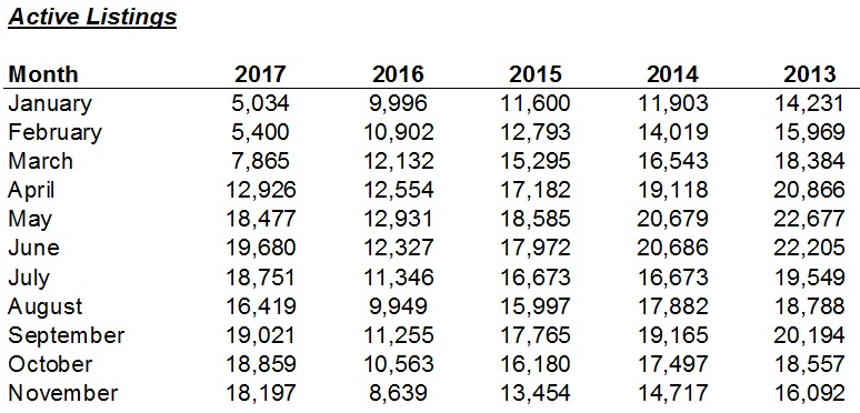
Now just as the “110.6%” figure jumped out at me above, upon glancing at the finished list here, I had three things jump out at me:
1) There are only six months in the past five years with less than 10,000 active listings, and three of those were consecutive, to start out 2017: January, February, and March. Jan/Feb/March of The inventory levels were historically low to epic proportions.
2) The “22’s” on the right side of the chart are jumping out at me. There are also some “20’s” in the same line – 2013. The amount of active listings in 2013 is shocking.
3) I’m not sure what seems to draw the eye in more: the drop in active listings to start 2017, or the surge in active listings to end 2017.
Whether you can do long division in your head or not, just look at the November numbers!
From 8,639 active listings in 2016 to 18,197 in 2017!
That’s what “110.6%” looks like!
But as my eyes danced back-and-forth, from the left side of the chart to the right, I continued to bounce over those 2016 numbers, and it became quite apparent that if anything, 2016 seemed to be an outlier.
The number of active listings in 2016 were the lowest, by far, of any year.
And active listings have been dropping every year for the past five years, save for the latter half of 2017.
Take a look:
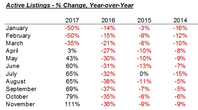
What I’m seeing here, once you get past the black numbers ranging from 43% to 111%, is a massive drop in listings in 2016 as the year went on.
This is what I remember from 2016! Listings were plummeting each and every month, and this continued into early 2017, when you see the insane fifty-percent drops in active listings.
So with the active listings dropping so drastically in 2016, perhaps it seems to reason that they would increase dramatically in 2017?
If I’m right, and 2016 was, in fact, an outlier, then the 2017 monthly “active listings” statistics wouldn’t look as bad when compared to 2015, 2014, and 2013.
Let’s look at that:
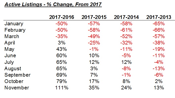
The 2017 numbers over 2015, 2014, and 2013 show that active listing levels were actually in line.
Take January, February, and March out of the equation for a moment, since we know those 2017 inventory levels were historically low.
Compared to 2013, active listings were still lower in 2017, in the remaining 6 of 8 months.
That’s 5 of 8 months compared to 2014.
And 2 of 8 months compared to 2015.
While I think that 2016 is an outlier, I’m also starting to think perhaps November is as well.
In fact, the one stat I didn’t show above, and could have included in the first chart was the sum total of yearly active listings, not including December.
This should put 2016 in context:
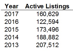
Active listings, through November, are up 31% in 2017 from 2016.
But that’s after dropping 29% from 2015.
So maybe the conclusion here, is that the massive decline in active listings in 2016 is the real reason for the eye-popping monthly, year-over-year increases in active listings that we’ve seen this fall? That, and perhaps November’s staggering 110.6% figure will seem like an outlier down the line once we have more data?
Or do you think I’m painting a rosy picture, just for the sake of doing so?
That’s fair. I can see how this looks.
But folks, I’m just trying to make sense of that “110.6%” statistic, because it’s so shockingly out-of-place. And as you can tell from the last chart above, we’ve seen active listings decline year after year, and even with that whopping 110.6% stat, active listings up to the end of November still trail 2015, 2014, and 2013.
So what else did we see in the November TREB numbers?
I certainly don’t want to gloss over the rest, but the active listings data was my take-away.
The average home price declined, month-over-month, by 2.4%.
It stops the “trend” of house price increases, after gains were made, month-over-month, in both September and October.
Sales were down 13.3%, year-over-year, but up marginally over October, and more significantly over September.
But perhaps this is the one month where price and sales seem somewhat boring, compared to the listings data.
And now we’re into December, which is a historically slow month, and I’d expect to see that “average home price” dip about 3-5% in December, over November, as is often the custom.
So what then? Start the discussion about January?
How it’s going to be slow, at first, as buyers take the wait-and-see approach to the new lending regulations, only to discover the regulations are having little, if any, effect, at which point buyers pounce, and the market heads back up?
Or how the Armageddon is coming, bears have been right for ten years, and the market is going to plummet?
Hmm…maybe I’m the only one who finds the active listings data positively fascinating…


Ralph Cramdown
at 7:26 am
Nobody owns TREB’s average home. Condo or detached. 416 or 905. Richmond Hill or Brampton. The biggest story for anybody who owns, or wants to, is price in their segment. There is a LOT of variation here. You should talk about it.
Piyush
at 8:19 am
Hi David can we look at the split of sales between different housing types to get a better handle on November avg price..also can we see a avg price chart or % price increase for the years you have compared above to give an idea to the naysayers on how much prices would have to decline for their much cherished crash to happen. In my neighbourhood which is a new one and in south west Brampton, prices are still hitting anywhere between 1 million – 1.3 million for detached houses..and semis are selling for 850k..so not much seemed to have changed on the ground
Chris
at 8:48 am
General data on Brampton detached:
http://torontorealestatecharts.com/2017/12/05/november-2017-detached-brampton/
For specific sales information:
http://housesigma.com/site/
Enjoy.
Appraiser
at 8:29 am
Excellent in-depth analysis David, especially in comparison to the usual media spin, which is often shallow and sensationalistic. A great study illustrating a basic tenet of economics known as supply and demand. Well done.
Chris
at 8:41 am
You got it Appraiser; supply and demand, the basic economic tenet.
Active/new listings up = increased supply
Sales volumes down = decreased demand
Solve for price.
Jennifer
at 12:57 pm
lol. I see some sales prices and think “are you nuts?” Who is buying at crazy prices still – and there are still some out there – are they oblivious to the market conditions or is their agent hiding under a rock?
Chris
at 5:36 pm
Prices are sticky on the way down. It’s hard for a seller to accept that the value of their home has declined from what they felt/thought it was worth in April.
Some will surely hold out and try to wait for prices to recover (dummy inventory as Kyle calls it). Others will have less time, due to realities of life (divorce, death, disease, job loss, moving cities, etc.); they will have little choice but to face reality and adjust their pricing accordingly.
Condodweller
at 6:01 pm
We still have a strong enough market to have a highly desirable property attract multiple offers in which case all the old rules apply. On the other hand you have a house with 0 desirability highlighted on Monday which sits on the market for half a year.
Chris
at 8:39 am
The jump in active listings, while certainly interesting, is not the biggest story from this report, in my opinion.
To my mind, the fact that average price has turned negative (-2.0%) year-over-year, is the point many people will focus on. Sure, we can discuss composition, etc., but for the average person, that headline number will stand out after so many consecutive years of y/o/y growth.
As I alluded to awhile ago, barring some dramatic price increases over the next few months, what happens to Joe Public’s sentiment in the spring, when y/o/y declines turn even further negative (thanks to the insane highs reached in Spring 2016)?
ed
at 9:16 am
In my opinion you can take the number of active listings for 2016 and the first four months of 2017 and dump them in the garbage. It was a crazy market then. Then look the the number of active listings for 2017 and it seems right in line with the other years shown.
So we are now returning to a more balanced market. The difference now is that some areas are still hot and some are getting pummuled. Think Richmond Hill and Markham, huge sales numbers and prices early in the year and now you can’t give them away. Go to realtor.ca and have a look of how many rentals are available at give away prices. I’m thinking a lot of people got caught mid flip and are now forced to rent out the house because they can’t afford to take the hit in price. To me this is the story.
Condodweller
at 9:59 am
I find it funny that David accuses the media of focusing on one number to try to sensationalize it and in turn he does the exact same thing. He just focuses on a different number and tries to sensationalize it by big words like eyepopping! I think it’s safe to say, with his blog and media appearances, David is also part of the media. While I commend him for collecting and presenting all the data points I find his conclusion is a bit short term and obvious. Focusing on one yoy number for one month is pretty simplistic and IMHO not very meaningful. My son when he was five years old would have picked out that 110% as the outlier number without knowing anything about real estate. He is pretty good at pattern recognition.
Personally, I like to crunch all the data and attempt to come up with a conclusion. My biggest number in all of this is the one not presented. Chris alluded to it below with his supply/demand analysis but left the solution as an exercise to the reader. Based on high supply and low demand I would have expected price to be significantly lower and the fact it hasn’t moved down significantly speaks volumes about the market. Based on this I believe we are still in a fairly strong market. While as Chris also points out we have our first yoy price drop for one month is significant, in my mind the turn of the market needs to be confirmed with a an entire year’s worth of price decline yoy which I don’t think will happen until 2018. However the spring 2018 numbers should be a good indication and as I mentioned before this is what I’m waiting to see to have a better reading.
Overall, I see one of two things happen by summer 2018. 1. We see lower yoy prices by the spring which would establish a price reversal trend and confirm my suspicion that spring 2017 was the high water mark for prices for this cycle. 2. We see price strength in spring 2018 and if they exceed spring 2017 and the trend of yoy price increases continue.
Considering that it looks like interest rates are going to increase from here and adding what Ed noted about rental increases, which I recall seeing during/after the ’89 crash, mixed in with my analysis I would give scenario 1 the edge. Having said that, I do not see a crash coming but a controlled price reversal and if I had to put a percentage to it I would say 60/40 in favour of scenario 1.
ed
at 10:30 am
I cannot imagine a situation where YOY sold price numbers are not lower in the months of Jan-May. Last year’s market was just insane. Having said that will that significantly change the sentiment of the buyer pool? Will everyone turn bearish?
Geoff
at 11:11 am
slightly off topic but I always thought that jobs were also tied to home prices, and the ontario jobs market looks at least pretty solid, no? It’s not just about interest rates.
Condodweller
at 6:11 pm
Jobs do have an impact however in absence of mass layoffs of prospective buyers with high earnings it’s a neutral ingredient for now. If we were to see meaningful layoffs it would likely accelerate the downward movement of prices due to lower demand.
JCM
at 12:05 pm
There is without question a 0% chance that we will have y/y price increases in Spring 2018. In fact, with B-20 taking effect, I wouldn’t be surprised if the GTA average is $650,000 in March 2018. It could easily happen. The GTA average in March 2016 was $688,000.
Chris
at 2:00 pm
Good points Condodweller, I definitely agree.
The only point I would amend would be your probabilities of situations; personally, I think situation 1 is much more likely to transpire.
Condodweller
at 6:04 pm
Agreed. I exercised some restraint with the probability as I didn’t want to attract name calling from the permabulls lol.
Chris
at 6:23 pm
Haha fair enough; but try not to let others stifle or temper your opinion. It’s as valid as anyone else’s, and none of us can see the future!
permabug
at 5:11 pm
I’d largely ignore next year’s YOY price figures until at least June, since the 2017 February to May numbers were between 18% and 26% above 2016 (spiking at a crazy $921K in April) but then the June to November figures settled into a reasonably stable range between $732K and 793K. So if, say, the April 2018 average price is in the $730,000 range (the 2016 full-year average) would it matter that this would represent a drop of more than 20% from April 2017? The media would surely be all over such a “crash-worthy” figure, but it would be largely meaningless, at least until the next few months’ (or even until year-end) worth of data were in.
Chris
at 5:33 pm
“I’d largely ignore next year’s YOY price figures until at least June…it matter that this would represent a drop of more than 20% from April 2017? The media would surely be all over such a “crash-worthy” figure…”
Therein lies the rub. The media will be trumpeting that figure, if only for the clicks it will generate. And what happens to market sentiment if/when the headlines are reading -20% y/o/y?
JCM
at 11:30 am
The real outlier is the number of NEW listings. It’s 30 to 40% above the 5 year average! Forget 2016. It’s historically high.
The only interpretation is that sellers are scrambling before B-20 comes into effect.
J
at 12:24 pm
“If I’m right, and 2016 was, in fact, an outlier, then the 2017 monthly “active listings” statistics wouldn’t look as bad when compared to 2015, 2014, and 2013.”
“Bad”??? An increase in active listings isn’t unilaterally bad. It means buyers have some choice and breathing room.
Or I could be misunderstanding…
“Marge, when kids these days say “bad”, they mean “good”. And to shake your booty means to wiggle one’s butt. Permit me to demonstrate.”
Kyle
at 2:56 pm
2016, was a year with very little inventory, making it prone to hyper-crazy price escalation. 2017 started the same way, but had a whole bunch of rule changes thrown at it, that IMO, the market is still adjusting to. Making both these years anomalous and much more volatile and noisy than usual. And when you have high volatility, as David points out you can make the numbers say anything, just chose the point-to-point comparison that makes your case.
Stepping back and looking at where the rubber meets the road, i think most active buyers would tell you that prices are not coming down and that there isn’t a tonne of inventory to choose from.
MD
at 3:10 pm
Kyle, your first paragraph makes sense.
But I don’t understand your logic in the second paragraph. Price seems to be coming down, but not uniformly so that part is less obvious and maybe harder to get a handle on. Inventory though is most certainly higher. I don’t know how you can convince yourself otherwise. Of the five Novembers listed, 2017 has the most inventory.
Kyle
at 5:05 pm
You bring up a very good point, the market is definitely not responding uniformly. From what i see it is very uneven. Inventory numbers are up for sure, but more properties on the market doesn’t always equate to more choice for active buyers, because there is a mismatch in what is available vs what buyers seek and because a lot of the inventory number is made up of Dummy inventory (i.e. over-priced junk being listed by unrealistic sellers). This dummy inventory counts from a statistical stand point, but doesn’t have any impact from a market stand point. It is no different than someone putting in a limit sell order of $500 on AAPL stock.
I think there is more choice and possibly better “value” to be found (relative to recent highs) for certain things in certain areas, but across most of Toronto i don’t think that holds. I think most active buyers in Toronto proper would still call it a seller’s market.
Ralph Cramdown
at 7:54 pm
It’s behaving pretty strangely for a seller’s market. Fall prices peaked (for 416 detached) in late September and early October, and have been falling since, though not yet to August’s lows. Zolo publishes 28 day sales and listing counts, medians and averages every six days, so you can clearly see the pattern with less granularity than TREB’s monthly reports.
And we know for certain that, come January 1st, there are going to be somewhat fewer buyers with somewhat less buying power.
Professional Shanker
at 5:09 pm
Using Mongohouse & House Sigma – one can search all sold records to determine the price differential of comparable properties within a specific neighborhood. In York Region suburbs, the declines of roughly 25% in average price from Peak House (March & April) I have validated and are consistent with what TREB is reporting, there is no magical mix issue – prices are off 25% for the majority of comparable properties.
Now in Toronto, this is very specific to property – certain neighborhoods I have seen comparable properties down 20% from March & April while others are significantly less.
Active buyers have seen properties stay relatively level (+/- 5%) for the past 3 months.
Farhad Alizadeh Noori
at 5:09 pm
This is data analysis done right. I’m always baffled by how rudimentary and just horribly wrong news article go about data analysis.
I am counting the days until this data is publically available so people who know what they’re doing get at it.
One thing I would do immediately throw the stupid AVG statistoc out the window. AVG without median and standard deviation is meaningless. If 5 20 million dollar houses are sold in a month it can easily skew the average.
Chris
at 5:29 pm
“I’m always baffled by how rudimentary and just horribly wrong news article go about data analysis”
Most media outlets are not doing analysis, they are simply reporting the analysis done by TREB; if you have a concern with it, contact Jason Mercer.
“If 5 20 million dollar houses are sold in a month it can easily skew the average.”
The chances of that happening are pretty slim…there are currently only five $20M+ homes for sale in the entire province.
Anyways, all the data is available on mongohouse and housesigma. Have at er.
Gattu
at 8:34 pm
1400 words for something that can be conveyed in a couple of sentences?! Not to be critical (because the analysis here is indeed better than “insights” from the media), but there’s altogether too much drama for a couple of straightforward takeaways 🙂 I prefer this, for a simple visualization of the data http://torontorealestatecharts.com/2017/12/06/november-2017-detached-city-of-toronto/
Appraiser
at 8:33 pm
“Forecasts may tell you a great deal about the forecaster; but they tell you nothing about the future.” Warren Buffett.
Chris
at 10:06 pm
“The most important thing to do if you find yourself in a hole is to stop digging.”
– Warren Buffett
Ralph Cramdown
at 11:49 pm
“When you combine ignorance and leverage, you get some pretty interesting results.” – Warren Buffett
steve
at 10:10 pm
The numbers seem to reflect a change in sentiment … when prices are rising, people hold on for greater gains, but after the tipping point, the sellers rush to list, fearing future lower prices. It seems April 2017 was the turn. Nobody now worries about prices being higher tomorrow. The pressure is off. My neighbour pulled his house off the market because he didn’t get a suitable offer. He will re-list next February. Sellers are still optimistic, smart buyers will wait it out.
Joel
at 10:46 am
I think we are going to see the average days on the market start to go much higher. Sellers still want their price and buyers don’t want to get stuck buying at the high. We can already see a dramatic increase over last year and I think 2018 we will see the average over a month, which was unthinkable for the last couple of years.
6 Daddy
at 7:10 pm
When I was a realtor until 17 years ago (ie. last century) a good rule of thumb we used was month of supply. In general 5 months supply of listings was strongly a buyer’s market and a two months supply was a strong seller’s market. Two comments based on your stats David: (1) with the super low inventory last year no wonder the prices skyrocketed in the spring, and (2) even with a 100% increase in listings from last year its still just over 2 months supply and will likely remain a strong a market.
Chris
at 7:19 pm
“even with a 100% increase in listings from last year its still just over 2 months supply and will likely remain a strong a market”
Depends what area you’re referring to. The GTA as a whole had 3.4 MOI in Nov 2017. However, this varied widely, from as low as 2.3 in the Toronto West, to as high as 10.0 in East Gwillimbury.
Micky Pinto
at 2:15 pm
Many Toronto homes are being “re-negotiated prior to closing”-in the order of 100,000’s. The real estate data we get is on the price that was offered and accepted-not the final closing price. I think the data may not be realistically show the situation and the drop in prices is already more significant than many realize.