I’ve seen a few bad ones in my day, but this is quite possibly the single worst floor plan I’ve ever seen.
If only I could take a video-camera into this condo and put it on my blog…

Is any space, really, truly “unlivable?”
Okay, that’s easy. Living under a bridge is unlivable.
Except, wait….some people do that.
The words, “I can’t live like this!” are thrown around quite often, but that’s usually a star of “The Real Housewives of Muskogee, Oklahoma” referring to only having three kinds of caviar and not the four that were promised…
So let’s talk about condos for a moment, and talk about what makes a condo unlivable in terms of the layout.
A poor layout has angles, nooks, crannies, slants, and wasted space.
A good layout is often referred to as a “square plan.”
More often than not, the squarer the floor plan, the better the layout. There are always exceptions in the rule (so please don’t hate me forever because your living room has a slight v-shape in the corner), but for the most part, a square plan will minimize wasted space, and avoid oddly-shaped walls that make furniture placing a nightmare.
Here is a condo floor plan that I found online, then made a few changes to just for fun, but it shows a square plan (FYI – a rectangle is still a square plan), and it shows no wasted space:
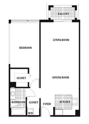
Now again – this is just for the purpose of demonstration. I know this isn’t the best floor plan in the world, and I know one person would want this, and one person would want that, but I’m just saying that when you have a square, you’re not going to waste space, and it’s really the path of least resistance.
Critics will call this “boring” or suggest it’s too common, but again – that’s not the point. The point is that there is no wasted space, no odd angles, and furniture placement is a breeze.
The point is that this floor plan is far, far better than something like this:

Okay, so I just drew that up in paint, but you get the point!
There are thousands of terrible floor plans in Toronto condominiums, and many of them could be avoided.
There’s nothing wrong with an angle or two, but how many CityPlace condos have bedrooms with eight walls?
So that brings me to the world’s worst floor plan.
This is something I came across in my travels, and something that I find utterly shocking.
It’s something that, to me, represents an impossible sale.
Here it is, in all its glory:
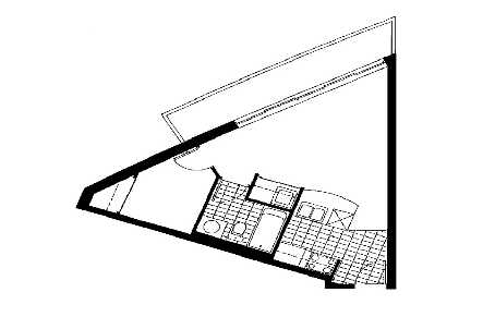
A goddam TRIANGLE!
Imagine living in that space. Seriously – just imagine it.
Can you picture yourself in that space?
No? Alright, how about now:
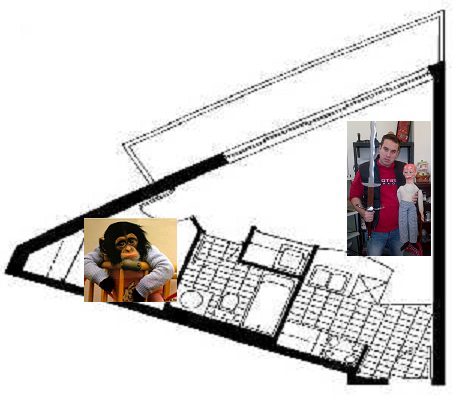
Now that I’ve added a cute monkey, and an even cuter photo of me holding a giant sword in one hand and a scary toy doll in the other, can’t you see how magical it would be to live in this triangular-paradise?
The bedroom is barely large enough to fit a bed, and while they’ve eliminated the triangle-shape by putting a closet in the corner of the triangle, thus squaring the wall (except now your closet won’t fit clothing…), we can’t ignore that the room has no window!
The living room, however, is a disaster.
First, consider that most agents would call this “living/dining,” even though you can barely fit a chair and a tv.
Second, look closely and you’ll see that your couch would have to be adjacent to your kitchen appliances, or two feet from your toilet and sink.
Lastly, how would you fit ANYTHING in that bizarre triangle?
Perhaps the owner should look into custom furniture – something that would wedge perfectly into that 60-degree angle! Or, just take your grandmother’s oak corner-cabinet, and maybe all the Royal Doulton figurines that come with it!
Either way, I think the unit would look ten times worse in person than it does in this floor plan.
So who then is the buyer for this unit?
The only word that comes to mind is “investor,” but then the follow-up question becomes, “Who the heck would rent this place?”










Dan Dickinson
at 7:22 am
That triangle’s so bizarre New Order wrote a song about it.
David Fleming
at 11:25 am
@ Dan
Once again, you prove your wit is too much for the average blog reader to handle! 🙂
But you did motivate me to open up iTunes…
Vincent
at 9:20 am
OMG I love floorplans, they are so much fun and imaginative. This floorplan is a disaster (you posted), I can’t even imagine the dimensions.
New Buyer
at 9:25 am
You didn’t mention that there is no closet by the entrance, the bedroom has no windows, and the front door is literally in the kitchen.
I think so many new condos have awful and cramped layouts (lots of corners or awkward angles, windowless bedrooms, linear kitchens), not to mention the horrendous build quality. When the newness of these units wears off, you will be left with a very unattractive condo.
Some older condos have fantastic floor plans but are in need of a serious renovation. The challenge is to find a well managed and well located building.
Scott
at 6:03 pm
David did mention the lack of windows in the bedroom, but good point about the absence of a closet by the entrance.
Where are people supposed to hang their coats? On the kitchen faucet?
George
at 10:41 am
When shopping for a condo a few years ago, I looked at some condos on Queen’s Quay and the Times Square building on Front Street that had similar angular layouts. I kept trying to place furniture in my mind, but there just wasn’t any way of doing it without cutting off walkways or angling a couch away from the TV. So yeah, that’s pretty useless. If the room isn’t a rectangle, it’s a furnishing challenge.
PFS
at 5:05 pm
I like the monkey.
Scott
at 6:05 pm
So do I. But, he doesn’t fit… the bedroom’s too small.
Bongo
at 10:54 am
Can you explain the sword and the doll? I think it needs clearing up!!!
Groperty
at 10:03 am
Sometimes even great interior design can’t compensate for a bad floor plan!