What kind of a band name is “Bananarama” anyways?
I understand that during the last decade of mainstream music, literally hundreds of thousands of bands have come and gone, and musicians need to get creative to come up with names that are not only appealing, but also haven’t been used before.
I’m pretty sure if a cool, indie band from Whitby tried to market themselves as “The Beatles,” they likely wouldn’t get very far.
I think my favourite band-name origin has to be Lynyrd Skynyrd.
As the story goes, the band members had a very tough gym teacher at Robert E. Lee high school in the 1970’s, named “Leonard Skinner,” and they wanted to mock him by naming their band after him.
So if I had a band, I’d call it Byb Myntgymry…
“Bananarama” just doesn’t seem like a name that can be taken seriously, although “A-Ha,” and “Devo” aren’t much better.
Banarama hit #1 on the U.S. dance charts in 1987 with their single, “Venus,” but I think “Cruel Summer” has been more absorbed by pop culture over the years.
As it should be.
I mean, how can you forget lyrics like this:
Hot summer streets
And the pavements are burning
I sit around
Trying to smile but
The air is so heavy and dry
Strange voices are saying
(What did they say?)
Things I can’t understand
It’s too close for comfort
This heat has got
Right out of hand
It’s a cruel, (cruel), cruel summer
(Leaving me) leaving me here on my own
It’s a cruel, (it’s a cruel), cruel summer
Now you’re gone
It’s a cruel, (cruel), cruel summer
(Leaving me) leaving me here on my own
It’s a cruel, (it’s a cruel), cruel summer
Now you’re gone
The city is crowded
My friends are away
And I’m on my own
It’s too hot to handle
So I got to get up and go
It’s a cruel, (cruel), cruel summer
(Leaving me) leaving me here on my own
It’s a cruel, (it’s a cruel), cruel summer
Now you’re gone
It’s a cruel, (cruel), cruel summer
(Leaving me) leaving me here on my own
It’s a cruel, (it’s a cruel), cruel summer
Now you’re gone
You’re always around
You found yourself
But now you’re by yourself, waiting for me
I’m your self
I am the sun (leaving me)
–
I’m no expert lyricist, but it sounds like somebody got left alone in Toronto on a long weekend without an invite from her friends to hit up the parents’ cottage on Lake Joe!
And if I’m right, the “I’ve got to get up an go” means she’s going to crash the party! That’s ballsy!
Imagine the surprise of her friends, at an epic dock-party, drinking mimosas, talking about which equestrian camp they went to as children, and BAM! Bananarama-the-left-behind, shows up, unannounced.
Or maybe I’m wrong, and this is just really crappy 80’s retro with no meaning, other than the cliché boyfriend who hurt her feelings.
Either way…
So here we sit, after the first month of a two-month summer break of sorts for the real estate market, and I figured we’d take a quick pulse check.
As I’ve written before ad nauseam, May is often viewed as the “peak” of the spring market, June is an extremely strong month (on par with April) but certainly falls below the peak of the curve, and things really, really slow down in July and August before the Fall market starts back up again after Labour Day.
In my July e-Newsletter, I noted that my expectation for the average home price, after April, May, and June averages of $804,584, $805,320, and $807,871 respectively, would fall below $800,000, simply due to the decrease in activity.
And that’s exactly what happened.
The July average home price in Toronto dipped to $782,129.
Now before we actually measure that number, and determine whether it’s more or less than expected, let me show you two headlines from last week when the TREB numbers were released:

Wait. What?
“Home sales and prices rise in Toronto region for a second straight month?”
I just said that the price dropped from $807,871 to $782,129.
I’m not wrong.
And technically, neither is that headline.
They’re talking about the second straight month of “year-over-year” increases, which holds true. But the way in which we measure the market, and the way in which we explain statistics – especially through headlines, can be oh-so-misleading!
I’m not here to cheerlead the market, and I’m also not going to fall into the bear-trap. But as I write, almost every month, surely we can clear all this up a bit, no?
How about this headline:

This one isn’t as poorly-constructed as the one above, since it doesn’t say “…for the second straight month,” referring to a monthly year-over-year number (man, that just sounds awkward). But it doesn’t specify whether the 19% refers to monthly or yearly, and again, in this case, it’s looking at year-over-year numbers.
So where does that actually leave us?
What is the public perception?
Here’s three headlines from the last 3 1/2 months, all from the Globe & Mail’s real estate reporter (keep in mind – the reporters don’t choose the headlines), and note how the sentiment changes?

Signs of firming?
Really?
Okay, well let’s take a look at the numbers.
For today’s experiment, I want to look at the drop-off (which we take as given) from June to July each year, as the market slows down for summer.
I want to look at Price, Sales, New Listings, and Active Listings.
And in order to draw any conclusions about how the month of July went, I want to compare the June-to-July drop in 2018 to the previous decade.
Sound fun?
First, let’s take a look at the average Toronto home price:
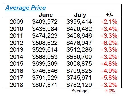
Despite what the newspaper headlines say above, we did see a drop in average home price in July, from June: $807,871 to $782,129 as previously noted!
That’s a 3.2% drop, which is significant in some ways, ie. when you consider the May-to-June increase was only 0.9%, but also insignificant if you compare against previous years.
This is what I wanted to look at: historical context.
Last year, we saw a 5.8% drop in average home price, and that was after the hammer had already hit in May and June.
The previous two years, we saw drops of 4.8% and 4.9% respectively.
And as you can see from the “average” at the bottom of (-4.0%), the 3.2% drop is trailing the decade-average.
For what it’s worth, the 3-year moving average including 2015, 2016, and 2017 was (-5.2%). So I have to conclude that the 3.2% drop in average home price that we just saw, is a sign of a healthy market.
–
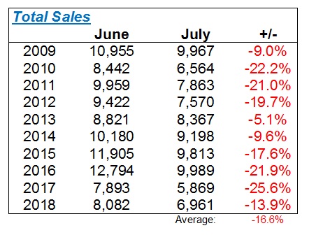
I’m tempted to look at the sales figures for June and July of 2018, measure them against 2014, 2015, and 2016, and say, “Wow, are sales ever down!”
But in context here, it doesn’t tell us about the market right now.
We saw sales drop 13.9% from June to July, which pales in comparison to last year when the drop was almost double.
Once again, that 3-year moving average greatly outweighs the overall average; a 21.7% decline from 2015, 2016, and 2017, compared to the 16.6% average through the entire decade.
Either way, the 13.9% drop this year, once again, shows the market is healthier than the average market during the last decade.
–
Next, we look at the number of listings, and here’s where you could make an argument either way.
On the one hand, you could suggest that a large drop signifies a healthy market, in that the summer is usually, or “supposed to be” slower.
On the other hand, you could suggest that market activity is market activity, and that the more listings there are, the busier the market is, and that in itself, demonstrates a bullish market.
Personally, I think the former applies.
I think the market cycle exists because of differing market forces, tastes and preferences, and interactions between buyers and sellers. There are peaks and valleys, and good and bad times to list.
Here’s how the Active Listings look for the past month, and compare to the last decade:
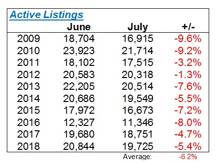
So if you’re taking my opinion on the measure of this statistic, you’ll note that a “healthy” market would see a larger than average drop, unlike the Price and Sales statistics above.
There were a LOT of “leftover” listings in 2017 from sellers who refused to accept market conditions, and held on for dear life. So the 4.7% drop, up against the 8.0% and 7.2% drops in the two years preceding, doesn’t surprise me.
But I am surprised to only see a 5.4% drop in 2018.
It looks ‘normal’ up against the 2017 number of 4.7%, but that, as I explained, was abnormal.
A healthier number, in my opinion, would have been around the 7-8% mark.
This tells me that a lot of holdover or leftover listings still exist, and we are still seeing freehold sellers listing at prices below fair market value, not getting what they wanted on “offer night,” and then re-listing again at a higher price. They often sit on the market thereafter, for weeks or months at a time.
–
Last but not least, we look at the New Listings.
And this number surprises the most.
New listings only dropped 12.9% from June to July, after seeing this number balloon to 27.8% in 2017, off a 20.2% stat in 2016:
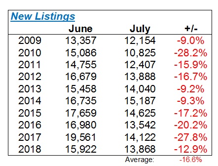
I’m shocked that so many sellers out there chose the month of July to list their properties.
Granted, the condo market isn’t nearly as cyclical as the freehold market, and while I would argue that I would rather list in June or September, I’m not completely averse to listing a condo for sale in the summer, as I would be with a single-family freehold.
But I would have expected this number to be way larger, at least showing a 20% drop.
–
Overall, I’d still say the month of July showed strength.
I’m always more concerned with price than I am with listings, and while I don’t make as big a deal about the number of sales as many people (especially the media who often lead with sales, over price), I do think the sales activity in July shows incredible strength when compared to the previous three years.
I wrote in a blog post a few weeks ago that you really can’t tell much about the overall health of the market from one slow summer month, and I stand by that.
But if you want a snapshot, or a proverbial “balance sheet” at a particular point in time, you can draw a very small takeaway from the numbers above, as they compare to years’ previous.
I do expect the average home price in August to dip once again, below the $782,129 number that we saw this past month.
But I would also expect the average home price in September to soar into the $820K range as sales pick up again dramatically.




















Ed
at 8:35 am
David you wrote -I do think the sales activity in July shows incredible strength when compared to the previous three years.
When I look at the sales numbers for June and July combined I see the lowest total number of sales over the last 10 years, and well below the average. While I wouldn’t conclude that the market is dead from this one stat, I would certainly think that it is still recovering.
Ed
at 8:38 am
Another good band name from the 80’s. Bow wow wow.
Also a girl band.
Batalha
at 2:57 pm
And a better band than Bananarama (sorry, David). Check out “I Want Candy” (Annabella was/is awesome).
Derek
at 10:26 am
Great post; nice to get those numbers in one place;
Housing Bear
at 10:36 am
Listings and sales proceed prices, Vancouver is a good example for this, inventory has been building since January, now prices are starting to drop, interesting to see how deep it goes. I’m still firmly in the bear camp for GTA. Dougy boy could toss his developer buddies a bone by introducing one of those first time buyer 5 year no interest down payment loans, that could let things run a bit further, but its looking like we should have 1-2 more hikes in 2018, then maybe 1-2 in the first half of 2019. YES, small chance that the overnight benchmark is up a 100 bps by May of next year. It would take a massive shock for anything less than 50 bps by that time. A record amount of new build condos on their way which were mostly pre sold prior to B-20 and rate hikes. Hopefully the investors can cover their cash flow negative gold mines.
Appraiser
at 11:44 am
Demand is still strong, possibly pent-up to some degree.
Listing are chronically low, again.
Price pressure to the downside is weak. Higher rates may keep a lid on things, but it is clear that the much-needed correction is well behind us.
Professional Shanker
at 11:51 am
when does pent up demand begin to show up? The hypothesis was that it would show up in the summer after a slow spring but that has not materialized, how many more months of below 10 year average sales will it take for the pent up demand narrative to vanish? If fall continues to show 10 year low sales volumes I think that should be enough time, or then the narrative will be 2019…….
Housing Bear
at 12:21 pm
My favorite is how agents always remind buyers that you cannot time the market. Only to come out and say that a bunch of their selling clients have taken their properties off the market to relist and “time” the fall surge.
Ralph Cramdown
at 11:52 am
So here’s the same analysis as above, but just for 416 detached.
416 Detached June – July Average Price
2012 803671 752431 -6.38%
2013 866326 793842 -8.37
2014 921127 880433 -4.42
2015 1051912 996770 -5.24
2016 1259486 1202753 -4.50
2017 1386524 1304288 -5.93
2018 1354429 1350700 -0.28
Average prices are down a lot less than usual.
416 Detached June – July Median Price
2012 615000 589500 -4.15
2013 675000 620000 -8.15
2014 721250 700000 -2.95
2015 808000 750000 -7.18
2016 950000 915500 -3.63
2017 1085313 979000 -9.80
2018 1035000 950000 -8.21
Median prices, though, seem to be down by a typical amount month over month. And are STILL lower year over year.
416 Detached June – July Sales
2012 1257 852 -32.22
2013 1137 986 -13.28
2014 1312 1045 -20.35
2015 1488 1031 -30.71
2016 1491 954 -36.02
2017 848 556 -34.43
2018 885 672 -24.07
Sales down by a typical amount?
416 Detached June – July Active Listings
2012 2112 1993 -5.63
2013 2361 2031 -13.98
2014 2068 1877 -9.24
2015 1777 1554 -12.55
2016 1149 1002 -12.79
2017 2196 1963 -10.61
2018 2260 2049 -9.34
Ditto actives.
416 Detached June – July New Listings
2012 2084 1548 -25.72
2013 1946 1599 -17.83
2014 2145 1721 -19.77
2015 2191 1548 -29.35
2016 1994 1334 -33.10
2017 2096 1282 -38.84
2018 1793 1365 -23.87
Ditto new listings.
Have some high end sellers decided to throw in the towel and dump product in July that normally would’ve been sold in Spring or Fall? Or have heretofore missing high end buyers finally returned? Choose your own narrative.
Appraiser
at 1:54 pm
Just for the sake of posterity lets review the average sale price for July over the past 5 years. Who’s betting the number next year will be lower?
2014 $550,625
2015 $609,236
2106 $710,471
2017 $746,218
2018 $782,129
Housing Bear
at 4:03 pm
I would take that bet, but I would prefer to say July 2020 will be below 2016 prices. I could see some strength in the fall of this year with condo owners moving up the ladder. Price gap has closed and higher rates take a while to work their way through (pre approvals). 1 bdr condos are the market floor, until they go, the rest of market can only drop so much. I still think we will be in a full on panic by next spring, but a strong enough bump in the fall could have buyers and sellers still playing chicken this time next year. Record condo supply on its way into a falling sales, higher rate environment so the pain train is coming. Failed NAFTA talks, a Chinese financial crisis, US recession, a bond route or an escalated trade war could accelerate this. A Dougie first time buyers interest free loan could give the condo market a longer runway. Sustained wage inflation could mitigate some of the fallout.
Appraiser
at 5:43 pm
Timestamp. You’re on! I bet that prices will be higher next July.
Loser has to keep on visiting this blog offering opinions. Winner must do same.
Housing Bear
at 6:06 pm
I will admit I’m wrong and change my name to Housing Idiot
Derek
at 11:41 pm
I’d say you two are cutting to the heart of the matter. So often, reading any reporting of R/E stats and associated commentary is unsatisfactory, but it is difficult to put your finger on why that is. I think it’s because typically, the stats are displayed and the commentary is often, “things don’t look good” or “things look fine”, or whatever. But, not good, or fine, against what? The past.
What everyone wants to know is what will it be like in the future; At least a year into the future. Kudos to you guys for addressing or guessing or making a call as to what many people that read any real estate information really want to know.
I imagine most people do not want to overpay today for a home that will be worth less in a year or 3 years or 5 years from now, even if it will be worth more 7 years from now.
Right or wrong in your predictions, you guys are addressing the key question (to the extent it can be addressed)
Appraiser
at 5:53 pm
P.S. All those condos are sold, many will be rented out – just what the core needs.
Please, no more old “condo glut” theories – that nonsense didn’t work last time, for the same reasons.
You must feed the beast with people… Toronto is the shit.
Housing Bear
at 6:05 pm
I would say all those condos are reserved not sold. 20% has been paid. The rest is dependent on bank financing, where the “buyer” entered the contract pre B-20 and pre rate rises. Hopefully they can all make up the difference. Those poor schmucks we read about a few months ago in Oakville were not so lucky.
Appraiser
at 9:02 am
Condo prices have been soaring steadily since “all of these” condos were sold, in some cases, years ago. Lenders covet the security (resale value) of the underlying asset, which in the case of most new condominium apartments, is solidly above the original price from the builder.
A few basis points in interest rates have not yet proven to be an instrumental barrier to buyers, many of whom have significant skin in the game (20% down payments) and a great deal of incentive to close.
Save for a real estate crash, which some observers seem to be praying for, the vast majority of these deals will close successfully.
False alarms are and dystopian hypotheses are not helpful.
Housing Bear
at 10:33 am
Yup and considering that new builds that were occupied in 2017, presumably presold 2013-2015, were 48% investor owned I think it is safe to assume that the % of investors buying up the presales between 2015-2017 was above 50%. 44% of the investors that took possession of their units in 2017 were losing money month over month. The 2015- 2017 presales were going crazy and at much higher price points. Rents have been increasing but that gain has been somewhat offset by raising rates. I’d imagine the bulk of the investors receiving their units over the next two years will be cash flow negative. Does the appreciation keep going like it has been? I think rates and b-20 will cap it out very shortly.
Anyway, bets are in, we will see what happens. Chances are we will know who is right by spring of next year.
daniel b
at 11:13 am
Hey housing bear, i wanted to respond to your comment on the 48% of investors being CF negative, but it was already too deep in a thread to respond to.
Here’s what i can’t figure out about the survey. Charts 3,4, and 5 in the urbanation report show who(m?) the investors are borrowing from. Chart 6 shows the interest rates they’re paying. ~6% of investors are borrowing from a non-bank. Yet over 15% of investors are paying north of 6% on their mortgage and another 15% are paying north of 9%.
This doesn’t make sense to me. Are the banks seriously charging these people over 9% on their mortgage? If so, no wonder they’re cash flow negative on their properties!!!
Overall, somethings fishy with those responses IMHO. Not sure what the real answer is though.
Housing Bear
at 12:02 pm
Its hard to say. I wish the report made things clearer in that regard. If i was to speculate it could be one or a combination of the following factors. – Maybe a mortgage broker on this site can weigh in.
1. An investor with multiple properties will be viewed as higher risk and may have to pay higher rates. CMHC does not insure investment properties.
2. While it says 5% of total credit came from private lenders, it also points out that 10% of total transactions involved them. Perhaps some of these investors hold multiple mortgages and are being counted twice. Use the private lender to get your down payment (i’ve heard about some of them charging 18%) then get a better rate from the bank for the rest of the value.
3. It looks like approximately 45% of investors were paying below 3%. Another 20-25% are paying between 3-6%. Perhaps the 75% of total mortgage credit held by big banks is mostly distributed in these tiers. Are HELOCS that are used to buy investment properties counted in this?
4. Credit unions and trusts perhaps charge higher rates than banks. They make up 20% of total credit.
Again, I am not sure what their methodology was for most of these calculations so I am purely speculating above. Your guess is as good as mine.
Housing Bear
at 12:04 pm
Also, 48% of units were held by investors. 44% of whom are cash flow negative.
Batalha
at 3:09 pm
“…the way in which we explain statistics – especially through headlines, can be oh-so-misleading”
Isn’t the lesson ridiculously simple? Read the story, not just the headline. Which I would argue most people actually do. And those who don’t, deserve to be misled (caveat emptor, and all that).
Sohag Mahmud
at 1:42 am
Nice Article.Need Broker in Spain Visit
http://www.spainforsale.properties/
SpainForSale.Properties
• Villas for sale in La Mairena
• Villas for sale in La Quinta
• Villas for sale in Las Brisas
• Villas for sale in Guadalmina Baja
• Villas for sale in Guadalmina alta
• Villas for sale in Los Almendros
• Villas for sale in Nagüeles
• Villas for sale in Puerto Banus
• Villas for sale in San Pedro de Alcántara
• Villas in Sierra Blanca
• Villas for sale in Marbella Golden Mile
Kramer
at 11:13 am
Great numbers David… whatever the conclusion, it’s good to remember there are these long term trends at play with lots of historical data, and that +/-$10,000 here, or +/-100 VYA or VMA listings there don’t determine the health/direction of the market…
And since Real Estate should be a long term asset/holding/investment, these are the only trends we should actually care about (along with trends in key drivers of these market statistics).
A
at 5:52 pm
I am not seeing a big recovery in the market. Yes, a few more expensive properties changed hands but many of these more expensive properties had to take a price cut…