

Oh, don’t you just love “stats day,” as we call it in my office? The day when the Toronto Real Estate Board releases Market Watch, and we all run to the computer to see what Santa gave us?
I guess maybe depending on the current market conditions, it’s like that great Christmas from 1994 when you hit the jackpot, versus that less-than-steller Christmas of 1995 when your Dad decided that you were too old to still be getting presents and left your Mom to pick up the slack.
There’s just such a mystery around the TREB numbers, and when they’re finally released, after clicking “refresh” for five straight days to start each month, our curiosities are finally satisfied.
This may come as a surprise to some of you, but this month I’m not going to pump the tires of the increasing average sale price figure like most agents are doing, which now sits at $838,540.
Instead, I want to look at some different stats, and while not as interesting as price, looking at sales and inventory might provide an even better explanation of what’s going on in the market, and why.
I want to look at the ratio of sales-to-new-listings, or SNLR as it’s commonly known.
Then I want to look at absorption rates, and months of inventory, which actually uses active listings, rather than new listings, so it means more work for me but more accuracy for you.
First, let’s look at the ratio of sales to new listings in each month so far in 2019:
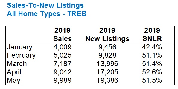
Make note of the SNLR, which shows that 2019 started slowly and then ramped up significantly thereafter. But the consistency in the market is what surprises me, with a 51.1% SNLR in February leading to an almost identical 51.4% SNLR in March, bookended with a 51.5% SNLR in May. Even April only saw a modest 1.2% jump from March, so the February-to-May market was incredibly consistent!
Sales went up each month, but so did new listings, and thus the SNLR remained almost the same.
I would have expected to see the SNLR to start around 40%, then up to 43%, then 46%, 49%, and 52% as we get into May.
Just for context, this is how 2019 compared to 2018:
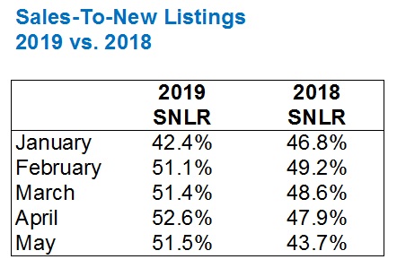
With the exception of January, the SNLR was higher in every month this year, which explains why prices have risen.
The huge 7.8% jump in SNLR in May speaks to just how busy the past month was, as well as why the average home price, at $838,540, is at its highest point in two years.
Coming into this blog post, I made an educated guess about the difference in SNLR between the 416 and the 905, thinking that the 416 would have to be anywhere from 8% to 12% higher than the 905.
Keep in mind that when looking at any “TREB” statistic, “TREB” isn’t “Toronto” as you might understand it. If you live at Highway 7 and Pine Valley, you might tell folks on your trip to Bahamas that you’re “From Toronto,” but according to TREB, you’re not. You’re from York Region. And thus, the “TREB” stat includes Halton, Peel, York, Durham, Dufferin, and Simcoe, and TREB further divides this into “416” and “905.”
When breaking down the data into 416 vs. 905, here’s what I found:
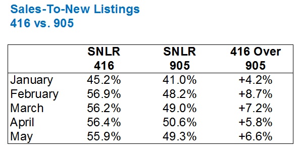
Well, it looks like my feelings were wrong, for starters!
But more importantly, most of us would believe that the 905 has become a “buyer’s market,” which prices having dropped substantially since 2017. The SNLR’s hovering around 50% would lead us to believe otherwise.
We’re looking at new listings right now, but active listings are typically used in the calculation of “absorption rate,” which is the metric used in defining a “buyer’s market” versus a “seller’s market.”
Now this may come as a surprise to many, but a “buyer’s market” is typically defined as a market where the absorption rate is less than 12%.
Twelve percent?
Whaaa?
Yes, well, we’ve been in a red-hot Toronto market for so long that the idea of a 12% absorption rate is ludicrous.
For what it’s worth, a “balanced market” is one where the absorption rate is 12% to 20%, although I have seen resources that use 14% instead of 12%, for what it’s worth.
A “seller’s market” is a market where the absorption rate is above 20%.
So how do these figures look once we’ve begun to use active listings rather than new listings?
Let’s repeat the first chart:
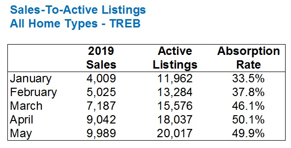
The absorption rate follows a similar pattern as the SNLR, which is to be expected. New listings and active listings typically move in tandem, and thus these patterns should be repeated.
But it’s also worth nothing that, most of the time, there are more active listings than new listings, thus it seems to reason that the absorption rate would be lower than the SNLR. There are months in which the new listings are higher than active listings, and it always makes the stats look a little odd.
So as we’ve done above, let’s compare the absorption rates between the 416 and the 905:
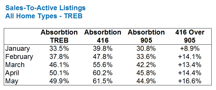
Now things start to look, on paper, the way they did in my mind.
The SNLR ratios above for the 416 vs 905 showed only a slightly busier market in the 416 than the 905, and that’s really not what I had expected.
As you can see from the difference in absorption rates, however, the difference is more pronounced.
Not only that, we’re now starting to see rates into the 60% range, which wasn’t the case of the SNLR.
But I wanted to break this down further and look at property types.
This is where things got very interesting!
Not only because of the differences between the 416 and the 905, but because of the differences between 416 absorption rates for, say, detached, versus 416 absorption rates for semi-detached.
Some of these numbers are just downright batty.
Here’s the chart for detached homes:
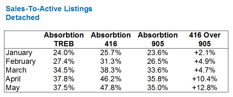
Two important notes here:
1) The absorption rates for TREB detached in March/April/May averages 36.6%, but averages 48.7% for all property types. This shows us that detached homes are still, on paper, weakest market segment.
2) The difference between the 416 and 905, with respect to detached, is not as pronounced as with all property types.
When it comes to semi-detached homes, the number are just mind-boggling.
Before you read these, keep in mind that I double-checked, then triple-checked.
There are a few eye-popping stats here, so have a look then we’ll discuss:
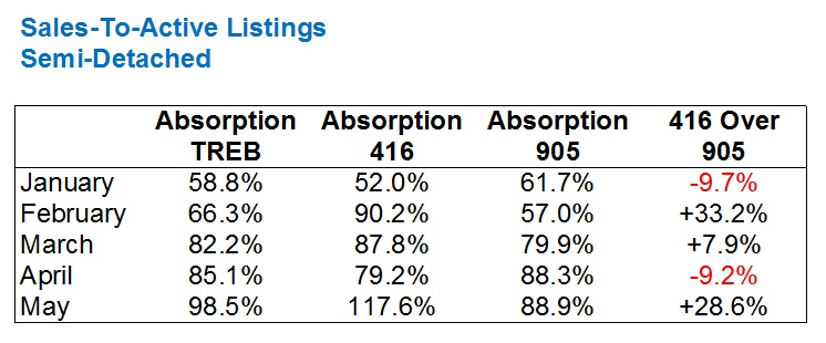
First of all, even at the TREB level, the absorption rates are just ridiculous.
A 98.5% absorption rate in May? Can that be?
Yes – that’s 1,019 sales, and 1,034 active listings. I double and triple-checked!
Now we have to keep in mind that this doesn’t mean that 1,019 of 1,034 new listings for semi-detached homes sold in the month of May. There were 1,494 new listings in May. The 1,034 refers to the amount of “active listings,” which is the number of listings left at the end of the month. The absorption rate isn’t looking at how many of the new listings sell. Then again, the sales-to-new-listings (SNLR) doesn’t either. It’s merely a ratio, since some of the sales could have been for houses listed in April, or March, or February.
Regardless, the absorption rate shows us that there’s a dearth of semi-detached homes in the GTA, and this has been consistent throughout 2019.
The 117.6% absorption rate for semi-detached homes in the 416 during the month of May is not a mistake. That’s 408 sales for semi-detached homes, and only 347 active listings at month’s end.
For those of you who like using the metric, “months of inventory,” consider that this would be less than one month of inventory.
Months of inventory is essentially the inverse of the absorption rate, although MOI is typically a 12-month running average intended to eliminate peaks and valleys.
The second item of note with respect to the semi-detached numbers is just how busy the 905 is! An absorption rate averaging 85.7% in March/April/May, wow!
Lastly, the fluctuations in 416 vs. 905 numbers was surprising, but again, I checked these numbers three times and they’re legit. It’s very odd to see the 905 outpace the 416 by 9.7% one month, then fall behind by 33.2% the next month.
Last but not least, condos:
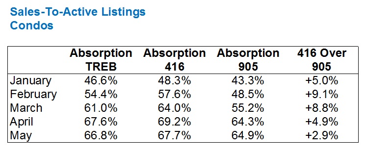
These numbers are the most consistent of the bunch, and perhaps the least interesting.
The absorption rates follow the basic pattern of an increase month-over-month through the spring, with a small drop in May.
The modest uptick that the 416 sees over the 905 is also a testament to the consistency of the overall GTA condo market, as well as the resiliency of the 905 market.
Personally, I would have thought that the absorption rates for 416 condos would be over 70%, if I had guessed coming in. Maybe as high as 75%.
–
It should be noted here that many online resources will tell you a 12-month rolling average should be used in calculating absorption rates, and many resources, especially when it comes to real estate, will simply use the number of sales in a month and the number of active listings at the end of the month. Voila!
I’m always cognizant of the fact that a small sample size can lead to problems with averages and other metrics. If I’m doing a comparative market analysis for a detached home in High Park, I won’t use the average sale price for W02/detached in each month the comparable property was sold, since that month may have seen 15, or 50 sales. That’s a surefire way to skew your data. Instead, I like to look at, say, the overall 416 home price, and then the TREB HPI, and maybe even average the two. The larger the data set, the more you avoid peaks and valleys.
But when it comes to the above monthly absorption rates, I’d say there’s enough data to draw conclusions here.
My conclusion?
There’s still not enough for sale in Toronto, and that’s across the board.
Properties might be taking longer to sell in some areas, and prices in a few neighbourhoods may have levelled off, or even dropped.
But until we start seeing absorption rates in peak months like March, April, and May cut in half, we’re going to continue to see a seller’s market. Even a luke-warm one…


Appraiser
at 8:51 am
Yeah, so excellent data and analysis and all, but everyone knows the market is still ‘gonna crash…
Signed, ‘da Bears
Professional Shanker
at 2:28 pm
buy buy buy…….Jim Cramer/Appraiser
Appraiser
at 4:12 pm
I assume the Jim Cramer reference is relevant because we are (perpetually) on the verge of a giant recession.
Amirite?
Andrew
at 11:09 am
Great post! My fave in the past little while.
Would you be able to repeat this analysis by property price range rather than property type?
Whaaa?
at 4:06 pm
Enough with the “perma-XX” already!!
Whaaa?
at 4:07 pm
Sorry, Andrew. My previous post was not aimed at you, but at the two idiots above you.
David Fleming
at 11:16 am
@ Andrew
Unfortunately, TREB doesn’t have this data published. They have sales by price range and house type, but not active or new listings.
Good idea though!
Marina
at 1:38 pm
It’s good to see the numbers backing up my personal experience in my neighborhood – houses just don’t stay on the market, unless they are really high end, or clearly overpriced.
A well-maintained or reno’d semi in the low $1M range is always gone the same week.
Good to know we are not the exception.
Jimbo
at 8:38 pm
Any thoughts on the large revision that was noted?