

Fantasy football isn’t just about the football, you know.
It’s about friendship. It’s about camaraderie. It’s a way to stay in touch with friends that you might not otherwise see or hear from.
Our fantasy football pool started in 2002 and up until last year, we’d only had one coaching change in all that time. The two new coaches were a welcome breath of fresh air and replaced two of the disenfranchised franchises, pardon that pun. And the “chat” function is a great way to keep connected.
The chat function actually contains more chatting that’s not about football than about football.
This weekend, a trivia question was asked: “What were the two C.D.’s that Dave bought on the Grade Eight graduation trip to Ottawa in June of 1994?”
The guesses were out of this world.
I’ll spoil the surprise: the one that nobody could get was “Ace of Base: The Sign”
But the one that my good friend Ryan couldn’t unforget?
“Salt n Peppa: Very Necessary”
With singles like “Shoop” and “Whatta Man,” how could I possibly leave that mall in Ottawa having not purchased this musical classic? The “Sony Discman” hadn’t been invented yet, so I had to wait until we got back to Toronto to play the disc.
Very Necessary.
It’s a great album name, and while “very necessary” was a part of our vernacular before Salt, Peppa, & DJ Spinderella released their fourth studio album in October of 1993, I like to think that the phrase has really caught on since then.
Very Necessary.
I use it a lot. It just works.
And as I noted in today’s front page excerpt, a follow-up post on Tuesday’s blog about Durham Region is, in fact, very necessary.
Prices in Durham Region are up 31.9%, year-over-year, in the month of September. A follow-up is the very definition of very necessary!
But it’s not just Durham Region that I want to talk about today, but rather the entire GTA.
The Toronto Regional Real Estate Board breaks down the GTA into seven districts, each of which contains several municipalities, as follows:
Halton Region: Burlington, Halton Hills, Oakville
Peel Region: Brampton, Caledon, Mississauga
City of Toronto: Toronto West, Toronto Central, Toronto East
York Region: Aurora, East Gwillimbury, Georgina, King, Markham, Newmarket, Richmond Hill, Vaughan, Whitchurch-Stouffville
Durham Region: Ajax, Brock, Clarington, Oshawa, Pickering, Scugog, Uxbridge, Whitby
Dufferin Region: Orangeville
Simcoe County: Adjala-Tosorontio, Bradford West-Gwillimbury, Essa, Innisfil, New Tecumseth
In past blogs, you’ll notice that I only look at Halton, Peel, Toronto, York, and Durham.
Because there are so few sales in Dufferin Region and Simcoe County, I typically don’t include them in my analyses. It’s not that I don’t want to include them, but rather if you have 2,700 sales in a single month in Toronto, 1,500 in Peel, 1,600 in York, and 19 in Dufferin, it opens the door to massive volatility in the data. What can we really expect to learn from average sale price in an area where there’s often no consistency in the numbers?
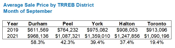
As per Tuesday’s blog post, as well as my TRREB stats post from last week, here is the chart that got my head spinning:

With the average home price in Toronto increasing 18.3% year-over-year in September, the chart above shows you how misleading that figure can be if you live in the City of Toronto, where prices aren’t up anywhere near that amount, or if you live in Durham Region where a mere 18.3% increase might be selling yourself short!
But this is only one month. It’s September. And it’s only one snapshot of the market dating back twelve months.
Let’s have a look at the data in more detail.
The first thing I want to do is look for a yearly outlier. I want to go beyond a single year and reassess the data above which shows price gains in Durham Region that are more than four times that of the City of Toronto.
Here’s how the same data looks going back to September of 2019:
Once again, Durham Region leads the pack and by a larger margin over Peel.
Peel and York have flip-flopped, however. It seems that York over-performed in 2020 relative to 2019, and that 2019 was a huge year for Peel Region!
Durham still outperforms Toronto by three times!
As noted in Tuesday’s blog post, I feel like people really, truly do not want to believe that the average house in Durham region is worth, or will sell for 58.3% more than two years ago, but the data doesn’t lie.
Going back to the start of 2019 and graphing the data, we can pick up some interesting trends?

Do you see what I see?
The seasonal adjustment in the City of Toronto is far more pronounced than in the other areas. Look at Toronto in the fall of 2020, trending over $1M from June through October, then declining substantially through January. At one point in January, you can see the lines for Toronto and Durham overlapping! Obviously, this is seasonal. But it goes to show you how resilient Durham Region has been.
Also worth noting is that while Toronto’s average home price declined in late-2020, Durham’s price increased. You can’t find a larger juxtaposition on that chart.
York Region trailed Toronto from January of 2019 through December of 2020; almost two full years. Since then, the two have gone back-and-forth, with the grey and dark blue lines intersecting multiple times.
Here’s the corresponding data for the chart above which is January of 2019 through today:

The major difference here is that the City of Toronto no longer drastically lags the pack, with Durham Region “only” ahead by a 3-to-2 ratio.
I believe the reason for this was referenced above: seasonal variation. The prices in Toronto are so depressed in December and January that to track data that starts in January makes Toronto look better overall.
Personally, I think going September-to-September gives us a more accurate snapshot, since September is a high-activity month and immune to seasonal variation.
So, having said that, let’s go back five years, shall we? Five years is a fair amount of time, and dare I say that it probably represents the average length of ownership of anybody who’s owned in the last decade, once you even out those buying their starter-condos and those buying forever-homes.
We’ll keep with the September-to-September theme to avoid those seasonal variations and get a far more accurate picture of the market, especially as we compare the five major TRREB regions:
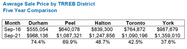
Once again, Durham leads.
Peel isn’t far behind, however.
It seems that when buyers can’t get what they want in Toronto, they go east and west. Not north, but east and west.
About five years ago, maybe more, I started selling a lot of properties in Mississauga to Torontonians who preferred taking the Go Train in the morning but having a substantially larger house than they would in the city. Mineola, Lorne Park, Port Credit, Cooksville, and Streetsville, which is further north but home to four of my clients.
Almost all of these clients had owned a condo in the city, with maybe two or three selling their small semi-detached houses in the city. There was a lot of similarity in age and family cycle, with most of these clients being in their early-30’s with 1-2 children already, or some with kids on the way.
Halton is further west than Peel and while I’ve had clients move out there, I can see the historically high prices in Oakville as a reason why Halton hasn’t appreciated as much as Peel. The same is true of York Region where the average home price was already the highest of the five in September of 2016, and where houses are larger and more expensive with seemingly less room for growth than Durham.
Check out the data graphically:

Those huge spikes you see in 2017 represent the infamous tanking of the market by the Ontario Liberal government in April of that year. Good lord, just look at York Region! It took quite some time for the average sale price to reach that $1.2M peak again. Four years, to be exact.
But what I find most interesting about this chart is Durham Region from the summer of 2017 through the summer of 2019 when prices remained flat, hovering around $600,000.
The City of Toronto was far more volatile, as you can see from the dark blue line. Toronto is, and always has been the most volatile and prone to cyclicality.
But if we look at average price growth from the summer of 2017, say, June, through to September of 2019, a funny thing happens:
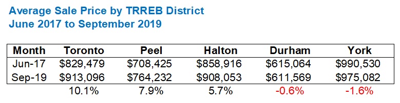
Fascinating!
To be fair, 2017 was a really odd year. But the idea of flat pricing in Durham for a two-year period, given the absurd increase in prices over the past five years, is worth noting.
So what’s the take-away here?
Is it that everybody who lives and owns in the City of Toronto should feel worse after reading this, since the “housing price increases” that they read about in the newspapers have more to do with Durham Region than where they live?
Not necessarily!
After all, we’ve only gone back five years.
To really get the full picture of GTA pricing, we should go back a decade.
Actually, nine years, since TRREB didn’t track the regional housing prices in 2011.
Here’s how the data set looks:

Toronto, eat your heart out!
Durham Region for the win!
One final thought, just to confuse the hell out of you: there are a lot more condos in Toronto in 2021 than there were in 2012.
In fact, I would guess that the ratio of condos-to-houses in Toronto, versus Durham, is exponential.
Durham does have condos, but in the past nine years, almost all of new builds in Durham have been freehold. In Toronto, almost all of new builds have been condos. So if we’re going to draw conclusions from the data above, taking condo starts versus housing starts into consideration is, well, very necessary…


Appraiser
at 11:13 am
One million: The number of new homes needed in Ontario
https://www.livabl.com/2021/10/one-million-new-homes-needed-ontario.html
JL
at 11:56 am
I wonder what the data would show broken out categorically (condo, detached, etc), and whether the higher proportion of condos is a major reason for the relatively lower Toronto average price increases.
It’s also interesting how in the last chart Toronto closely follows the trend of the other regions up until the seasonal winter 2020 dip, and then simply doesn’t bounce up anywhere nearly as much as the other regions. Covid effect maybe? (i.e. migration to suburbs)
Condodweller
at 2:22 pm
It seems to me that 416 reaches a point of price exhaustion at times when surrounding areas rise and when they reach a point where 416 seems reasonable it starts rising again. Then the cycle repeats. It looks like an auto leveling system where the surrounding areas never surpass 416 because it’s still more desirable.
Appraiser
at 1:47 pm
Good news for the planet:
“Canada’s big banks join Carney’s net-zero banking alliance”
https://www.theglobeandmail.com/business/article-canadas-big-banks-join-carneys-net-zero-banking-alliance/?cmpid=rss&utm_source=dlvr.it&utm_medium=twitter