

Before you read the following, ask yourself this simple question:
“Will the areas outside the province of Ontario show a better or worse market that what we read about in Wednesday’s blog?”
I ask this at the onset because in order to fully grasp any statistical analysis and market conclusion, I believe that you must first have some sort of expectation.
Toronto and Vancouver have long said to be the “best” areas of the country for real estate, although it depends on who you ask. A would-be buyer who has affordability issues wouldn’t put any positive label on these cities, whereas an investor who reaps the rewards of continued appreciation would call it “great.”
Whether “best” is synonymous with “most expensive” is a matter of opinion.
Some might argue that Toronto and Vancouver are the “safest.”
Others might suggest that if you can get a detached, 4-bed, 4-bath in Regina for one-fifth of the price of what it would cost in central Toronto, then that’s a better place to live.
To each, their own.
But if you really narrow in on expectations, what do you think other cities across Canada would look like when compared to the twenty-six areas of Ontario that CREA tracks, and which we analyzed on Wednesday?
Personally, I would have expected areas of Ontario to outperform.
Then again, they did outperform – they hugely outperformed in early-2022, and that’s part of the reason why we’ve seen a decline in the past two months.
Therein lies the irony!
When we look at today’s data, the conclusion might seem different from our expectations. But if we consider that volatility leads to more volatility, then perhaps the data set we’re about to analyze should come as no surprise.
On Wednesday, we noted that twenty-two of the twenty-six areas in Ontario that CREA tracks have declined since March, with two of those areas declining more than 10%, and twelve declining more than 5%.
We also noted that, since December of 2021, twenty-four of the twenty-six areas have seen an increase in the HPI. That seems to reason, given the massive increase in prices to start 2022, but the pullback in prices over the last two months has reduced these gains.
Four of the twenty-six areas saw the May figure come in as the “peak,” which is to say that these four areas did not experience a decline from March to May.
Again, keep in mind that this “decline” comes in the from of CREA’s Home Price Index (HPI) and we’re using the seasonally unadjusted composite benchmark. You can use different numbers to create a different argument and come to a different conclusion, but we’re trying to compare apples to apples while using a smoother, less volatile measure of each market.
Across Canada, not including Ontario, there are twenty areas that CREA tracks which I would call “cities” or “regions.” CREA also the following provincial stats:
Quebec
New Brunswick
Nova Scotia
PEI
Newfoundland & Labradour
Saskatchewan
Because CREA tracks St. John’s, Saint John, Montreal, Rideau, Regina, Moncton, Halifax, and Fredericton, I don’t think we want to include those six provincial stats in with our data set.
First, let’s look at the twenty areas from December through May:
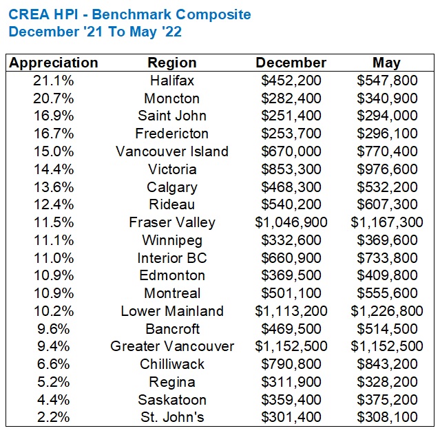
The first thing you’ll notice: no red numbers.
In Ontario, there were two regions that experienced a drop in HPI from December of 2021 to May of 2022, which were Oakville-Milton and Cambridge. These were also atop the list of decliners from March to May.
The average rate of appreciation among these twenty regions is 11.7%.
The average rate of appreciation among the twenty-seven regions in Ontario was 10.7%.
Call that a wash, right?
The medians are 11.3% and 11.1% respectively, so it would seem that the Canadian regions and the Ontarian regions have moved in tandem through 2022.
Except that how we got to this point – December of 2021 through May of 2022, could not possibly be more different when comparing Canada vs. Ontario.
Yes, the December-to-May figures look identical, but we saw a massive decline from March-to-May on Wednesday in the Ontario numbers.
Let’s re-run the chart we saw on Wednesday, and we’ll sort it in terms of “decline” as we did then:

Why did I start with the lowest first?
Continuity, for one thing. But also because it underscores just how ridiculously different these Canada-wide figures are from the Ontario figures that we saw on Wednesday.
Only five of these regions have seen a decline in HPI since March, out of twenty.
Compare that to twenty-three of twenty-seven regions in Ontario experiencing a drop in HPI during the same time frame.
So why is it that while Ontario has been beaten down in the last two months, the rest of Canada has not?
Well, I suspect it’s because of rampant price appreciation in January and February that simply couldn’t be sustained.
So let’s compare both areas once again, and this time look at December to March. This will enable us to see how prices rose from the end of 2021 through the so-called “peak” in HPI:

From December through March, the twenty-seven regions in Ontario averaged a 14.0% increase in HPI.
Remember, these same areas averaged an 11.% increase from December through May, as we saw on Wednesday. But the recent decline has whittled that gain down.
Any way you look at this, a 14% increase in three months is substantial, especially when you consider that the HPI is a “smoother” and less volatile measure than a simple average price. To see that kind of increase in HPI is shocking!
So now, let’s look at December through March in the areas outside of Ontario:

The max is lower, the min is lower, and the average is substantially lower as well.
Ontario’s twenty-seven regions increased an average of 14.0%, but the regions throughout Canada only saw a 9.6% gain in the same time period.
This makes perfect sense!
It’s almost like solving a trigonometry proof back in high school. Those were so satisfying, right?
The up-to-date data will show that, currently, Ontario is getting hit hard. Prices have dropped and so too have the respective HPI’s for almost every region. But the reason for this is because Ontario regions appreciated far faster than the rest of Canada to start the year.
What did I say at the onset? Volatility leads to more volatility? Something like that, but it makes perfect sense in this case.
It’s not quite an example of “what goes up, must come down,” but it stems from that logic. If prices are less volatile on the way up, they should be less volatile on the way down.
When the TRREB stats are released in about two weeks, I think it will be very interesting to see how the GTA and the 416 perform. We’re coming off a month of May which saw the lowest number of sales ever (I don’t look pre-2002 since a third of the city didn’t exist back then…) and I have to wonder if June will continue that trend.
I’m going to continue to monitor these Canada-wide stats through the summer as I want to know what other markets are doing. Why? Well, because as I’ve noted in recent posts, I don’t believe the drop in activity and pricing here in Toronto is actually do to the increase in interest rates, or at least not yet. I think buyer psychology has had a greater impact. People are confused, timid, and some of them just don’t want to learn about what’s happening in this market, despite being able to buy today for less than in the spring. They would rather wait. For what? I don’t know. For the market to go back up? Sure, maybe! It’s safer on the senses to buy on the way back up, even if it costs you a little.
Have a great weekend, everybody!


Appraiser
at 12:04 pm
Toronto GTA June Rent Report 2022 —> rents rise 5.7% monthly, the highest since
@BullpenConsult started writing this report in 2018″
https://www.torontorentals.com/blog/toronto-gta-june-rent-report-2022
Darin Barrett
at 5:47 pm
They claim to have done really detailed research for this article. Really? If you want to know what research means, together with all the scientific data, questionnaires, reports, verified reviews, etc. go to compacom.com. Any article on this website resembles a good expert speech designed for the people in order to help them and not confuse even more.