
That was a very interesting exercise on Wednesday!
Thank you to all the readers who took part. I’m sure we’ll continue to see votes, predictions, and opinions roll in, and I will be sure to catalogue those dates and prices so we can come back to this in a few months or years.
Of course, we only looked at the GTA average home price, and whereas many want to cast the net much wider and focus on Canada, others want one of those tiny nets that our kids use, without success, to catch butterflies. That is to say that people want to know what’s happening in the 416, and some just want to know what’s happening in the central core.
So let’s look at a lot of data today!
Those who love stats will have a field day whereas those who like MLS Musings will skim to the bottom to convince themselves they read this. 🙂
What we want to know is:
-Where/when was market bottom?
-What was the largest peak-to-trough move as a percentage?
-Where are we today based on that market peak in February of 2022?
Let’s look at each TRREB district as well as the 416 and 905 property types.
Starting with the GTA average home price, we all know that the peak took place in February.

The trough took place in January, from which we have recovered.
But the chart looks like this:

Get used to seeing that huge hump in the middle, and as with most regions, the trough is noticeable in the last few months.
Using the overall market peak of February, 2022, we see a 17.9% decline based on last month’s data:

–
The decline in Peel Region wasn’t nearly as steep as the GTA average, and perhaps as a result, the peak-to-trough wasn’t as bad:

“Only” 24.8%, compared to 26.0% for the GTA average.
However, the trough took place in December as opposed to January:
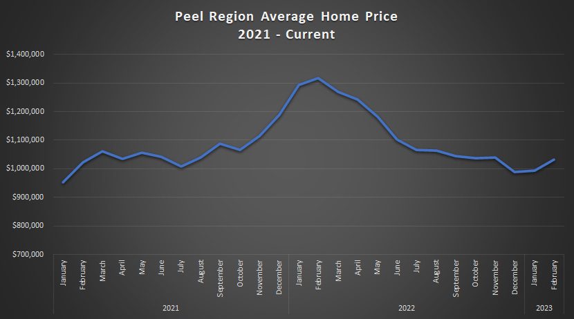
With a two-month recovery, the decline now sits at 21.6%:

–
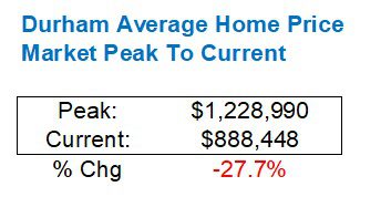
Durham Region was perhaps hit the hardest by the decline, which was almost 30%:

The chart shows a far steeper drop in 2022; actually the steepest:
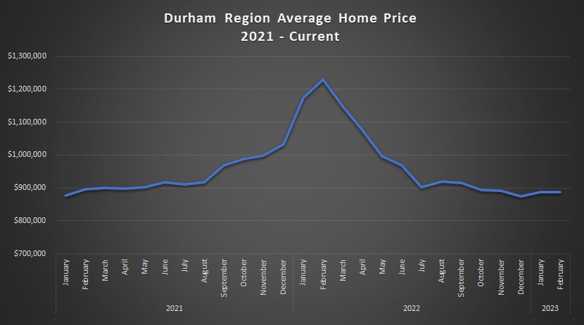
Durham has recovered the least of all five major TRREB regions:
–
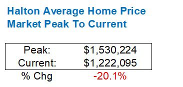
Halton saw a very large decline in peak-to-trough:

However, the chart shows a recovery that, like the GTA average and the 416, has surpassed the peak last fall:

The recovery isn’t substantial, overall though:
–
York Region saw the smallest peak-to-trough at only 20.2%:
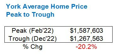
The decline last year was sharp, but not as much as Durham Region:
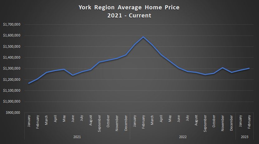
Currently, the market has recovered somewhat, but not nearly as much as the 416:

–
Last, but not least, we get to Toronto (416).
The peak-to-trough was the second-lowest:

And look at the chart!
It’s, by far, the most volatile and seasonal, and I have to think that’s because of all the luxury homes that don’t sell off-season.
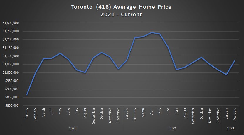
But the recovery has been substantial with the average price only down 11.5% from last February’s market peak. Looking at the actual individual peak for the 416, that figure would be slightly higher:

–
Now, as for property types, I figured we could look at the 416 versus the 905.
Starting with detached:

The 416 detached market has recovered substantially compared to the 905 so far this year as you can see at the tail end of the chart.
The ascent in the 905 detached price actually began, relative to the 416, in 2021. In fact, there was a point where the two prices drew pretty close in December of that year.
As we move into March and April, expect the 416 uptick to continue dramatically. It won’t come close to surpassing the $2,000,000 mark, but I believe the ascent has only begun.
As for move from our February 2022 peak to current:
Peak-to-current:
416: -17.4%
905: -25.5%
–
Here’s the semi-detached comparison:

As with the detached segment, the 416 has shot up like a rocket so far in 2023, but the 905 remains flat.
The crazy thing is: I can’t find a single house in the central core that’s “down” by the percentages we’re talking here, so I just don’t understand this data.
Nevertheless, the peak-to-current figures look a lot like they do above for detached:
Peak-to-current:
416: -17.2%
905: -26.0%
–
Condos is where things get really interesting or really boring, depending on how you look at it:
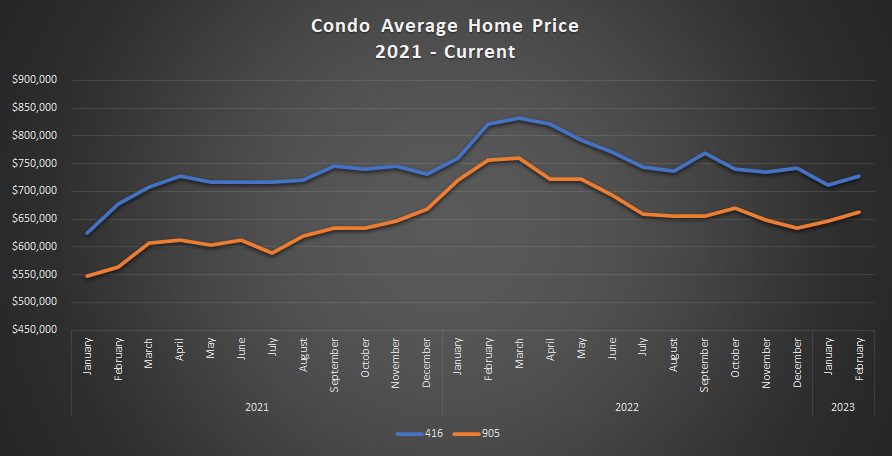
These lines almost move in tandem. But it’s our peak-to-current that speaks volumes:
Peak-to-current:
416: -12.4%
905: -12.4%
On paper, the 416 and the 905 are “down” an identical amount from their respective peaks.
Is there a semi-detached house out there that would sell for 17.2% less today than in February of last year? I really doubt it.
But when it comes to condos, I can see these figures holding weight.
I had a few condo listings in Jan/Feb/March of 2022 that just went berzerk. One comes to mind on Richmond Street: I sold it for $940,000 and I could see it getting fetching 12.4% less today, absolutely.
Then again, there are some condos selling that I feel are only 2-3% below what they might have sold for last year.
And if a Durham, Peel, York, or Halton agent wants to make the same argument in their neighbourhood, or farm area, or favourite condominium, I’m all ears.
Alright, that was a lot of statistics for one week!
Thanks again to the readers for commenting on Wednesday’s blog, and for those that haven’t, well, there’s no reason you can’t go back and do it now.
Have a great weekend, everybody!


QuietBard
at 11:34 am
11:30 and no comments….. guess people don’t like stats. Too bad, more for me I.
One thing I don’t understand is that if the avg 416 property is down 11.5% and the Detached (down 17.4%) and semi (down 17.2%) and condos (down 12.4%). What segment of the market is above the 11.5% decline to bring the average up? Either there would have to be a lot of these units selling above the average decline or they could be extremely high value listings (assuming its weighted average). Maybe 3 homes sold on bridle path are skewing the numbers? Can’t say for sure.
Also I think there should be one important distinction when comparing the peak numbers (Feb 2022) to current. In 2022 with cheap money available everybody was buying and everything was selling. Cruddy shacks in Toronto laneways were going for a million bucks. But in 2023 only “quality” listings are selling and are being bought by “quality” buyers. I’m not sure what the trend for the rest of the year will look like though…
Bryan
at 12:39 pm
The only explanation is that the more expensive property segments are making up more of the market now than they did at the peak. If the proportion of detached houses to condos is higher now than it was at the peak for example (and I am pretty sure it is), that would offset some of the declines in the individual segments in terms of overall average home price.
QuietBard
at 10:40 am
Hmmmmm…. what you say makes sense. If there are more, for example, $2 million properties selling it would bring the overall average price up. But those $2 million homes could still be selling less than Feb 2022 and thus still have the 17.4% decline. I guess looking at overall averages can be misleading or at the very least confusing
Ace Goodheart
at 3:13 pm
I have not noticed a difference in either final sale price, or difficulty of purchase (ie bidding wars, bully bids) for 416 semis and detached.
They are saying prices are down by double digits percentage wise
This is not what I am seeing in the area where I live (Junction).
I see repeated multiple offer sales. Over ask. The sale prices are if anything, higher than Feb 2022.
There are 2.5 bedroom semis here with no parking on tiny lots going for over 1.3 mil. Tiny little houses. One of the bedrooms is the size of a walk in closet and could not fit a double bed (hence 2.5 bedrooms).
There are no deals here that I can see. It is the exact same difficult to enter, ultra expensive market that it has been for years now.
A two bedroom church condo with no parking is over a mil.
I guess somewhere in Toronto, prices are down?
I am not seeing it here.
Ace Goodheart
at 11:28 am
Another thing to look at is the wide gulf in pricing between tenanted and untenanted properties.
The exact same house can often sell for 300-400k less, then another house. The only difference is one had tenants and the other did not.
The “tenant disount” is extreme.
I have purchased houses with tenants, way under asking, after having made my.own private deal with the tenants (the seller and their agent HATE it when I do this, but I do it anyway).
You save multiples of six figures, then it is like 10k to get rid of the tenants (arranged privately with them ahead of time) and you then have immediately made like 3-400k on closing.
Just by talking to someone and paying them a little cash.
The stats should list tenanted and untenanted separately.