
Soooooo………does anybody want to talk politics?
I guess after Wednesday’s blog on property taxes, which turned into a debate about how the Toronto government spends their money, I figured I’d let those that want to continue debating, continue, and those that want something flashy to look at on a Friday, can look at this blog…
I’ve seen a LOT of bizarre listings come out in the last two weeks, and for the life of me, I just can’t get over the colours!
Let’s have a look at some of the funkier features of some current Toronto listings…
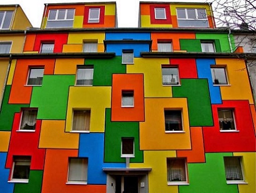
The photo above is actually a house in Cologne, Germany.
In searching Google for “colourful houses,” I realized that maybe, just maybe, we Canadians – and more specifically those of us here in Toronto, are boring with our tastes.
Everything we see out there today is some sort of “clean” and “crisp” colour, pastel in in nature, and most main living areas are some form of white, grey, or beige.
I’m not a designer, nor am I necessarily a forward-thinker when it comes to style.
But I do know that when I see photos on MLS like the ones we’re about to look at, it makes my eyes bug out just a wee bit.
How about this bathroom?
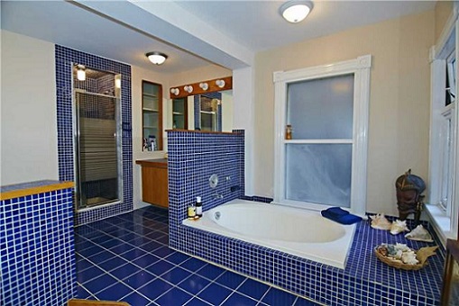
Is it a little too blue for you? Or just enough?
I know, it’s old. It’s probably 70’s. But even in the 70’s, did somebody say, “What we’ll do, is match the floor, to the wall, to the tub, to the mirror”?
When was blue “in”?
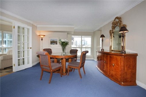
Blue carpet?
Carpet in a dining room?
Flat carpet, with no texture, that looks somebody spray-painted astroturf at Rogers Centre?
Maybe like this…
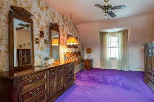
I guess blue is better than purple.
Especially when your purple carpet looks like there’s a body underneath it…
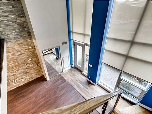
Or maybe just paint some of the property blue?
Like the columns?
Three columns, all blue, and all eyesores…
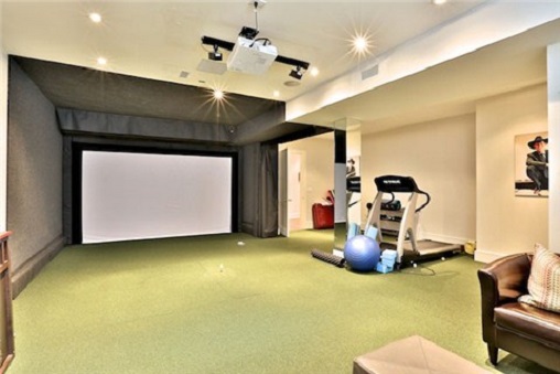
I hope this green carpet is actually astroturf, and that screen is a virtual golf simulator.
Otherwise, I think the green carpet is worse than either the blue or the purple…
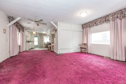
Staying with the carpet theme for a bit – how about pink?
HOT pink!
I know, I know – this is another old(er) house.
But at what point was hot pink carpet “in”? Where, when, and how did somebody see this in a showroom and say, “YES! That’s what I want in my living/dining room”?
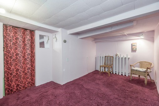
Now, is the carpet below simply dirty pink?
Is there another name for it?
Crimson?
BLOOD?
Enough carpet.
And let’s look at a new colour.
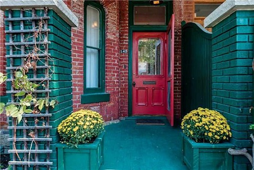
How about green?
How about green, in your face, as you come up the front steps?
Green brick, green concrete porch, green planters, green window trim.
Too much, or not enough?
Again, I’m no designer.
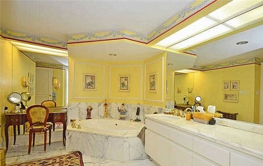
But a yellow feature wall in any condo has to be considered ugly.
A yellow feature wall next to light brown cabinets – a bit of a clash, in my mind…

Yellow just isn’t an easy colour to work with.
And while every home-owner is free to channel their inner Mick Jagger, and paint it black, if they damn-well choose, I don’t understand why, in today’s market, where every buyer expects white/beige/grey, a seller would leave their bathroom YELLOW:
Then there’s this one.
Pink, orange, light red – all in the same room.
Each wall surface was a different colour.
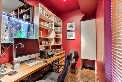
And who doesn’t love granite tile in an office anyways?
–
Yes, these photos are like a kaleidoscope of colours that don’t belong in houses for sale in Toronto in 2016.
Maybe we’re off-base here.
Maybe we should be more like the Germans in Cologne, and paint our houses every primary colour, and more.
But as I said, I don’t set the trends, I just follow them.
And as a Realtor that stages every single property I bring onto the market, trust me when I say that appearance makes a massive difference, and can swing the sale price of a house or condo up to 20%.
So why oh why would a home-owner skimp out on something as cheap as paint when it comes time to sell his or her largest asset?
Have a colourful weekend, everybody!


hoob
at 8:02 am
Notice that the purple floor was so intense it blew off one of the ceiling fan vanes.
Joe Q.
at 9:33 am
Nice catch. I LOLed.
Tamara Stone
at 9:19 am
Wow. Seems to be a theme with purple. The green carpet is probably my favourite part haha
Tamara Stone
http://www.stonesisters.com
Dan
at 9:24 am
I actually didn’t mind the blue columns
Joel
at 1:59 pm
I thought they looked good too
AndrewB
at 4:22 pm
I thought they looked great as well and are nice pops of colour!
Paully
at 9:51 am
We once looked at a townhouse where all the rooms except the kitchen were done with old, tired-looking chocolate brown shag carpet. Yeah baby! The fixtures in all of the bathrooms were lavender! Yes, purple tubs, toilets and sinks! Oh behave!
Appraiser
at 2:44 pm
SHAGADELLIC BABY!
GinaTO
at 11:18 am
Ah yes! Nothing like a pink shag carpet to brighten your Friday morning. When I was very young, the house we lived in had red shag carpet in the kids’ bedroom – it was the “strawberry field”. And the living room had green shag carpet – we called it the “meadow”. I worked for many years in a school library where the carpet had been vomited and peed on by small kids for 25 years – it had to be held down by electric tape in many places. I had nose bleeds three times a week, until the blessed day when they finally ripped it out and put tiles instead. That thing was radioactive, man.
m
at 11:49 am
Funny post. On the blue tile bathroom, I’d say the issue is more with the execution as opposed to the choice of tile colour. Blue tile bathrooms can look fantastic. But the interaction here between the white grout lines and the beige walls means the grout lines stand out more than anything else.
Re the “dirty pink”, that’s called dusty rose! I remember it well from the 1980s.
Appraiser
at 2:51 pm
Dusty rose and grey was all the rage back in the day. That and wallpaper borders, fluffy window valances and all things brass (switch-plate covers, cold-air returns, fireplace utensils etc.).
Squidward
at 6:16 pm
Appraiser, I think you’ve just described my childhood home. To a tee. [nostalgia sigh]
Appraiser
at 6:13 pm
Hey, @Ben Rabidoux, where’s that GLUT of condos that was supposed to kill the T.O. condo / real estate market you predicted?
http://www.urbanation.ca/news/89-condo-rental-activity-soars-2015
Oops! OUCH!!
Oh SNAP!!!
Chroscklh
at 5:04 pm
House with body under carpet, is for sale cheap after police investigate, yes?
lui
at 2:34 pm
The blue columns looks fine but the two different flooring he/she used near the windows is weird and those fake panels is way too much over powering for the space.