

Believe it or not, I had a post all ready to go for today about the landmark Court of Appeals ruling that will affect both marijuana grow-ops, and the application of caveat emptor, from here forward.
However, with the TREB numbers being released for the month of May, I figured the readers would hijack the comments section and ignore the court case. Perhaps, rightfully so.
So today, let me give you my Top Five important statistics to take away from the May real estate market, courtesy of TREB Market Watch…

Monday’s photo was awful, so I’m making up for it now with a photo of a cute baby!
What’s more precious, right?
So let’s get into the Top-5, and keep in mind that these aren’t really in any particular order, other than what I look at first, and what jumps out at me the most. So draw a conclusion, if you’d like.
1) Toronto Average Sale Price
How come we use “average sale price” and “average home price” interchangeably?
Well, because we associate the value with the price, and the free market. If buyers and sellers combine to produce a given sale price, then that must be the price of any given home.
Nevertheless, I strive to use the term correctly; average sale price.
The average Toronto sale price in May was $805,320.
This is significant to me for two reasons:
a) It was higher than the $804,584 average sale price in April
b) It’s “only” 6.6% lower than the 2017 average sale price of $862,149
The average home price has held quite steady so far this spring, which has surprised many.
The bears, and even those riding the fence, didn’t seem to think that the change in mortgage regulations, and higher interest rates, would keep the market running at the same speed.
But alas, it has.
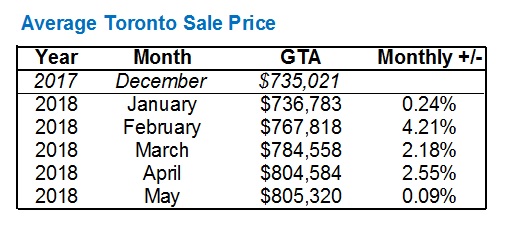
December is a slow month, and the average home price was up over $780,000 in October, so I’m not trying to prove a point that’s not there by showing the end of 2017 and start of 2018.
But I am trying to show that despite the bearish outlook of many, March, April, and May were strong months.
As for the point about the market “only” being down 6.6% over last May, I feel it’s significant because April’s number was down 12.4%.
Some of you will point out, rightly so, that the 6.6% decline is only smaller than the 12.4% decline because of the massive peak in April of 2017. I’m merely trying to show that the number isn’t as dire as it seems.
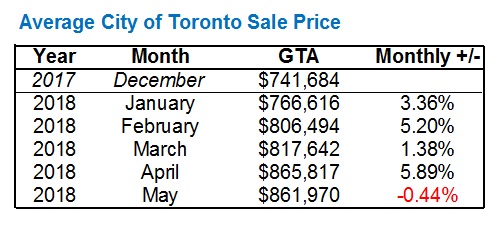
2) City of Toronto Average Sale Price
Remember that the “Toronto” average sale price is the GTA, plus Dufferin County & Simcoe County, as TREB incorporates all of the above into the overall statistic.
The City of Toronto is the MLS districts you all know – West, Central, and East.
The City of Toronto average home price is down 4.2%, year-over-year, compared to the overall TREB average of 6.6%.
This has been the trend throughout the start of 2018:
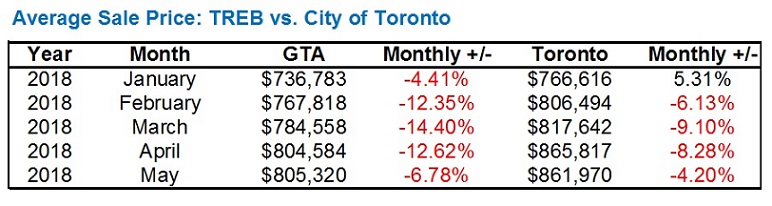
As continues to be the theme, the City of Toronto is outpacing the rest of the GTA.
Interestingly enough, month-over-month, we actually saw a slight decline:
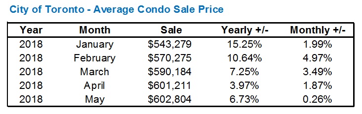
3) City of Toronto Average Condo Sale Price
The average Toronto condo price increased marginally, just like home price, from $601,211 to $602,804. Essentially akin to a rounding error.
What’s impressive about this number is that after all the heat in the early-2018 condo market, that number is still holding steady.
When downtown 1-bedroom units were selling for $1,000 – $1,100 per square foot, onlookers were saying it wouldn’t last.
Here’s the average Toronto condo sale price so far this year, with both year-over-year, and monthly increases:
Now as for that downtown core that was on fire early in 2018, is it possible that the area has cooled?
Are there other areas of the city that are picking up the slack, say, if those $1,000 – $1,100 per square foot numbers weren’t being met?
To be honest, I would have thought so.
I truly would have.
So I was shocked, when I looked at the C01 data, to see this:
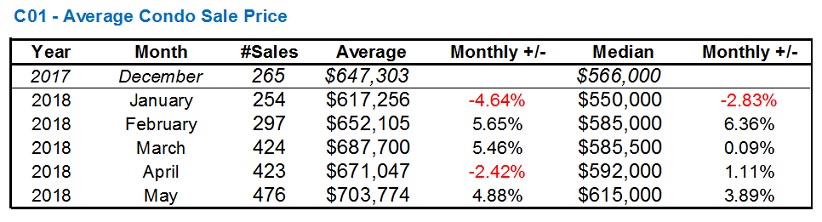
Perhaps the month of May, and the 2.42% drop, was an outlier.
But overall, the C01 average condo sale price has risen all year, and continued into the month of May. I included the Median price just in case the small(er) sample size misled, but overall, the two numbers tell the same story.
4) City of Toronto Detached Sale Price
I can’t help but feel like it seems I’m putting a positive spin on things.
But I’m not.
Or at least I’m not trying to.
Honestly, this is what I look at when I boot up TREB Market Watch – GTA sale price, Toronto sale price, condo sale price, and now detached sale price.
The detached segment of the market was probably the hardest hit when the market turned in 2017, and perhaps that’s because it’s the most expensive, and thus prices had the longest way to fall. But one could also argue that the more expensive a home is, the more somebody would “overpay.”
Either way, the detached segment has made a huge comeback in the past two months:
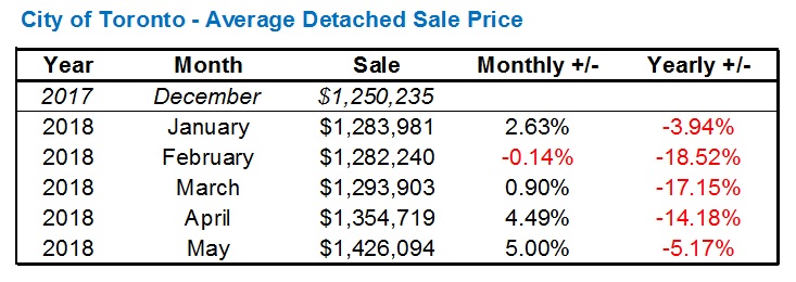
The year-over-year number doesn’t look nearly as bleak in May, at -5.17%.
I never would have thought that the detached number would actually decrease from January to February, but there it was, even at a little more than a tenth of a percentage point.
The Toronto-detached segment was slow to start, but has really picked up of late, up 10.2% in two months’ time.
5) GTA Total Sales
Yes, this is one of the last stats I look at, and it’s one of the first that many, including the media, want to view.
I generally don’t care how many properties are changing hands, as I’m more concerned with the price.
I know that many conclusions can be drawn when looking at sales, but it’s a bit further down on my list.
The most interesting part of the spring numbers, as they pertain to sales, is the consistency. Around 7,000 sales in each of March, April, and May:

I would also note that the decline in sales is, in itself, declining.
34.9%, 39.5%, 32.1%, and now “only” 22.2%.
But again, much of that can be explained by the market cooling last May, lower sales numbers, and thus a lower number against which to compete this year.
The second-most interesting part about these numbers (or the first, if you find the previous point lacking), is that the typical pattern of sales increasing through spring has become the norm, after the trend was bucked last year.
In each of 2013, 2014, 2015, and 2016, sales progressively increased from January, to February, to March, to April, and finally May.
Last year was the only year in the six years including 2018, in which sales declined from March to April, and April to May:
This year’s increase is modest – from 7,792 to 7,834, April to May, a mere half-percentage.
But a trend continued, nonetheless, especially considering the 12.2% drop in sales from April to May last year.
–
So there is my take on the May numbers.
Bullish, optimistic, glass-half-full, and through rose-coloured-glasses. And if anybody can tell me the origin of the “rose coloured glasses” idiom, without the help of Google, then you are my Star of The Day.
As I said, I’m not looking to paint a cheerful picture of the market.
There are terribly slow, and declining pockets of the GTA.
Sales are down, affordability is down via both new regulations and higher rates, and oh yeah – we have an election in two days.
But that’s the way I saw the month of May.
Let me know if you see something different…


Carl
at 8:00 am
“I generally don’t care how many properties are changing hands, as I’m more concerned with the price.” —But many other people care, for good reasons.
Fewer sales very likely mean fewer new mortgages. In the short term, that means less money in the economy, so less “growth”. In the long term, it means lower total household debt.
Izzy Bedibida
at 8:55 am
“Fewer sales very likely mean fewer new mortgages. In the short term, that means less money in the economy, so less “growth”. In the long term, it means lower total household debt.” I would also like to add- More disposable income available for other/discretionary spending which I feel really helps local businesses and the economy as a whole.
Professional Shanker
at 10:54 am
Imagine someone telling you the liquidity of an asset you own is reducing and that it isn’t a key statistic. If contained to a short period of time due to specific factors (mortgage rule changes, etc.) then I would agree it can be pushed aside but if this continues through fall then I believe it is a key indicator of upcoming price declines.
# of sales in the fall market will be the statistic to watch!
Geoff
at 9:09 am
Agreed — though if you believe your house is a liquid asset, you need to hit the finance 101 books again!
Professional Shanker
at 10:56 am
Tell this to every speculator in the market!
Regarding your comment, liquidity is relative of course, RE does have some liquidity and I would agree with your statement that it is less liquid than other assets, which to me is even more concerning if sales volumes continue to fall.
Which brings us back the initial point of sales volumes being viewed as a leading indicator.
Tommy
at 12:02 pm
We can expect prices to increase even in a declining market, so long as Months-of-Inventory (MOI) remain low. The MOI is just over 2 months which is theoretically a strong Seller’s market. To become a Buyer’s market – where prices come down – MOI would have to be around 6 – 7 months. If sales remain lower than in previous years (i.e. April and May sales volume were lower than in almost 10 years) and if inventory continues increasing (appears to be a trend, but will it keep going up?), we will reach higher MOI.
With major banks predicting a 50% decline in mortgage originations in the second half of 2018, it’s safe to say that sales volumes are expected to decline sharply. If this is met with growing listings, you have a perfect recipe for a steep market correction.
Condodweller
at 1:21 pm
I would agree with this. If banks are expecting that much of a decline I would almost take that as fact. If people can’t secure higher mortgages to keep paying higher prices I would expect prices to decline as well.
RealGeorge
at 4:32 pm
“With major banks predicting a 50% decline in mortgage originations in the second half of 2018…”
I’m not sure I’m ready to take this as “fact.” Putting out a number such as this could well be a tactic intended to dampen down the major banks’ Q3 and Q4 (and Q1/19, etc.) earnings expectations. As with all else, it seems, we shall see in early 2019.
Condodweller
at 12:06 pm
Hence my “almost” qualifier. Even if they are setting the bar low for earnings expectations it’s not looking good.
RealGeorge
at 12:09 pm
Agreed.
Pk007
at 12:25 pm
IMO if sales don’t pickup prices will drop but not like 40-50% levels like what a lot of bears would like to see more 5-10% levels..as for new construction homes, townhouses and condos will keep getting smaller in size but price psqft would rise already seeing that in most constructions around my area in Peel where new toes are selling at $410 psqft range and half as big as towns built in 2016 which are selling in $260 psqft range and people are lining up every day to register for hrs together..so to the bears I think my 2 cents would be Dream On.
Tommy
at 1:28 pm
Just as an aside, David. Considering record high prices in the condo market and Sugar Wharf Condos recently launching with pre-sale pricing at over $1k per square foot…. AND there will be affordable/market rentals available in the complex, do you expect that the Harbourfront will become a ghetto? Do you still think City Place will become a ghetto for the same reason, as your prediction in 2009: https://torontorealtyblog.com/archives/2351
Jackie
at 4:23 pm
CityPlace might not be a ghetto, but sales per square foot are trending below $1,000/sq ft for units WITH parking
Chris
at 1:32 pm
Sales volume is, in my opinion, worth paying attention to.
In 1989 (cue Appraiser’s outrage for daring to discuss 20 year old history), sales volume turned negative YoY first, then prices, and delinquencies peaked ~3 years later.
https://pbs.twimg.com/media/De2oI2HXUAAAQbT.jpg:large
And yes, I realize 2018 isn’t 1989, and interest rates were higher and the population was lower and the economy was going down the tubes and this time is different and and and…
But as others have alluded to, lower sales volume is hardly a positive leading indicator, particularly if it is paired with higher active listings.
Then, there’s the impact on the overall economy of lower sales volumes, as real estate and ancillary/related industries make up a significant portion of our economic activity. That alone makes the number of properties changing hands worth caring about.
Appraiser
at 2:57 pm
The number of transactions affects a great many industry players, not the least of which is real estate brokerages. Incidentally, top agents will always do well. I don’t think that people don’t care about the knock-on effects of the sales slump, but rather that sales volumes are a poor leading indicator of price declines in real estate. Despite persistently lower sales volumes, prices have increased every month this year.
Chris
at 3:37 pm
Prices have increased month over month from December to May, as they typically do moving from the Winter to the Spring market.
Hence why most comparisons are made on a year over year basis, to remove seasonal variability from the equation.
When looking at this more accurate comparison, sales volumes and prices are negative, as is evidenced in the May TREB Market Watch.
Sales volumes may not necessarily be the definitive leading indicator, but prices increasing from the winter into the summer (while being down from last year) is poor evidence that it should be disregarded as an indicator.
Appraiser
at 3:25 pm
Where there is low co-relation there is weak evidence.
Chris
at 3:41 pm
“Despite persistently lower sales volumes, prices have increased every month this year.”
Wrong. Sales have been increasing month over month, as would be expected given the seasonality of our real estate market.
January – 3,989 Sales, $735,793 Avg. price
February – 5,154 Sales, $767,858 Avg. price
March – 7,201 Sales, $784,646 Avg. price
April – 7,779 Sales, $804,832 Avg. price
May – 7,834 Sales, $805,320 Avg. price
http://www.trebhome.com/market_news/market_watch/2018/mw1805.pdf
Sales volumes are down from 2017, as are prices.
Now we move into the summer months, when the market slows and sales volumes usually start to slip downwards again. Let’s see where prices go. You can probably guess my bet, based on the historical correlation.